The most complete guide to understand logos
Let's talk about logos
This is the most complete guide to understanding logos.
Do you know what is the difference between logo, isotype, isologotype and imagotype?
In this post I intend, without lecturing on anything, to show you everything you need to know about logos.
You will know the different types classified according to their morphological and semantic structure, graphed with very famous logos that you probably already know.
If you are a graphic designer, this guide will help you to reinforce your knowledge and incorporate some aspects that you may not have known about.
If you are a client who is looking to design your brand, you will have a global idea of all the design possibilities that I can offer you, and choose the one that best suits your company, product or service.
I welcome you and hope you enjoy it.
What do we call a logo?
Not everything we call a logo is actually a logo.
It is a misconception to call any graphic image that identifies a brand a logo.
But it is also true that our clients surely do not know all the technical terminology that we use. graphic designers.
And when requesting a visual identity design service we would be complicating the task of finding us on the web.
That is why we usually use the word logo (or its shorthand for logo) in a generic way, and we all understand what we are referring to.
In order to favor the SEO positioning of our services in search engines, we accept the word logo to cover all possible variables.
Therefore, it is certain that very few will Google “image design” but rather “logo design”.
What a logo is?
The word logo comes from the Greek language, where "logos" means "word" and "typos" means "punch mark or imprint".
This is because the old printing systems stamped the characters by means of blows given with molds called types.
The visual image of a brand, product or project (which we usually call a logo), is a graphic symbol that identifies it, allowing it to be recognized among its peers.
Some brands are capable of transmitting a message, a concept or specific information about it. which represent.
Although it is not necessary that this image be allusive to the brand, it is considered a good "added value" that this symbol transmits some allegorical message.
This message can be oriented both to the name and to the activity they carry out, favoring the pregnancy in the public and its correct identification.
Read my article 80 logos famous with hidden messages where you will know some interesting curiosities about the design of many logos that you will surely already know.
Represent the synthesis of an idea
The Fate logo represents a tire. Fate manufactures tires and the chosen symbol is the synthesis of their activity reduced to the minimum expression: All tires are round.
The INCAA logo represents a film frame: All stages of the film production process are reduced to a cut frame.
The Instagram logo represents a camera. Instagram is a photography social network: All photographs are obtained by means of a camera.
Therefore, we summarize that a logo is not just any graphic drawing or pretty typography that identifies a brand.
Graphic designers often hate when our clients say to us very proud: "I send you the logo in Word" and it is their name written in any typeface and color, but that is another topic of discussion.

What do we need to consider before designing a brand?
Before undertaking the project to develop a visual identity we have to know our client very well and know what they want to communicate, and thus obtain the concept of the brand.
Subsequently, it is essential to know what type of product or service sells and how the brand will be applied.
Brand usability
It is not the same to design a logo for electronic devices than one for a clothing brand, where the brand will be applied embroidered on a small fabric label.
In these cases, we should not design logos with too many details or quantity of colors, since we will have many inconveniences when applying them on the products.
Some companies require to apply their marks in large canopies with corporeal letters, or on the contrary, in very small supports such as pins or pens.
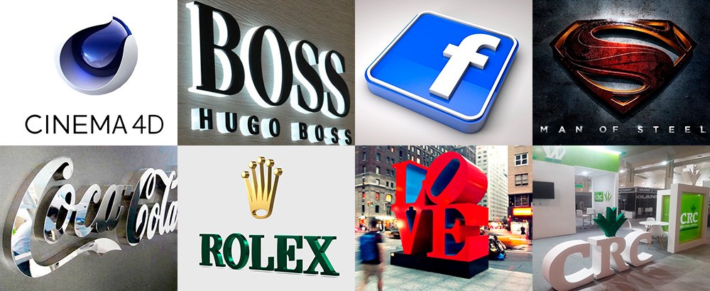
A brand's design must also support video animation or 3D implementations.
That is why we have to take into account all these factors before choosing what type of brand we are going to develop.
What are the different types of logos and how do we identify them?
The visual image of a trademark can be made up of one or more words and a symbol in various combinations.
Next, I am going to explain to you with very famous examples, all the types of logos classified by their morphological and conceptual structure:
1. Logotype
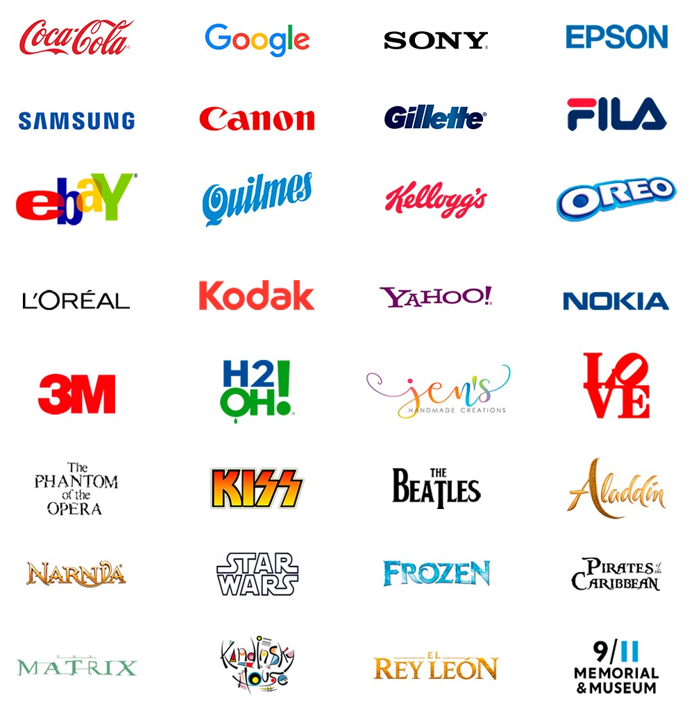
The logo or wordmak consists of a brand composed exclusively of words.
It is a mistake to consider any name to which a typeface and an institutional color is applied as a logo.
A brand should try to be unique and perfectly recognized .
Logos must have a projected design with a communication strategy.
The typographic style and the appropriate choice of institutional color must be taken into account, both determining factors to give a visual identity to the brand.
The logo color is not a determining factor of identity.
A good brand must be able to identify itself in black and white, positive and negative.
Variations allowed
Large companies generally create their own typefaces that add identity.
Others take popular commercial typefaces by adding subtle detail or applying some kind of warp to them.
Thus we can see the use of expansion, contraction, variation of the kerning, curvatures in its baseline, which provide traits of business identity.
Some brands incorporate very subtle geometric elements that are not considered as isotypes or pictograms, and for this reason they are clearly considered logos, and not images or isologotypes.
Any other graphic element that composes it (boxes, outlines, underlines) will be secondary and will not provide identity but only decoration or graphic reinforcement.
Some logos have duplicate letters or special typographic characters (such as umlauts, dashes or accents), or simply variations in their letters (ligatures, rotations, mirrors).
These are very useful elements, since strategically designed they grant an additional semantic value to the brand.
There are also marks in which some of their characters are replaced by a pictogram with similar shapes.
These fulfill the role of the letter they substitute, and in other cases, the symbol replaces a verbal or phonetic expression.
Some designers use the negative value resource to omit characters without losing readability.
Other designers choose to take a bolder step and create typographic alphabets with minimal legibility but with a great pictographic sense, reaching the limit between the concept of logo and isotype.
At first glance it is perceived as an abstract isotype but in reality it is a typographic logo.
2. Isotype
The word isotype comes from the initials of the English expression “International System of Typographic Picture Education (Isotype)”.
The purpose of this system was to achieve visual communication through purely visual, non-verbal elements.
The value of this type of proposal was quickly capitalized by the advertising world for the benefit of brand positioning in the market.
Therefore, the isotype or symbol of the brand is a graphic symbol (not typographic) that represents the visual essence of the brand.
It is the perceptible representation of an idea, with features associated with a socially accepted convention:
They have the peculiarity of being able to be applied independently (without the logo) without losing identity.
The power of giving identity
Sometimes the isotype is so strong that when you see it you immediately associate it with a brand without having to read its name.
Many isotypes are allegorical or tell a story related to the brand they represent.
Generally used in large international companies with long trajectories, whose products or services are deeply rooted in the people.
In these cases, the mere presence of the isotype indicates prestige, quality and institutional solidity, and that is why they generate in people the need to acquire them.
Isotypes can be pictographic or typographic symbols.
Pictographic symbols or pictograms
Pictogram is a neologism and has its etymological origin in the Latin "pictus" which means "painted" , and in the Greek "gramma" which means "written"
Pictograms are signs that, through a figure or a symbol, allow to develop the representation of something.
Many ancient alphabets were created around pictograms, such is the case with Egyptian hieroglyphs.
In prehistory, man recorded various events through pictograms.
The figures that appear in cave paintings, for example, can be considered as pictograms.
A pictogram is a sub-class of isotype and consists of a symbol in the form of an icon that represents the minimum synthesis of the objects, shapes or characteristics that best identify it.
Pictograms can be figurative or abstract.
Figurative pictograms
They have great graphic similarity with the real elements they represent and their design is very simple and minimalist.
They are easily recognized and accepted by consumers, and they create a very close identity relationship with the brand they represent.
That is why We mention them as Apple's apple, Twitter bird, Mercedes Benz star , etc.
Abstract pictograms
Unlike figurative pictograms. They are not directly related to elements of the real world, but rather represent a subjective concept or idea of the brand.
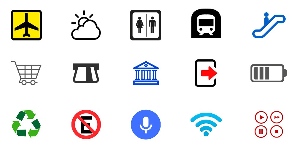
Pictograms on signage
The pictogram is not an exclusive concept of brand design.
They are also used in the design of signaling systems due to their ability to replace words or concepts with images or icons.
This is very necessary and favorable to break from this way the international language barriers.
These are universally accepted symbols, with an extremely simple and minimalist design.
These symbols have a direct semantic relationship with what they represent, so as not to leave your meaning behind.
That is why it is very common to see them in public spaces such as airports, restaurants, highways and shopping centers, as well as on electronic devices .
Pictograms in everyday life
Surely very few times you became aware of the role that pictograms fulfill in our daily lives.
Not only from the world of brands, but also in the environment in which we live.
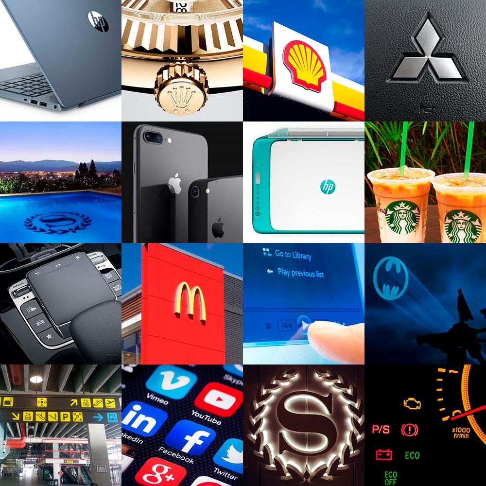
We are able to identify a commercial brand through its pictogram without having to see the name (unspoken mode) and that is possible thanks to good graphic design and successful advertising campaigns.
Without realizing it, we are bombarded with signals and stimuli that finally make us recognize those symbols even if we don't consume them.
Almost everything that surrounds us has some kind of pictogram and graphic design, from the remote control of the television, the urban signs, to your mobile phone.
We live permanently interacting with pictograms without realizing it, and these greatly simplify our daily life.
That is why when someone tells you that graphic design is not important or that it is only a «decorative» discipline, ask them what they would do if they were in an airport in Dubai or Tokyo without the presence of those «cartoons» that they despise so much.

Typographic symbols
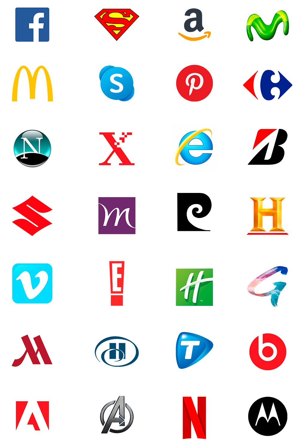
They are made up of typography and the main characteristic of these symbols is that the characters form graphics, but not words, so it can be confused with a logo.
According to the number of characters that compose it, they are divided into: Initial, Monogram, Acronym, Acronym and Anagram.
Initial
The brand is represented only by the first letter of its name and can have an element that contains it (a square, a circle, etc.)
Monogram
The word monogram comes from the Greek "monos" which means "alone, unique, isolated" and "gramma" which means "engraved, written"
The monogram is a logo variable and is applied to brands that use two or three initials as an abbreviation, and can be used (or not) accompanied by a logo.
Generally they correspond to the first and last names of people or the initials of the words that make up the name of a company.
It is not simply individual letters.
They are graphically combined by means of a design, interlacing the features of some letters with others, to form a sign fused in a single unit to stamp mode.
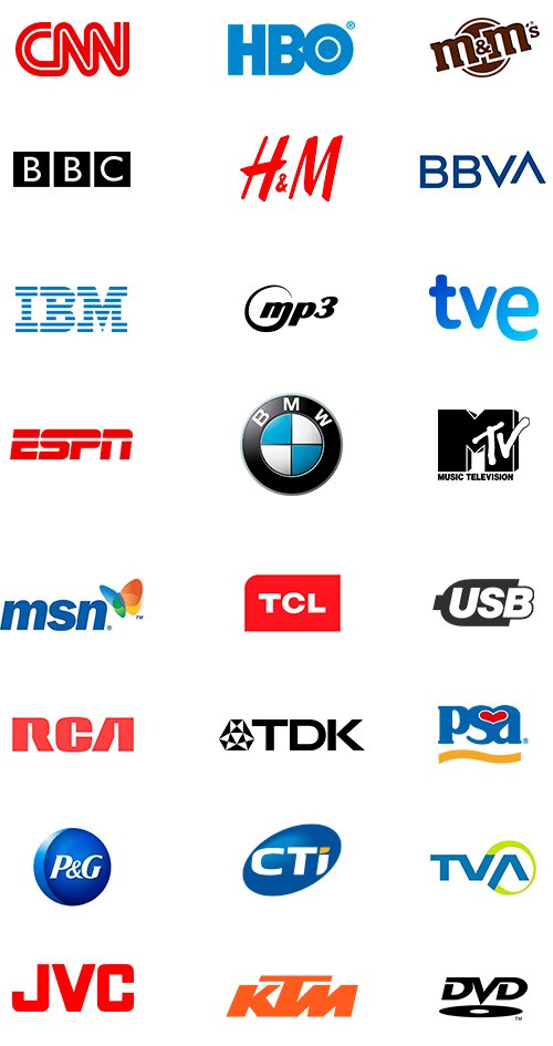
Sigla
Etymologically it comes from the Latin «sigla» which means «figures and abbreviations».
It is a word formed by the set of initial letters of an expression.
Each letter corresponds to a word, is pronounced independently, and does not form a new word, as in the case of anagrams and acronyms.
It differs from monogram in that it is not intended to create a fused symbol, but rather that the letters differ well separately.
They are generally used in large multinational companies to summarize very long or difficult international pronunciation names.
Acronym
An acronym is a linguistic rather than a graphic concept.
Its etymology is of Greek origin formed by the words «akros» which means «extremes», and «nimo» which means «name»
Consequently, an acronym means "extreme name" or "name made up of extremes."
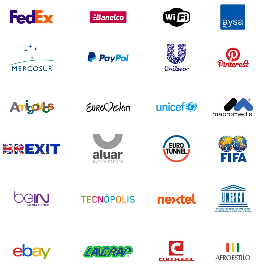
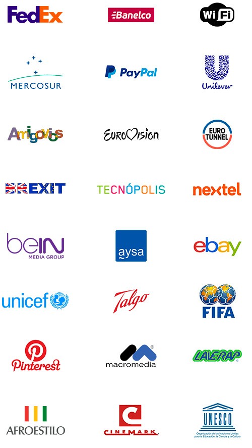
On the one hand, it is the term formed by the union of elements of two or more words: Mercosur (Mercado Común del Sur), FedEx (Federal Express), Banelco (Banca Electrónica Compartida), Wi-Fi (Wireless Fidelity), etc.
On the other hand, an acronym that is pronounced as a single word is also called an acronym: NATO, UFO, UN, AFIP.
It also refers to the word formed by the union of elements of two or more words, consisting of the beginning of the first and the end of the last.
A clear example is Pinterest , a social network that summarizes the idea of clicking with a "pin" on the board those contents that "interest" us, so that they are quickly accessible when we need them.
Large multinational companies take advantage of the use of acronyms to create short, strong brands that are easy to recognize and pronounce in different languages.
Anagram
It comes from the Latin «anagramma» and consists of creating a new word from the rearrangement of the letters that make up another word.
They are very common examples of anagram: LOVE, ROMA, ARMO, MORA, RAMO
Therefore, an anagram, like an acronym, is a linguistic rather than a graphic concept, allowing the creation of word games that add originality to the brand name.
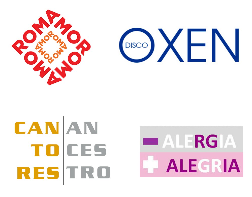
In the following examples, OXEN is a by-product of the NEXO company and the set of letters indicates the membership relationship between the two.
CANTORES ANCESTROS (ANCESTRAL SINGERS) is a folkloric musical project with strong aboriginal roots, and its name represents its essence: Singers who perform their ancestral music.
- ALERGIA + ALEGRÍA (in spanish means "less allergy, more joy") in addition to playing with the paronyms, it incorporates the antonym: ALERGIA (ALLERGY) produces sadness, and it is the opposite of ALEGRIA (JOY).
3. Isologotype
An isologotype or isologo is a type of combined brand, which consists of an isotype and a logo grouped in a single graphic symbol that cannot be separated, as an identity seal.
You have to be very careful when designing isologos.
Being words within symbols, graphics can have legibility problems in very small brand applications, less than 15 mm.
Such is the example of merchandising products printed matter: pens, pins, newspaper ads, etc.
4. Imagotype
The origin of the word imagotype comes from Latin "imago" which means "image" and « type » comes from the Greek « typos » which means « Blow, mark, shape ». Just as the etymological meaning of the logo is "brand-word" , the imagotype is "brand-image".
The imagotype is the most frequent type of combined brand, in which the isotype and the logo act together.
Unlike the isologotype, both elements can be recognized separately without losing identity, since they have a well-defined graphic presence .
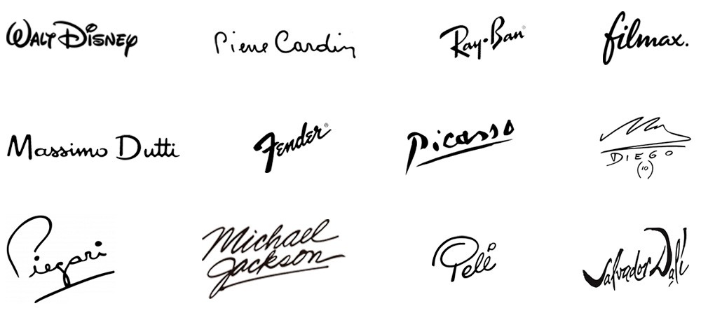
5. Signature
It consists of creating a logo from the handwritten signature of a person.
It is generally applied to very famous personalities whose own name has become a registered trademark.
Such is the case of great fashion designers, musicians and movie and sports stars.
6. Mascot
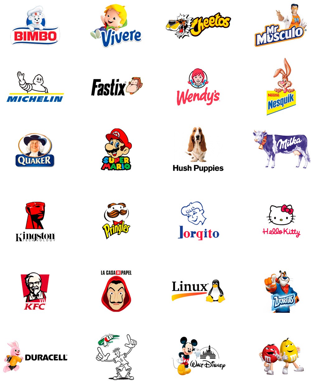
They are logos whose design is based on a character or mascot, be it an animal, a person, a cartoon or an animated object.
The mascots work as an isotype that complements the logo.
This logo has sufficient graphic identity and does not depend on the mascot to survive, in fact it can be omitted and the brand will be easily recognized.
While the logo gives identity, the mascot directly communicates value and culture to customers, and reinforces the institutional image, since they often maintain the colors of the logo.
Why use a mascot logo?
The mascot is associated with good luck and reflects the spirit of the organizations with which it is linked.
They are very efficient in terms of associating the image with the brand they represent as they are very easy for the public to remember .
They have great communication potential in marketing campaigns, since they are very friendly and allow various advertising developments.
And this is how we see them in animations in audiovisual media, creation of merchandising products, corporeal applications for banners and exhibition stands.
They are even used in promotional live performances with dolls and actors, etc.
The mascot creates a bond of familiarity with its consumers and transmits a very clear message:
- The Bimbo bread bear is soft, delicate, neat and fluffy.
- Mr. Muscle is a superhero who with his powers will do the heavy cleaning work without you having to strain.
- “Fido Dido” from 7up, is a simple character, colorless, adolescent, rebellious, carefree, with a lot of personality and he always does his own thing.
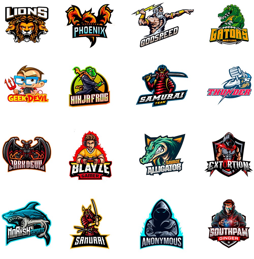
Gamers and Esports
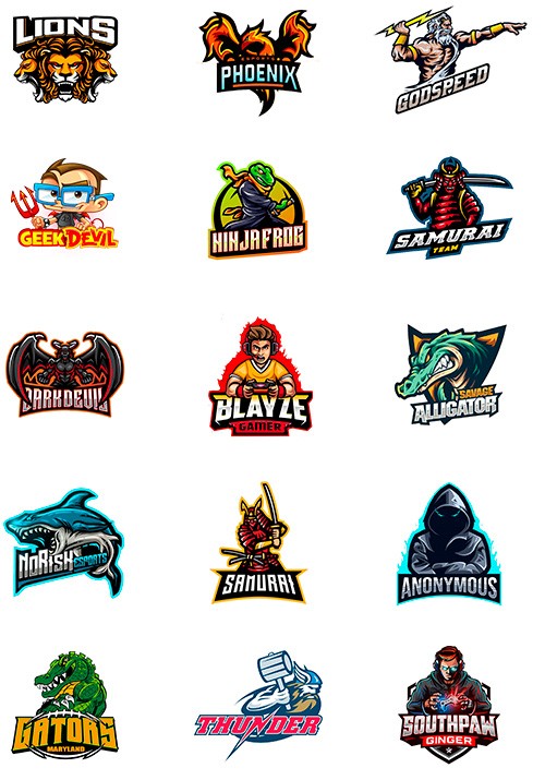
Mascot Logos are currently a trend in the world of Gamers and Esports to identify sports teams.
The choice of mascot reflects the spirit and values of the brand they represent.
In these cases they have a very particular graphic design and their characters have aggressive attitudes and intense colors.
They represent action games with a lot of adrenaline, with opposing teams that seek to be the winner or the hero of the story.
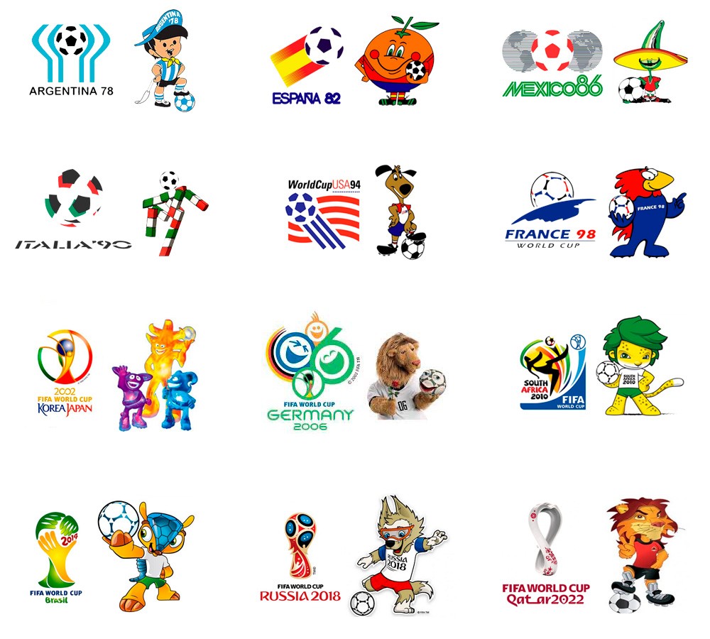
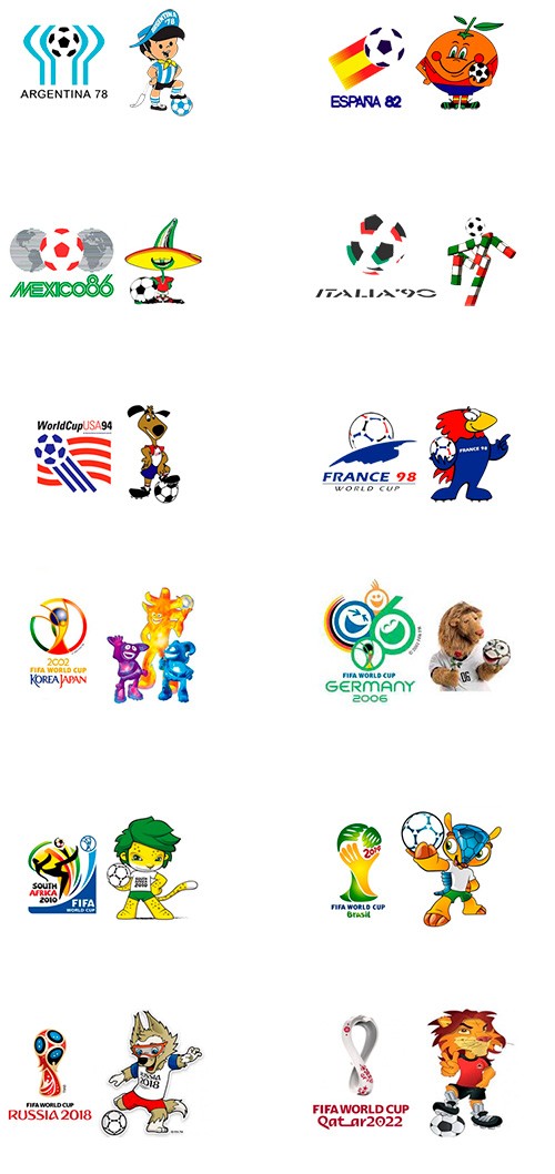
A good example of the use of mascots can be seen in the soccer championships for the FIFA World Cup.
Each country tries to show the world its spirit, culture and tradition through its graphic identity.
Below I show you the mascots and the emblems of the respective sede.
The following types of logos (emblem, shield, badge, and medal) are not necessarily logos, although some function as such.
A logo can be made up of an emblem, but an emblem is not necessarily a logo, rather it is a much more comprehensive concept.
The same concept applies to shields, badges and medals.
All these types of logos grant prestige, distinction and special recognition.
That is why many companies decide to take advantage of these concepts and design their brands using These guys.
7. Emblem
The term emblem comes from the Greek language and means "what is put inside or enclosed", since they were generally inside rectangles or circles.
In ancient times, emblems were enigmatic drawings that told stories through quite complex designs and provided with many details, accompanied by a title and an explanatory text.
They were made by woodcut or intaglio.
At present, they are widely used as a logo or seal to represent institutions of great prestige and trajectory. We can find them in very exclusive universities and clubs, which claim to show their ethical and philosophical values through a solid image that represents them.
They are also used to graphically represent ethical and moral values, such as Justice, Freedom, Independence, equality, etc.
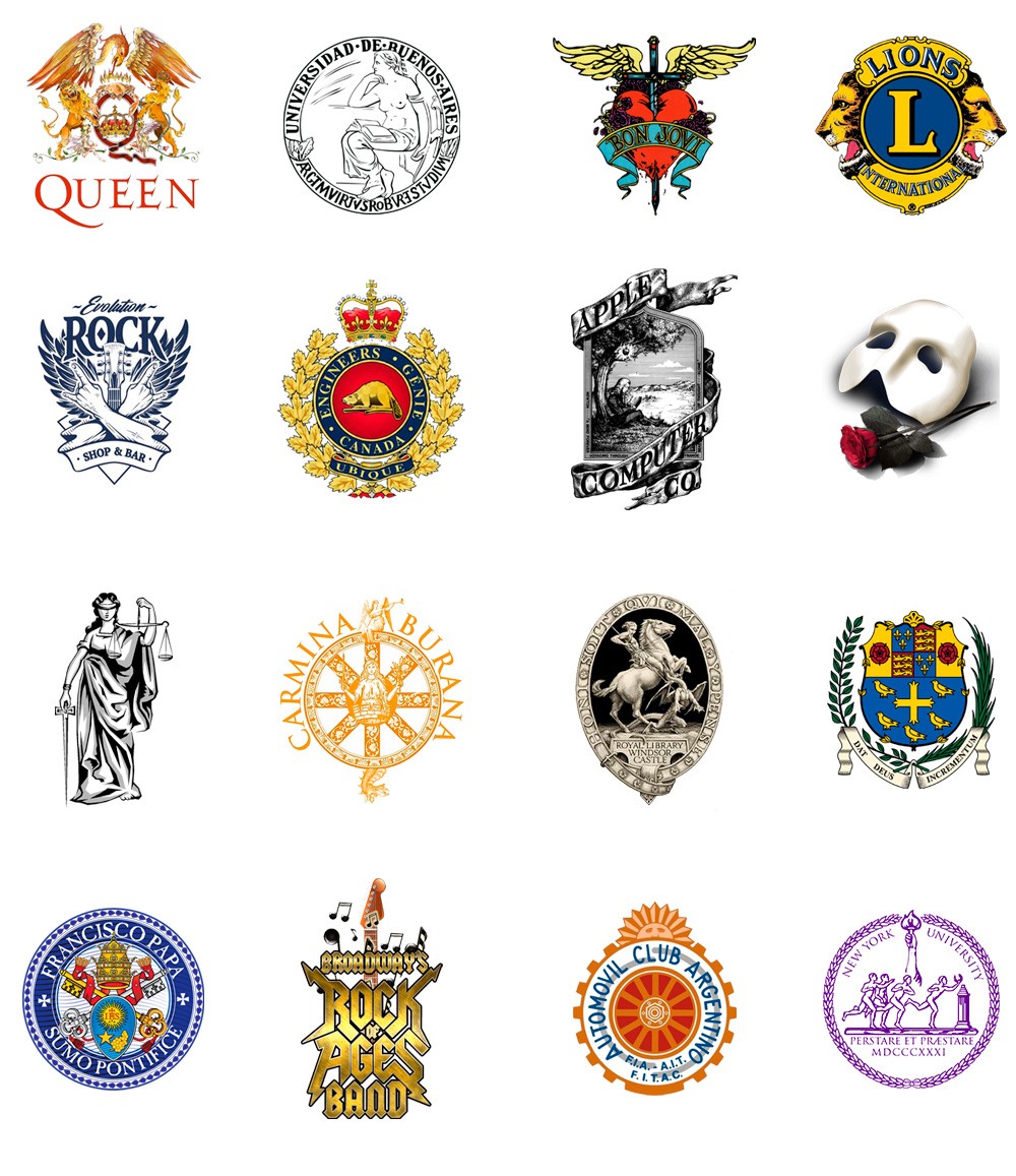
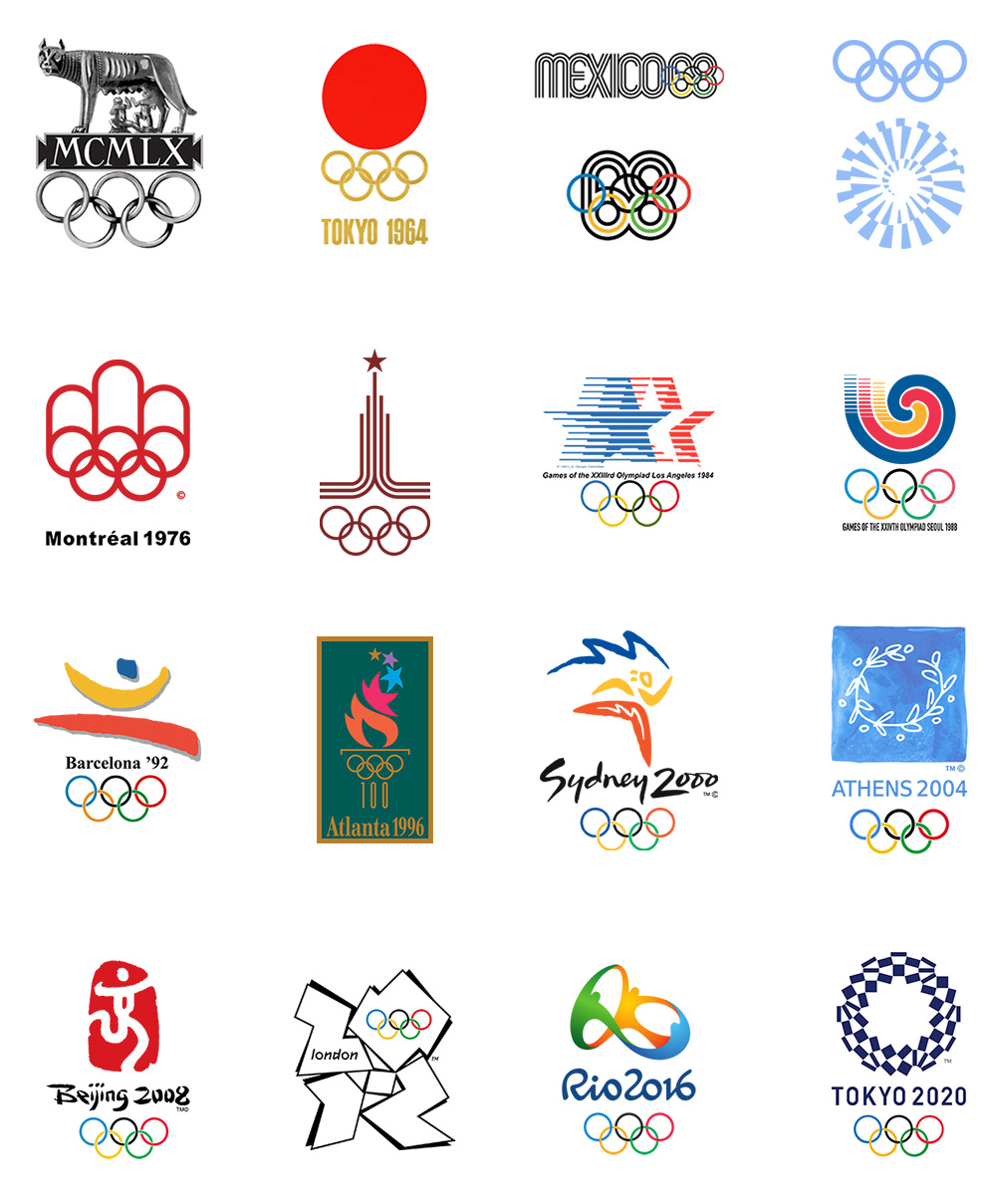
A very frequent use of the emblems can be found in the commemorative designs of world events such as the Olympic Games.
Like the mascots, these emblems are intended to show the world the philosophy and spirit of the city they represent and also generate many advertising and merchandising products.
8. Shield
The shields are a type of emblem that refer to the ancient heraldic shields, symbols of belonging to a family, country, region, association or moral ideology, with a strong bond of identity and belonging.
They are directly associated with the coats of arms used by warriors in battles, and from them they acquire their most characteristic feature: their forms.
Shields are used as national symbols to represent countries and regions, as well as by sports clubs, universities, automotive companies, political parties, and religious and social groups.
Unlike emblems, shields have a much more simplified design.
They contain drawings that convey a message or represent identity, loaded with high semantic and allegorical content.
That is why some companies choose shields in their designs of its brands to transmit strength, security, trust, trajectory, luxury and exclusivity.
9. Insignia
An insignia (from the Latin insignia, which means "emblem, symbol, insignia, honorific mark") is a distinctive mark of belonging to a group, rank, rank or function.
It is a symbol or sign of personal power, status or function of a certain social sector.
There are several types of insignia such as flags, decorations, awards, accolades, crowns, cockades and shields.
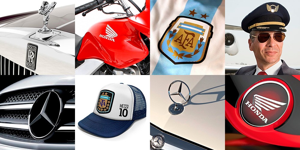
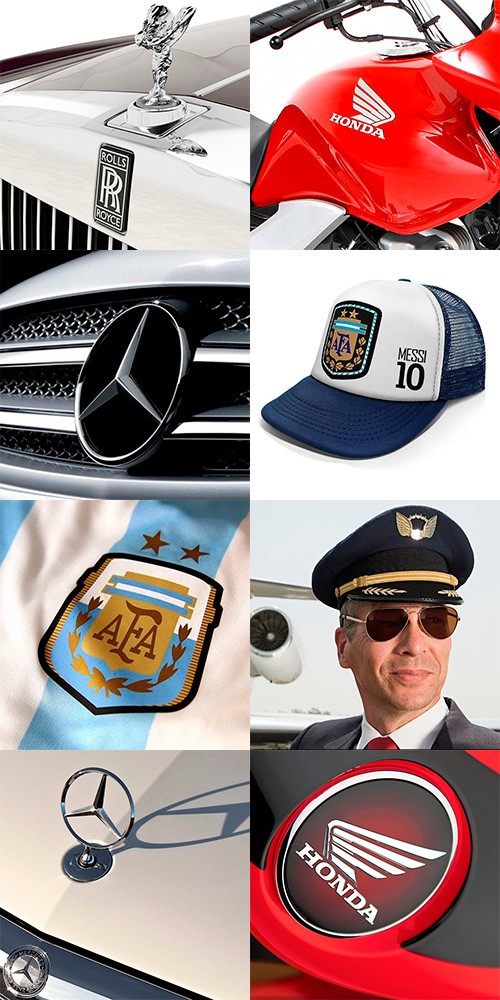
In graphic design, badges fulfill a similar role to emblems and shields, but their shape and complexity of design vary.
It is very common for brands with badges to contain graphic elements such as wings, stars, crowns, medals, banners , flags, laurels and ribbons, all of them distinctive and decorative elements.
Some companies use badges when designing their brands to show a high-quality image, and make their customers feel worthy of belonging to a certain select group, or having access to a higher quality product.
Insignias are generally made of metal but they are also very frequently stamped or embroidered on flags, uniforms and clothing.
They are very chosen in automotive brands or luxury products and also in the military and sports environment.
Virtual badges are also used to reward the best buyer / seller or follower in online stores and social networks.
10. Medal
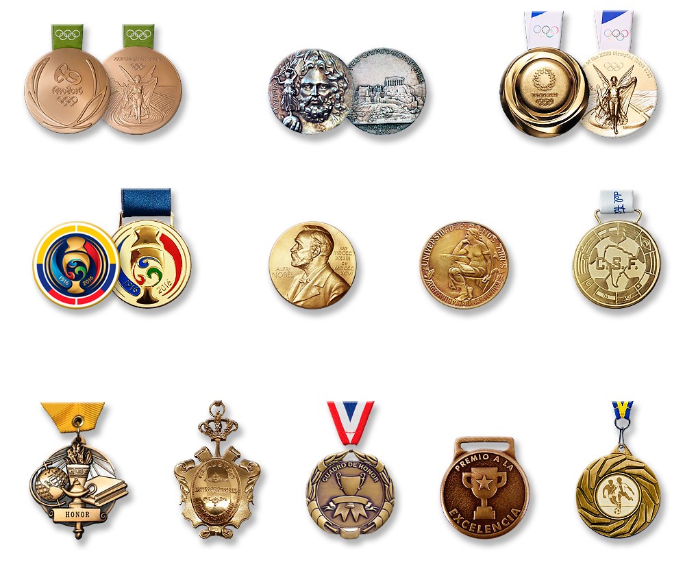
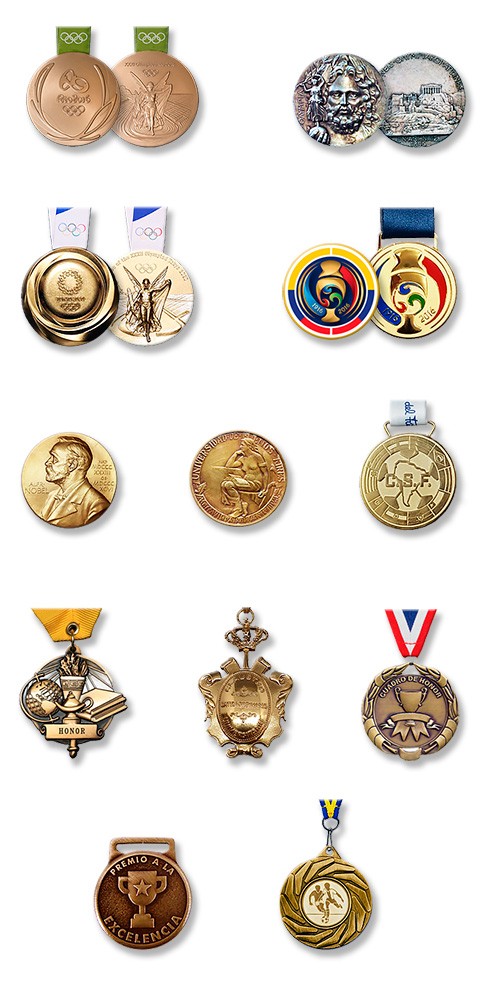
The medals (from the Italian "medaglia" which means "coin or prize") tend to be metallic discs, similar to coins, although with a larger diameter and pronounced relief, that incorporate some type of symbol or distinction.
They can contain logos, shields, emblems and legends.
Medals are quite similar to emblems, shields and badges in terms of the concept they represent.
They are always limited to a round, oval or rectangular shape, and generally go Accompanied by a ribbon to hang from the neck or put on clothing.
A matter of honor
The medals are issued for various purposes, such as a badge that recognizes a person in the military, religious or civil spheres.
They are also used as an award in sports, educational or business competitions, or as a commemoration of an important event or memory.
Therefore, a medal is synonymous with a prize, award, recognition, honor or decoration.
Conceptually, medals are highly prized and desired objects that are awarded to special people: the best in their class.
They are awarded at important ceremonies and events or at official events, and whoever receives them receives recognition that distinguishes them from their peers. .
This represents pride and added value to their curriculum and career, and causes the need to display them as a trophy or distinction.
The type of material of the medals represents the hierarchy of the award: gold, silver, bronze, etc.
As for the graphic design of the medals, we must consider that they are three-dimensional objects of small size and minted in metal in a similar way to coins.
We must choose monochrome designs (although some incorporate color) and that can allow the use of reliefs.
Final conclusion
I hope you have enjoyed this article and it has been useful to you.
Surely you will continue to call all types of trademarks logo, but at least now you know the differences and the possibilities of use of each one.
If you wanted to have your brand and you consider that I am a suitable professional, do not hesitate to contact me and I will gladly advise you.
In the Related Articles section below, you will find many articles with specific topics that complement the one you just read. Thank you!

