Why redesign a brand?
In this post I want to tell you about the differences between Rebranding and Restyling, and the importance they have when redesigning a brand, with examples that have arisen through specific personal experiences with some of my clients.
I will also show you how, through the redesign, other very important objectives were achieved that had not been taken into account until now.
These are cases of clients who already had a brand in use and had not considered the possibility of changing it, as they did not consider it necessary or, alternatively, they were not aware of the growth possibilities that a new image could give them.
Read my post The most complete guide to understanding logos for more information
Rebranding vs. Restyling
The terms Rebranding and Restyling are often used synonymously, but in reality they are quite different concepts, and although the result of both is obtaining a new identity design, we should not confuse them.
Both concepts respond to the need to update the image of a brand and ensure its permanence and recognition over time and in different circumstances and applications.
Restyling, a question of visual style
A brand restyling is an update of the aesthetics, a facelift, but without altering its fundamental essence, preserving its perfectly recognizable key elements.
It is an efficient option when a brand wants to stay relevant in a changing market.
Over the course of a company, product or organization's life, its visual identity, like many other elements, may need to be transformed, adapting to current times and different brand application environments (graphic media, digital media, social networks, videos, etc.)
These design transformations are usually gradual, even very imperceptible, and always maintain the original concept of the brand.
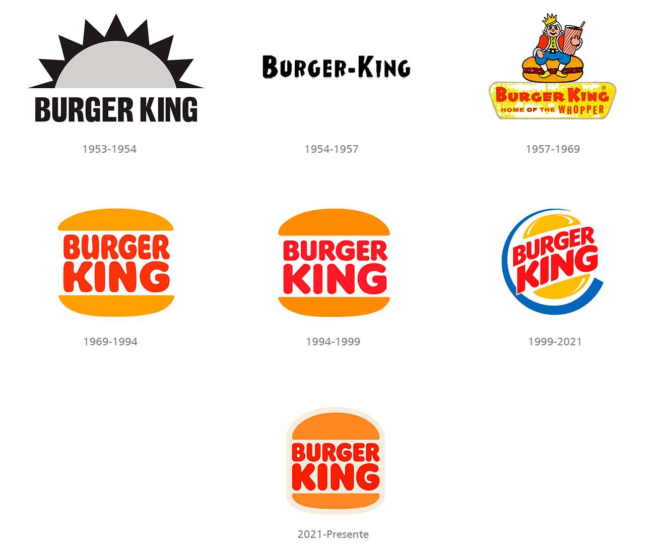
Below we can see a clear example of restyling in the evolution of the Burger King logo, where after experimenting with various styles.
It is a curious case since they have decided to return to their classic logo, but adding modern elements.
This change seeks to reinforce its identity as an authentic brand focused on customer experience (UX).
Rebranding, rethinking new communication strategies
Rebranding (redesign) is the intensive modification of the visual identity of a brand to adapt it to a new desired positioning.
Unlike restyling, it involves a complete review of the brand's communication strategy and identity, which may include a complete change of the logo, institutional colors and value proposition, reflecting a strategic change in the company's direction.
Many times a brand feels “threatened” by new competitors or motivated to change by current technologies, and this leads to the decision to make more drastic changes, even changing the name and the entire identity design.
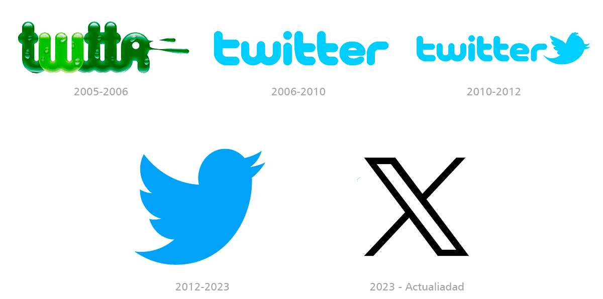
A recent case of extreme rebranding is that of the social network X, formerly called Twitter, in which absolutely all the identity elements have been changed (name, colors, fonts, etc.)
The following example shows the case of the comprehensive redesign of the logo of the TV channel Animal Planet.
The brand explains that the goal of this change is to “interact with mass audiences across all platforms.
“We can reach all generations through our content and storytelling; we are here to entertain and delight by bringing people closer to animals and nature,” they say.

Rebranding always starts from specific objectives or needs so that the brand can be aligned with the company's strategy and verbal identity, and therefore, involves deeper changes in its identity.
It is a process that goes beyond changing the visual style or modernizing the aesthetics of the logo and addresses essential aspects such as the company's mission, vision and values, strengthening the links between the brand and its target market.
The little apple is always at the forefront
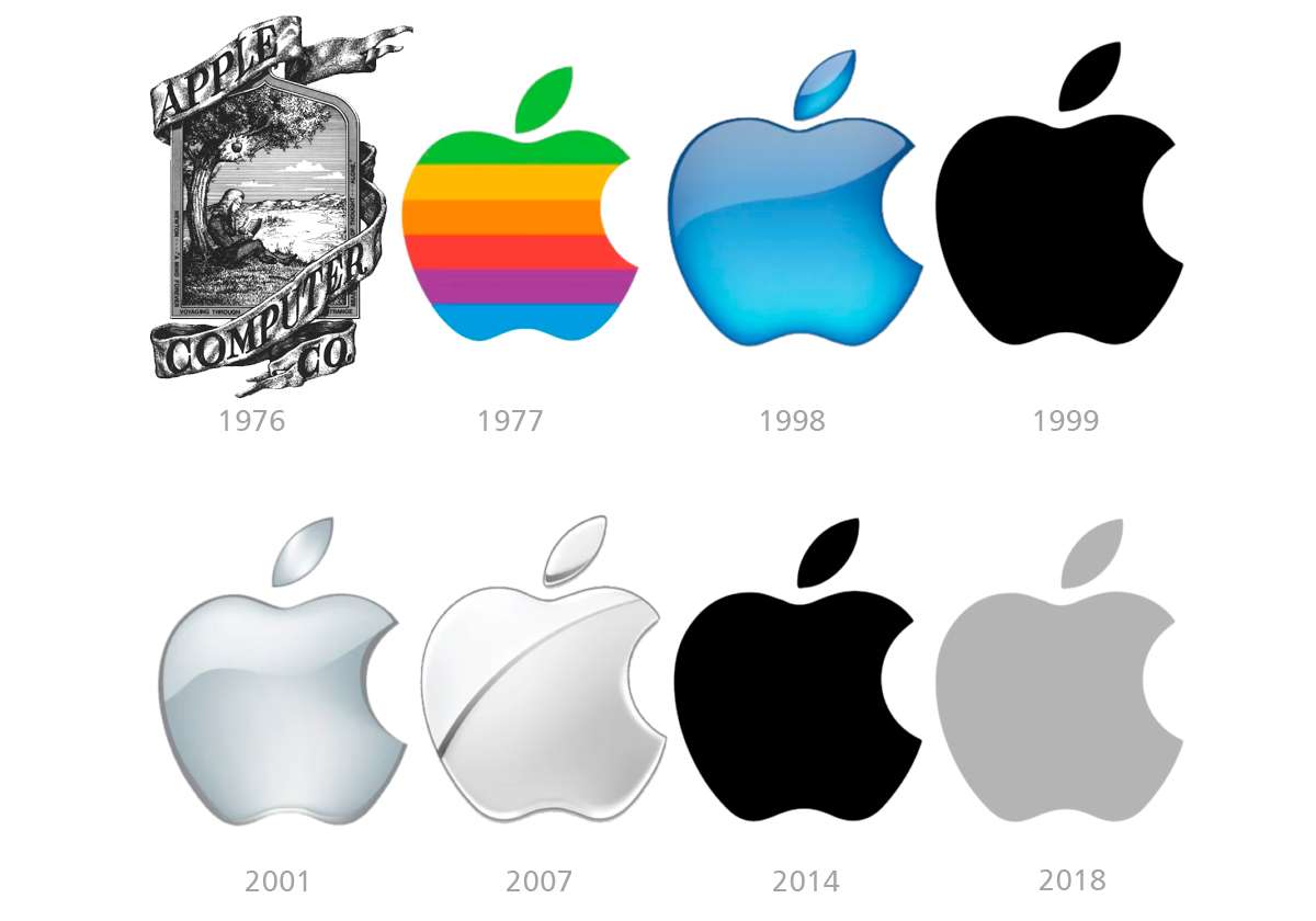
A very illustrative example is that of Apple, which went from being a "nerd brand" of garage computers to becoming a worldwide reference for design and technology.
This led to a brutal rebranding in 1977, which went from having an emblematic illustration depicting Sir Isaac Newton under the apple tree to identifying the brand with the now world-renowned bitten apple.
From then on, the following updates consisted only of restylings that were adapted to the brand's communication needs.
As a curious fact, Rob Yanoff, the designer of the Apple logo, is said to have revealed that the creation of the famous logo was thanks to some apples he bought to paint in a portrait.
In an attempt to simplify the company's symbol, Yanoff wanted to include the image of the "bitten apple" since the word "bite" in English is bite, which is similar to a computing term (which is byte, like gigabyte, megabyte, etc.), taking advantage of the wordplay with phonetic pronunciation.
Knowing how to advise the client
In my professional experience I have often found that some of my clients were clinging to an image that has identified them for years.
They were not very willing to innovate and make changes, despite my suggestions and the needs that the market itself was asking of them.
Regardless of whether the brand is good or bad in terms of design, I consider that in these cases, a restyling is the most appropriate, since a rebranding would be a very drastic option and difficult to assimilate for the client and the people who work in their environment.
Let us not forget that behind a brand there are always “people” who feel, have emotions, stories, memories, traditions, etc.
Many times these are family businesses or enterprises, where the original brand was created by someone who is no longer with us, or who deserves the respect of continuing their legacy by their successors.
For this reason, in these cases, I suggest to my clients a restyling of the existing brand, preserving the original concepts in semantic graphic elements and colors, but adapting them to more current forms that allow their application in various graphic and digital media.
Accepting the need to innovate
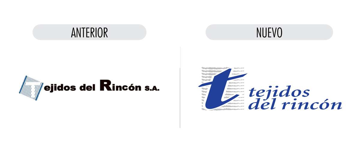
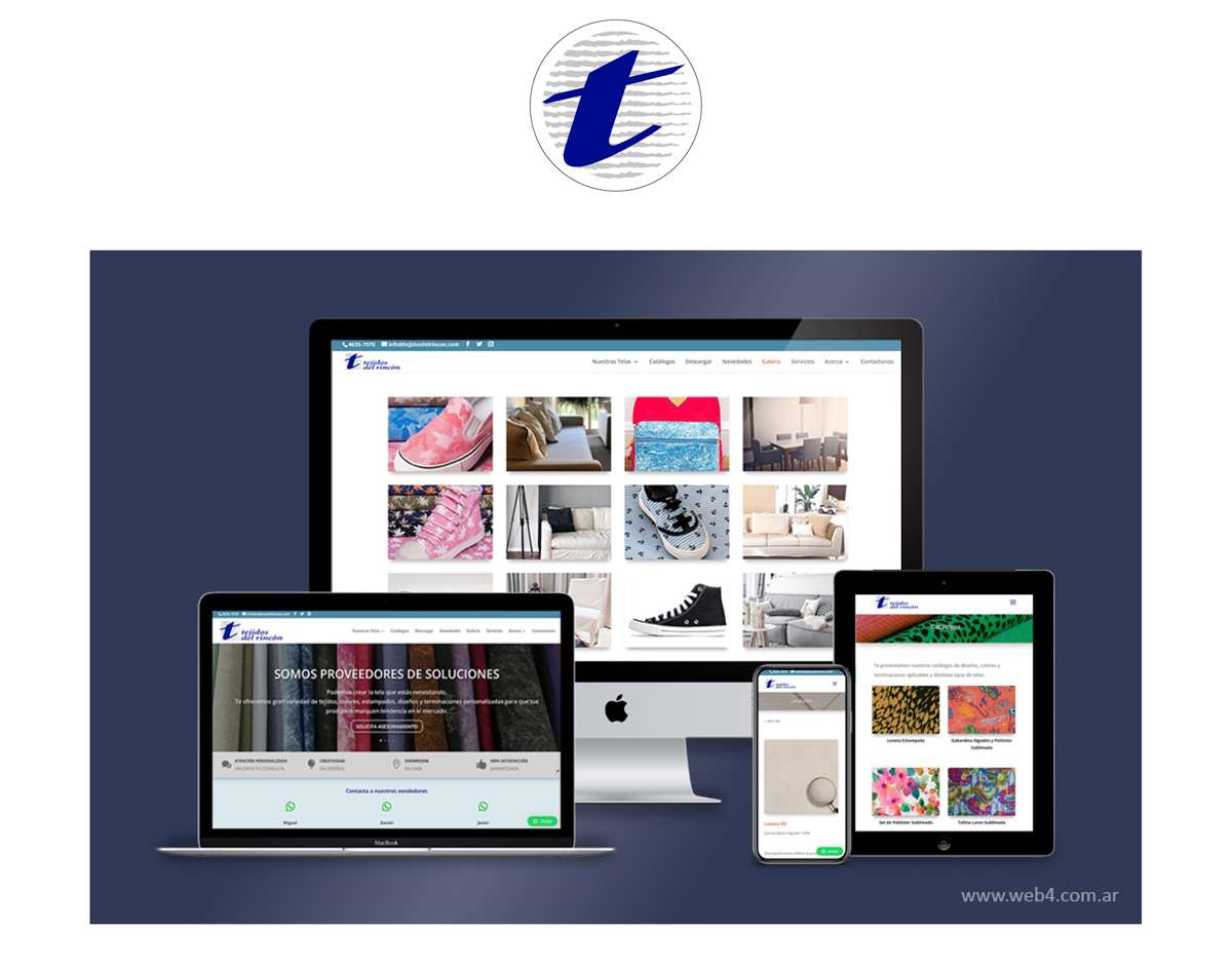
The example illustrated below is the case of a client who has a family business manufacturing fabrics for footwear, leather goods and decoration, with more than 60 years of presence in the Argentine market.
I was called upon only to update a website that had been “forgotten” for some time, but there was not much to salvage in its content, and that is why I proposed redesigning it entirely.
My client immediately accepted my proposal and also my suggestion to update their brand.
I suggested that by doing so, we would have many more corporate elements to develop the design of the new website, applying logos, colors and styles that respond to the brand and identity of the company, and being able to unify communication criteria with all the elements that emerge from the logo (social networks, catalogs, advertisements, flyers, publications, etc.)
Keeping company traditions
The company name corresponds to his family name, and therefore I tried to respect all the traditional and emotional aspect that it represents for my client, but persuading him of the need for an adaptation of the brand that would allow him to have a stronger presence in print, digital and social media.
That is why I proposed to preserve the concept of the initial “t” and the loom, which represents the company’s activity, and to standardize the use of colors and fonts, obtaining a more modern, appropriate and versatile brand.
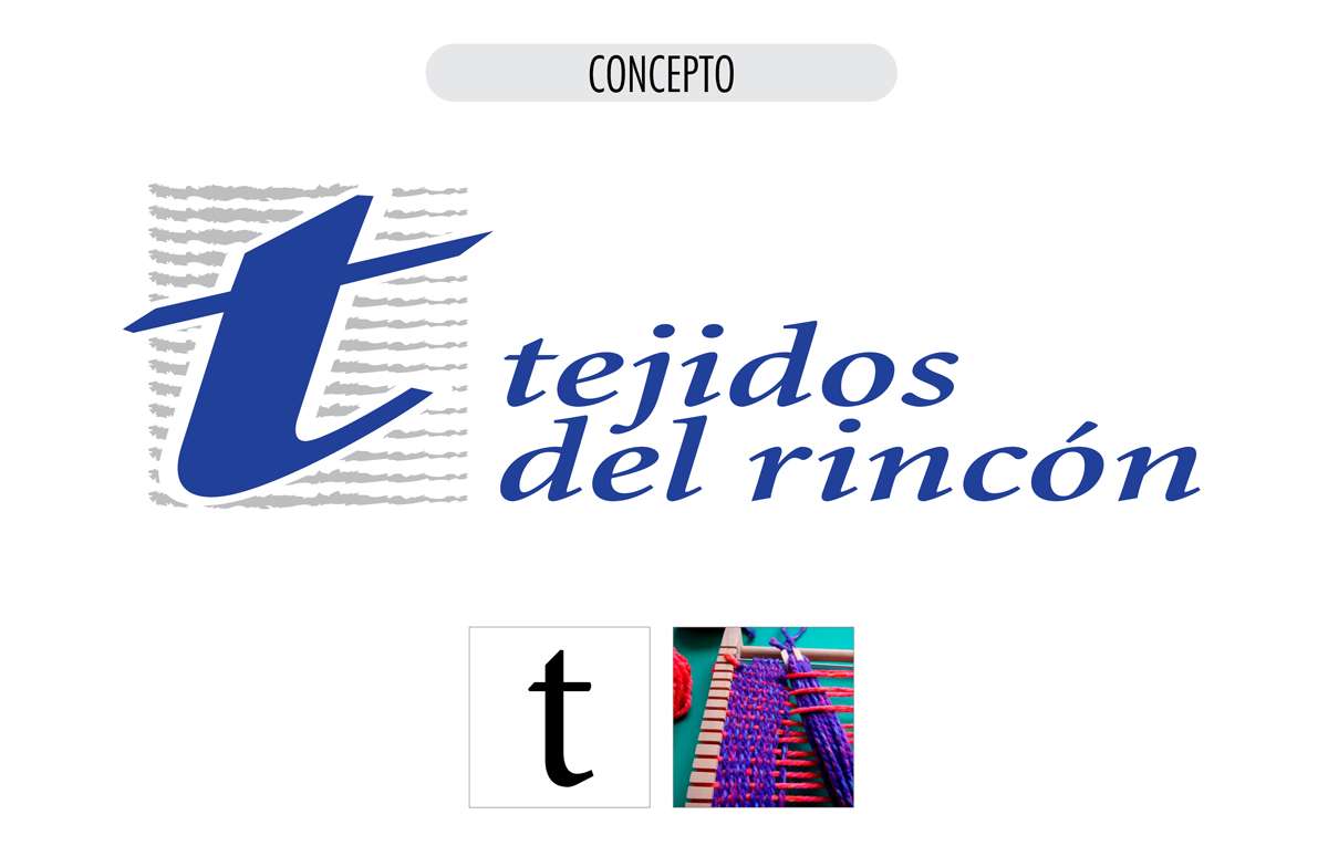
This brand restyling allowed the company to take a new level of visual communication, through product catalogues, websites, social networks and even stands at exhibitions in which it participates.
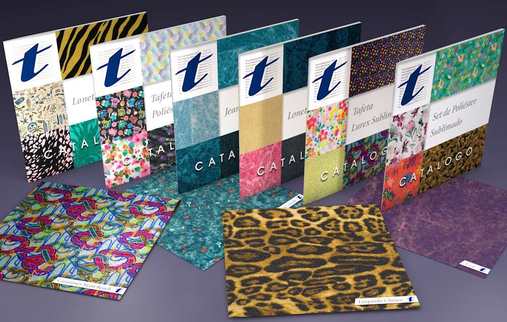
You can visit the website by clicking HERE.
Changing habits
It is often a very hard job, but effective and satisfying when achieved, to convince the client that, based on having a new good institutional image, they must change their communication patterns with their own clients or consumers, always choosing quality options with professional criteria, and leaving behind amateur, improvised and illogical issues.
I always suggest that once you have your new image, you accept it and incorporate it into your new life, showing it off with pride and improving day by day.
I also recommend that if you take photos, they should be quality and well edited, that you carefully choose the content of your social networks, that you show your image with coherence and criteria, always in the same way, with the same colors and fonts.
Esos son los aspectos que forjan y favorecen la forma de comunicar una marca, y que sus consumidores terminan adaptándose y eligiendo ese estilo de comunicación, en que se sienten cómodos y a gusto.
Elements such as well-designed commercial stationery, advertising banners, graphic pieces, flyers, printed or digital, social networks, well-written texts and, above all, a professional look, are essential allies to promote the growth and positioning of a brand and its products.
It is always about improving the experience of our users, so that we make their daily lives easier and more enjoyable and therefore that they "choose us", since that is what the success and permanence of a brand is all about.
Rebranding: A change of strategy in communication management
We've already talked about restyling and the benefits it can bring to a brand, but now we're going to address the case of another client in which there was no solid starting point on which to build a good identity; there really was nothing left to save.
This is the Online Argentine Journal of Anatomy, an international scientific publication of the Argentine Association of Anatomy.
In this journal, physicians, residents and medical students from Argentina and around the world publish their work previously presented at the Argentine Congress of Anatomy, which takes place annually in various cities throughout the country.
Being a designer and webmaster of the Argentine Association of Anatomy since 2015, where I had already completely redesigned its website; in 2017 I was called to take charge of the editorial design of the Journal, which had been published quarterly since 2010, in its print and online versions.
The journal was seriously behind in its publications and had been in arrears for its editions since 2015, as the person in charge of doing so could no longer take care of them.
This person was not a graphic designer but a doctor who worked with very good intentions, but without adequate knowledge or tools, using “what he had at hand” for free and “pre-assembled”.
However, the results were not satisfactory, since the criteria and experience for designing are not included in these tools that are freely accessible to the general public.
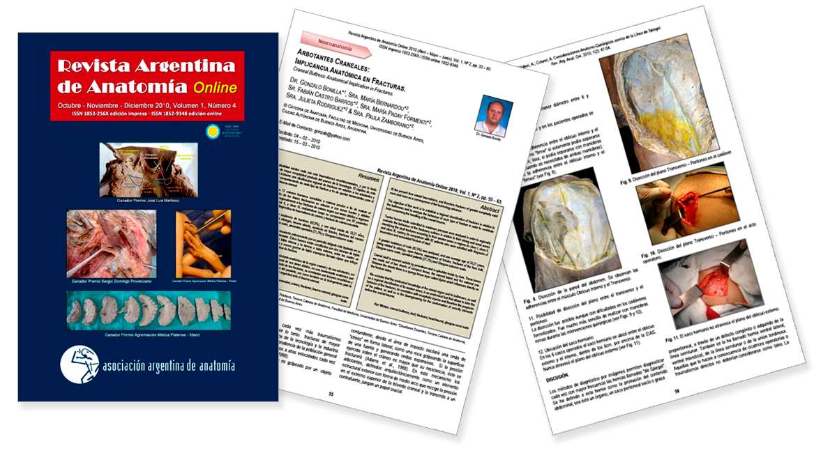
Below is an example of the journal's editorial design.
Where to start?
The editorial design of the magazine I inherited was very poor and rudimentary, without form or identity, developed with inappropriate tools (PowerPoint) and the results were very poor.
PowerPoint is a very versatile tool for creating brief, high-quality graphic presentations in a very simple and intuitive way, but not for creating 100-page graphic editions.
The structural design grid was barely hinted at and was not respected in all publications, which took away identity, coherence, harmony and fluidity from the reading of their contents.
Furthermore, their website was designed by the same person, continuing with the problems that arose from the magazine's design.
A totally dysfunctional website, without organization, aesthetics, or any criteria, resulting in a poor user experience and totally non-existent web positioning (SEO), since the content was not optimized to be crawled by search engines like Google.
The website was developed with a very basic and poorly used amateur template, without any knowledge of web design or layout and structuring of content.
The overall design had a black background with small white font that made it difficult to read, and it was not responsive, so it did not adapt to mobile devices.
In addition, it was hosted on a cheap hosting server, with its consequent advertising banners, slow browsing and downloading, and exposure to viruses and hackers.
Reborn… a new opportunity
The journal's directors suggested that I continue with the previous model, but I proposed making a comprehensive change starting with the design of a new identity.
This would allow the magazine to reach much higher and more accurate international standards, with a professional and global perspective, and would favour its publication in various graphic and digital media, with graphic and conceptual unity and coherence.
Indeed, a Rebranding was the best option to make the journal more relevant and to recover a global position not only for the editorial product, but also for the people who make it and the institution that supports it.
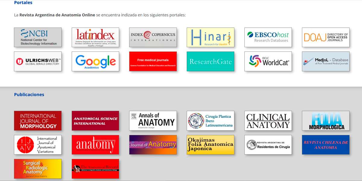
The journal is indexed in various specialized international portals, where several similar publications from other countries coexist, and therefore must stand out and be at the same level as its peers.
Redesigning the identity
The previous logo had no identity criteria at all and was not even always displayed in the same way in the various publications. It was just an inappropriate typeface chosen at random.
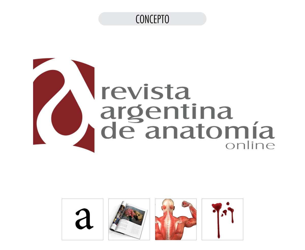
My proposal was to start with a complete redesign of the brand, providing a solid identity with allegorical concepts to the activity it represents: Anatomy.
The brand concept is developed through a blood-red continent, strategically curved like a page, which cuts out a letter “a” (from Argentine anatomy) slightly rotated so that a drop of blood forms in the eye of the letter, and which at the same time represents the union of muscles and cartilage in the human body.
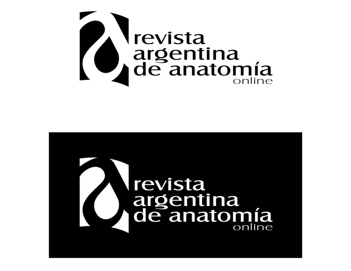
Regardless of the semantic concept that color gives it, the brand works perfectly in its monochromatic version, in positive and negative, to be used in applications that require it.
New editorial design
This rebranding is accompanied by a comprehensive editorial redesign of the magazine.
A new, clear and functional layout, where I have set out publication criteria that authors must respect in order to present their manuscripts in the journal.
My design idea was innovative and widely accepted by the board, who decided to believe in my proposal and gave me complete freedom to create a new product, and finally join the Editorial Committee as General Editor, Designer and Webmaster.
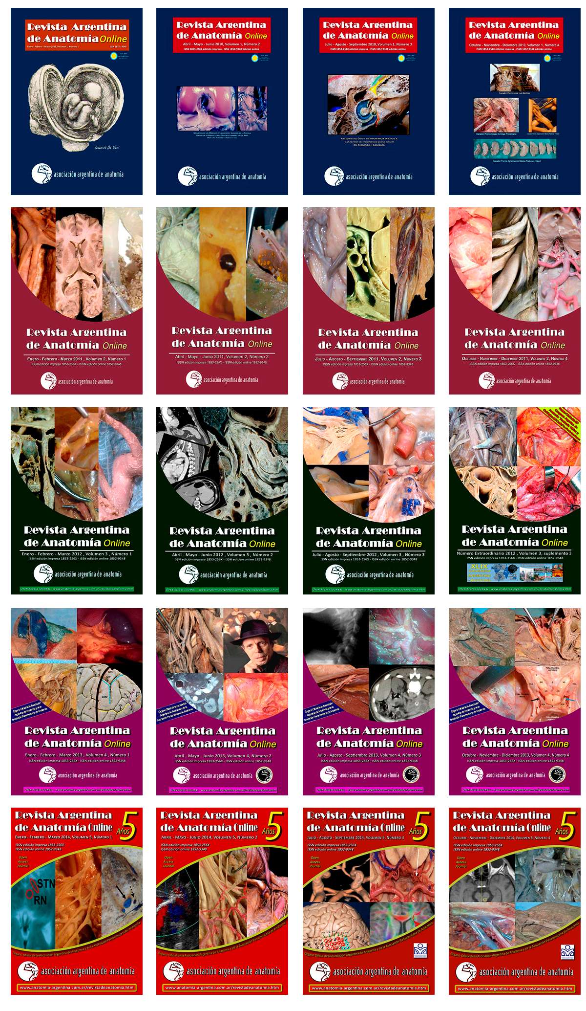
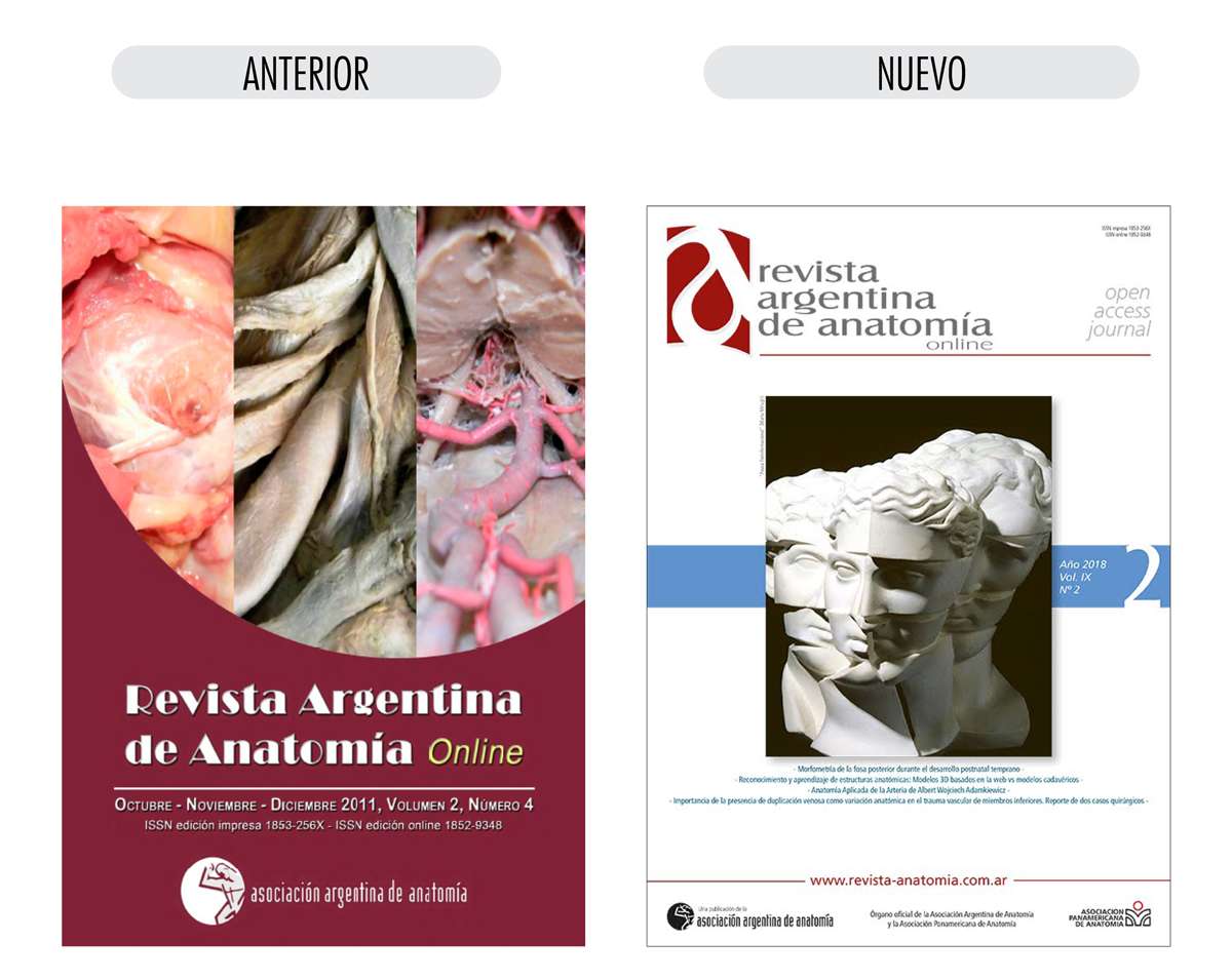
Previous covers consisted of a random collage of images taken from published works, usually dissections of cadavers.
A background color is used corresponding to each year of publication, the magazine logo is shown in different places and no identity or permanence is obtained in the memory of readers.
A new look at the concept of identity
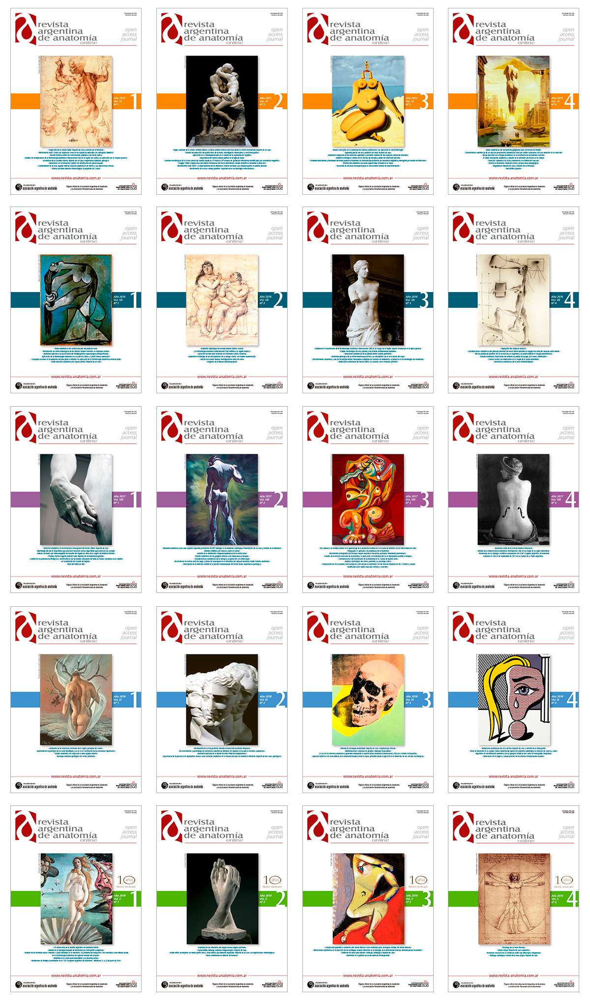
My concept for the covers of the publications is to show how different artists from all eras and areas of art (painting, sculpture, design, photography, etc.) interpret the human body.
The result is a graphically different and innovative proposal compared to similar publications, which are illustrated with dissections and viscera.
With a minimalist, clear and uncluttered design, a place of importance is assigned to the journal's logo, strengthening its identity.
A band of uniform color represents the year of publication, highlighting the volume number and including an index of the titles published in each issue, so as to allow easy access for searching content by volume.
Major surgery
The following image clearly shows the differences in design criteria for the journal's covers, which invite the reader to a better reading experience and understanding of the works that are published.
A good layout and design of the content also favours the dissemination of its authors and allows the journal to truly be an organ of scientific dissemination and appreciation of the work of those who participate in each edition of the same.
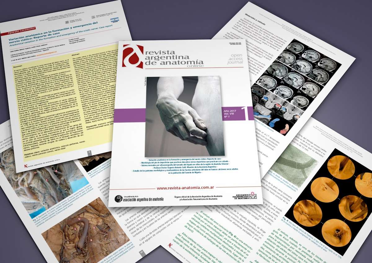
Each published work has the same header design, highlighting thematic sections, authors, institutions of affiliation, country of origin, submission and acceptance dates, and highlighted abstract in Spanish and English.
Image and table sizes, reference numbering in graphics and texts, image captions, bibliographies, etc. have been standardized.
New website
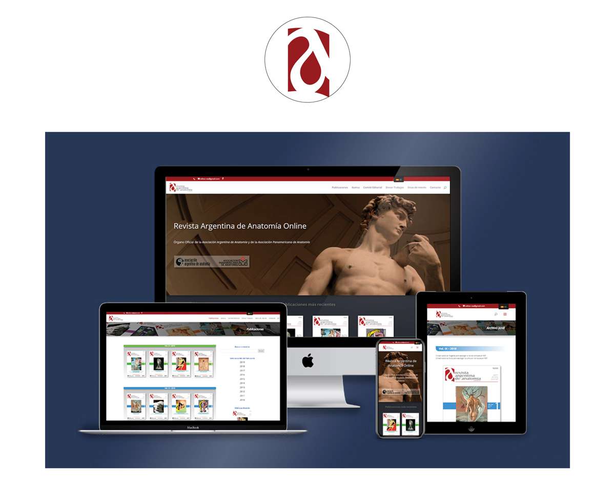
For the design of the new website, I continue with the same criteria as the magazine, optimizing its identity and improving visibility and access in all the specific search engines in which it is indexed.
Publications are available for free download in PDF format, both in their full version and as individual articles.
To reinforce its international character, the website is bilingual (Spanish/English) and its contents are optimized following guidelines that favor web positioning in content search engines (SEO).
Downloadable files have optimized metadata so that they can be tracked by author names, titles or keywords, favoring the dissemination of authors and their works.
The new brand design also allows the website to optimise its online presence through the use of avatars that improve access to the site from different browsers.
You can visit the magazine's website by clicking HERE.
A new way of being
In the example above we can see how, through conscious and strategic rebranding, developed with professional criteria, a new life has been given to a publication that almost did not exist.
They had the best product displayed in the worst way.
These are the characteristics necessary to guarantee the failure and invisibility of a publication as such, and of any other commercial, institutional, service or personal undertaking.
There is no point in having excellent content and good intentions if you lack design, organization, aesthetics, good taste, and above all, functionality that guarantees the satisfaction of your consumers and your positioning on the Internet.
Establishing a starting point
Brand redesign is always the starting point to obtain a graphic interface that provides identity and coherence to any type of product we want to develop, be it a magazine, a website, an app, social networks, videos, printed graphics, etc.
From it, we can find the color styles, fonts, design grids and all the characteristics that give "personality" to any product that aims to be recognized and accepted on a massive scale.
Just as members of a family are recognized by their genetic traits, physical appearance, their belonging to a name, their essence and their personality, the same happens with brands and the products and services they represent.
That is why they must be treated with respect, commitment and professionalism, since our brand speaks of «ourselves» as individuals and as members and representatives of the society in which we live.
Final conclusion
I hope you enjoyed this article and that it was useful to you.
My objective in this work is for you to know the differences between Rebranding and Restyling, and the benefits of redesigning a brand and the new possibilities that open up for the future of the client's commercial activity and its effective permanence in the market.
If you wanted to have your own brand and you consider that I am a suitable professional, do not hesitate to contact me.
In the Related Articles section below, you will find some articles with specific topics that complement the one you just read.
I invite you to read them, share them and leave your comments if you wish.
Thanks.




Hola amigo
Encontré tu blog de casualidad, buscando otros temas en Google y no sé por qué lo he leido todo…
Soy un médico de Venezuela y casualmente, hace unos años me han publicado algunos de mis manuscritos de la Revista Argentina de Anatomia Online que tu diseñas y que traes en este articulo tan interesante
Me gusta mucho tu trabajo y el tratamiento que le das a la revista, y realmente la hace diferente a las demás, y ahora entendí lo de la identidad que tú explicas tan bien en este artículo, y veo que lo haces de lujo.
Me gusta mucho ver mis trabajos publicados y de mis colegas, y apreciio el respeto profesional con el que tú les das forma e «identidad»
He publicado trabajos de congresos de anatomia en otras revistas de Venezuela, Mexico y Brasil y ni modo de comparación con el excelente trato que les has dado tú.
Felicitaciones!
Hola Manuel.
Muchas gracias, me hace mucho bien que me trabajo mejore el trabajo de las personas.
Yo prefiero creer en las causalidades mas que en las casualidades. Saludos
Espectacular!!!
Creo que me acabo de convertir en tu fan, realmente escribís muy bien y los ejemplos gráficos son clarísimos
Gracias
Muchas gracias Marcelo, bienvenido!!!
Muchas gracias por tu articulo. Está muy bien explicado
Muchas gracias Martín