Personal branding: Benefits of having a logo with your own name

In this article I want to tell you about the importance of having a personal brand, a logo with your own name.

You should also be aware of its most frequent uses and the universe of possibilities and benefits it offers to promote and/or sell your activities, ventures or services in increasingly accessible and competitive media.


What is a personal brand?

A personal brand is a logo that speaks about you in the first person, and therefore bears your name, as if you were your own product, your own company.

A personal brand logo is a visual representation of your unique identity and professional personality.

Personal branding gives your name meaning and value to other people, and this considerably increases your chances of being “chosen” either within your environment or in a specific market in which you are interested in participating.

michael buble

The visual power of a personal brand makes your name easily remembered and identified among many others.

It is proven that people recognize icons and visual signals very easily.

If we apply this concept to the signage that we see in our daily lives, we all know that if we see a sign with a drawing of an airplane, it is indicating that it is an airport, and so on with many others.

We respond easily to visual stimuli, and graphic design, and especially logo design, thrives on that.


You can read my article “The most complete guide to understanding logos” for more information.

Packaging posavasos

>>> I WANT MY PERSONAL BRAND <<<

Packaging posavasos

Let's talk about Branding

I don't want to go into too much detail about branding because that's not the purpose of this article, but I will mention some basic concepts so that you understand that designing a logo is not just about making a pretty drawing.

A logo is a “brand”, YOUR BRAND! that can become very powerful if you know how to manage it with judgment and professionalism.

Branding, also known as brand management, is made up of a set of actions related to the positioning, purpose and values ​​of a brand.

Its goal is to create conscious and unconscious connections with the public to influence their purchasing decisions.

The most common types of branding are:

  • the product branding
  • the service's
  • the corporative's
  • the personal's


Personal Branding

Personal Branding is the management of your personal brand, acting and positioning yourself in such a way that your audience clearly understands who you are and what you offer.

That is, you must know exactly what you want to be remembered for and work to design that image for your audience, and this is precisely what you have to agree with your graphic designer.

It is the way you present yourself, the way others perceive you, your style, your intentions, your personality, what you say and what you do.

These are the ingredients that make up your personal brand and, in other words, the lens through which others see you, both personally and professionally.

Packaging posavasos

Why have a personal brand?

Maybe you have ever wondered why you should have a personal brand if you are not a company, a product or a service.

Having a personal brand does not necessarily mean having to identify yourself as a commercial, corporate or institutional entity, although it is true that every good brand responds to the design of corporate identity as such, with its usage regulations perfectly established.

A personal brand doesn't have to be something cold and devoid of emotions, sensitivity or personality, since in reality it is quite the opposite.

In fact, a personal brand serves to say "Here I am, this is who I am!" and often represents your essence, your personality, the activity you carry out or what you produce and want to make known, but always with your unique and personal seal.


Entering the digital universe of screens

A personal brand today is closely linked to the digital world and without it it is almost impossible to ensure entry and belonging in these media.

In these times when a large part of our existence is spent on screens connected to the Internet through websites, social networks, streaming channels, influencers and YouTubers, people increasingly need to identify themselves in order to distinguish themselves from their peers.

That is why designing a personal brand is important to have a relevant identity that allows you to remain in the media leaving your own mark.

Packaging posavasos

Uses of personal brands

Who should use personal brands?

Podríamos resumir diciendo que las marcas personales son aquellas que representan entidades con nombres de personas (y no nombres de fantasía) que desarrollan alguna actividad o servicio, tales como profesionales, artistas, emprendimientos familiares, etc.

Y es así que encontramos logos de abogados, estudios contables, músicos y otros, pero siempre se trata de personas físicas reales, con nombre y apellido.

logos personales
logos personales

On the other hand, although we all know countless commercial brands with proper names, these brands do not represent people but commercial products that are for sale.

Many of them were probably born as personal brands backed by the good name of their creators, but they have evolved and created fame until they became registered trademarks, exponents of quality, luxury and international prestige.


When fame means prestige

Many of the clothing brands we know have been born from the design workshops of their creators who decided to put their signature, their own name, on them, and so they remain current over the years, even when these people have ceased to exist, and have now become international franchises.

You probably know the brands Pierre Cardin, Versace or Louis Vuitton, and you will tell me that they are personal brands that come from the names of real people, but... Do you know the faces of these people?

When you buy a Versace suit you are not buying a personal creation of Gianni Versace, you are buying the prestige of his brand.

What I mean is that if you go to a store to buy one of those products, you don't have direct contact with its creator; in fact, most of them have already passed away or don't live in your city.

marcas comerciales

Types of personal brands

Within the typology of brands there are basically 3 types of logos that adapt perfectly to individuals who use their own name as brands.

These types are: Initial, Monogram and Signature, which I will explain very briefly below.


Initial

The brand is represented only by the first letter of its name and can have an element that contains it (a square, a circle, etc.)

logos iniciales
logos iniciales

Monogram

The word monogram comes from the Greek "monos" which means "alone, unique, isolated" and "gramma" which means "engraved, written"

The monogram is a logo variable and applies to brands that use two or three initials as an abbreviation, and may (or may not) be used in conjunction with a logo.

They generally correspond to the name and surname of people or the initials of the words that make up the name of a company.

It's not just about single characters.

They are graphically combined through a design, interlacing the features of some letters with others, to form a sign fused into a single unit like a seal.

logos monograma
logos monograma 2

Signature

It consists of creating a logo from a person's handwritten signature.

It is generally applied to very famous personalities whose own name has become a registered trademark.

This is the case of great fashion designers, musicians, film and sports stars.

Packaging posavasos
logos firmas

This is not exclusive since there are many famous brands that use other typologies such as logos, imagotypes or isologos.

otras marcas personales

You can read my article “The most complete guide to understanding logos” for more information.

“Personalized” personal brand

Whenever we design a personal brand we must not forget that we are designing for a “person” who has emotions, feelings, expectations, dreams, goals and objectives to achieve with that brand.

Empathizing with that person is essential to understanding our creative work and achieving our client’s goals. That is why the word “personalized” takes on a fundamental value in this case.

So we design for people, not just users. A user is just a number.

For example, the number of followers you have on your social networks, where you don't identify them one by one but the total number that grows and grows in your favor, but perhaps you don't even know many of them, and that's why those people become "depersonalized."


We are persons, not numbers

The above is a statistical and abstract term, and while it gives you prestige to have a large number of followers on your channel or social networks who give you their likes, that does not identify you and does not guarantee that you really are who you claim to be.

Instead, “a person” is about the person and their behaviors, their emotions, expectations, their own universe, and that is where we must focus and empathize.

That is why a good personal brand should reflect in its concept some personal aspect that identifies that person and what they want to communicate through their own name.

Packaging posavasos

The power of a good personal brand

I would like to tell you briefly about the personal brand of Hauser, a virtuoso cellist of Croatian nationality.

Hauser is a prime example of an artist who knows how to put his personal brand to good use.

He is very careful about his image and flaunts his somewhat eccentric personality.

In his live performances he personally takes care of all the details, as he himself makes the musical arrangements, edits his videos, stages his shows and manages his website and social networks.

He has undoubtedly managed to turn his name, his art and his personality into a true trademark, knowing how to make the most of the image of his personal brand.


Smart Choices

Hauser chooses to use only his last name for his brand, as his name Stjepan, like most Eastern European names, is very difficult to pronounce in other countries where he develops his professional career, and on the contrary, his last name Hauser is pronounced the same way in almost all languages.

Packaging posavasos

His logo is very simple, a capitalized typeface with only its outline, so that it can be placed over the images on the covers of his albums and promotional pieces.

The fact that the logo is not filled, just outline, does not detract from the images, which are always excellent quality photos.

In some versions, it adds the silhouette of a cello to the letter H, which reinforces its concept of identity and favors its use as an avatar on social networks and YouTube videos.

Hauser discos
Hauser discos 2

Something to say…

Still a very young artist (born in 1986 in Pula, Croatia), he has had an international professional career spanning more than 20 years.

Hauser knew from the beginning what he wanted to do with his art, taking the cello to very high levels of virtuosity and bringing that instrument closer to ordinary people through very diverse musical repertoires and settings.

"My passion is to show the world the versatility of the cello," Hauser says on his website.

His personal brand is always with him, not only on the covers of his albums and advertisements but also in the stage designs of his concerts.

Packaging posavasos

All this history and curious facts that I mentioned to you about Hauser is a pretext… 

Yes, it is an excuse to tell you that this is what a good graphic designer needs to know when empathizing with the client to create a personal brand, or any other similar project.

We must always know who we are designing for, and we must not be afraid to ask and talk politely with our client, in order to obtain all the information necessary to achieve a successful work.

When typefaces give identity

There are many commercial fonts that have the power to communicate ideas or concepts through their strokes or features, and as designers we can use them to give identity and personality to the brands we create.

While it is true that many of them were created by great designers for a specific logo, the design of their alphabet allows them to be applied in totally different projects.

Many times a typeface speaks for itself and does not need any other element to complement it to convey the message it intends to give.

The following examples are excellent examples of fonts that communicate characteristics of the people they represent.

Picasso

The “Picasso” logo is a clear example of the good use of typographic fonts.

Although the brand refers to a model of the Citroën car brand and not to the person of the Spanish plastic artist Pablo Picasso, it makes direct reference to the painter due to the concept that the Citroën brand wanted to give to these car models.

The Brush typeface makes a clear reference to the painter's brushstrokes.

Packaging posavasos

But what if the logo designer had chosen a different font? Would we still associate the name of the car with the painter?

Packaging posavasos

I suggest you analyze other cases that refer to famous people known worldwide for their works.

Here the typefaces and the graphic treatment applied to them directly represent the outstanding characteristics of the people to whom the brand name refers.


Gaudí

Antoni Gaudí (1852-1926) was a great Catalan architect, creator of numerous monumental works in Barcelona (Spain), such as the temple of the Sagrada Familia, Parc Güell, Batlló House, among others.

One of the main characteristics of Gaudí's work, and which is repeated in all of them, is undoubtedly the use of a technique of his creation called trencadís, which consists of designing multicoloured textured coverings from fragments of discarded ceramics.

The word trencadís in Catalan means "broken" or "chopped."

Packaging posavasos
Obras Gaudi

This trencadís concept is transferred to the design of a large number of logos related to the person of Gaudí, his city and his art.

The mere invocation of the name Gaudí brings to mind that mental image of colorful scraps, since it is his identity, his main feature, his trademark, and also that of the city of Barcelona.

In these cases, it is not the typeface itself that conveys the brand concept, but rather the segmentation and color treatment given to it, simulating the characteristic trencadís, associated with a name that is very strongly embedded in people's memory.

Gaudí means trencadís, Gaudí means Catalan modernism, Gaudí means Barcelona.

Packaging posavasos
Logos Gaudi

Kandinsky

Here we can see other examples of personal brands inspired by famous people, which make direct reference to the Russian visual artist Vasili Kandinsky (1866-1944), one of the great masters of abstract art.

In this case, with much more extreme designs than the previous ones.

It is not the typeface or its artistic treatment that gives identity to the brand, but the design of its alphabets that use characteristic forms taken from the painter's works and his own unique and unmistakable style.

Packaging posavasos

Brands that leave “marks”

Surely we all remember the Walt Disney character “Zorro” and his unmistakable mark of the Z, drawn in countless places with his skillful sword and always leaving his mark, as if saying “Zorro was here!”, accompanied by a voice that said Zorro!

And it is not just any letter Z, it is “that Zeta”, which is always the same, with the same design… that is called IDENTITY.

Packaging posavasos

Art is work

“Art is work” the great New York graphic designer Milton Glaser (1929-2020) told us

As usual in my posts, I like to share first-hand experiences from real cases with my clients.

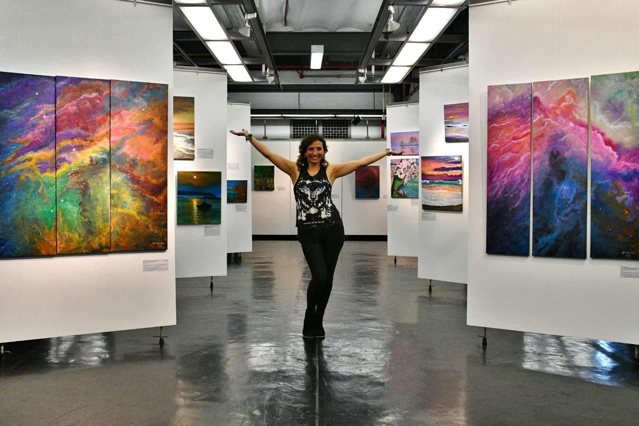
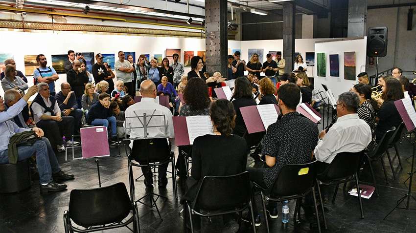
Such is the following example of Gisela García-Gleria, an Argentine visual artist and composer, who actively participates in numerous exhibitions and events, both her own and collective shows, in Argentina and abroad.

Since the beginning of her professional career, I have created graphics for exhibitions and events, designing flyers, banners, video clips and other promotional media.


Knowing the client

It is very important that the designer and the client form a team with specific objectives, getting to know each other and contributing creative ideas that allow the development of valuable products.

Gisela is a great creator, an inexhaustible source of new projects, and all of them need the professional vision of a creative designer to materialize these ideas in the best possible way.

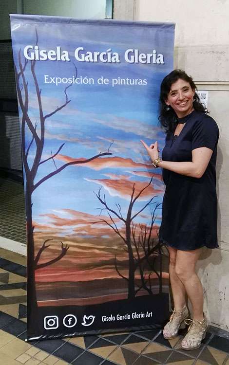
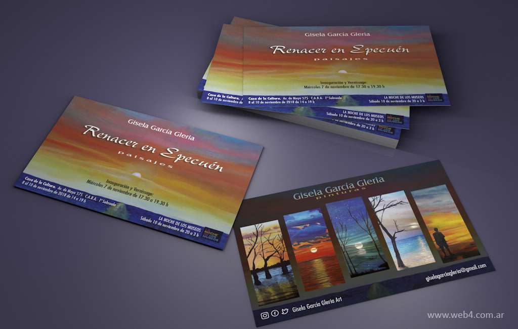
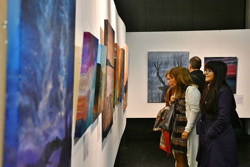
In the following images you can see the artist’s first solo exhibition held in Buenos Aires in 2018, called “Reborn in Epecuén”, with simple promotional graphics consisting of a banner and flyers, where the work prevails over the artist’s identity, and at that time, that was what we needed…

The need to design an identity

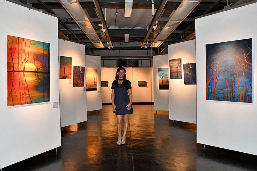
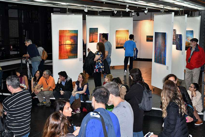
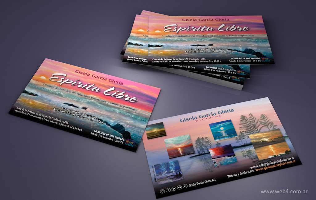
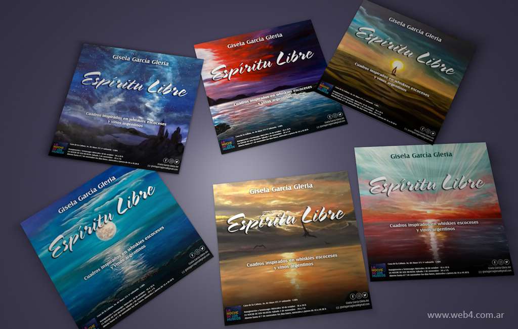
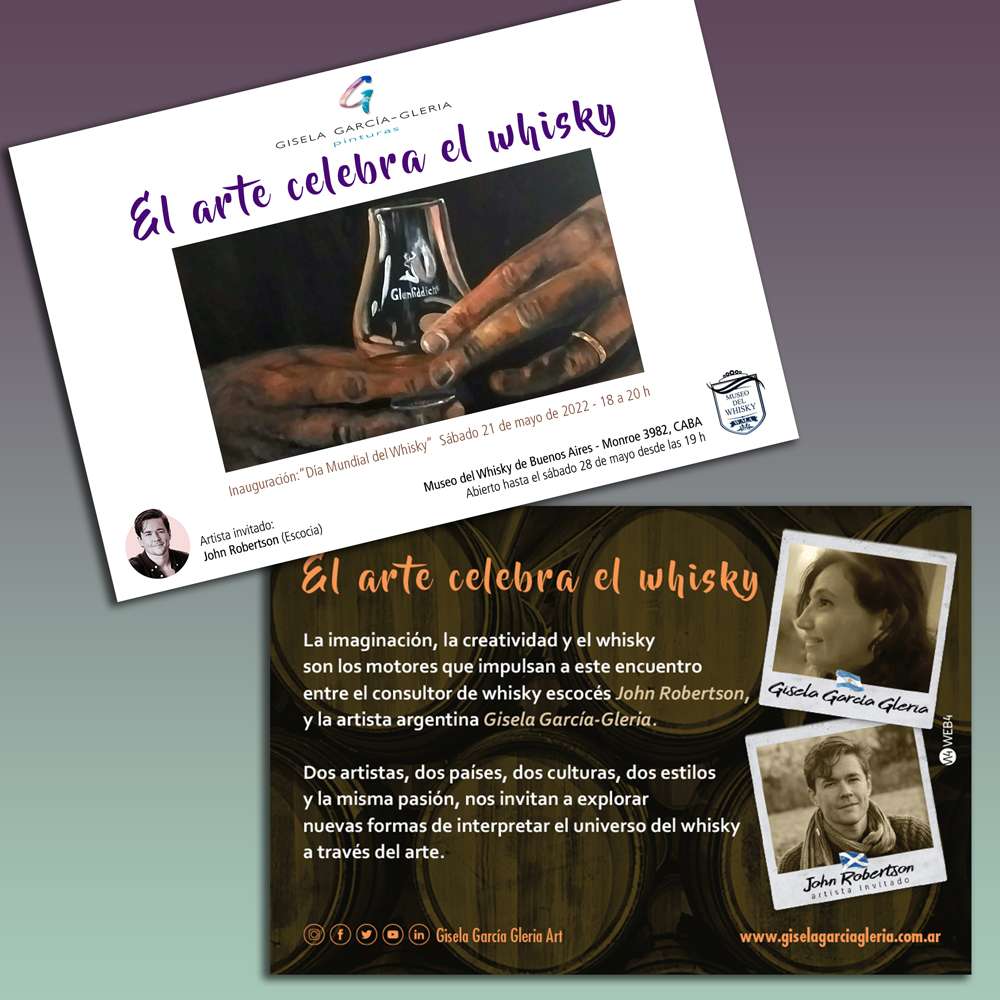
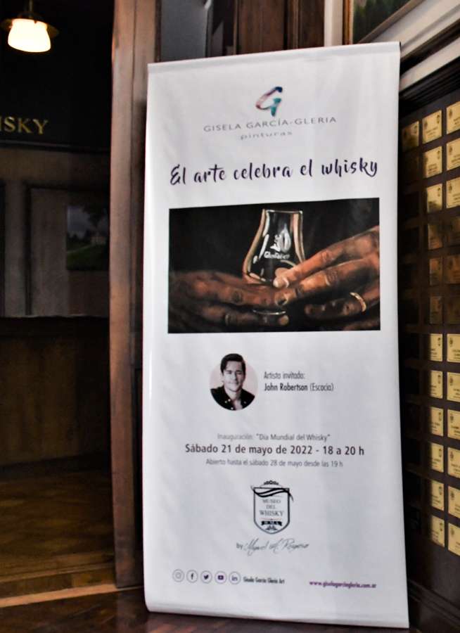
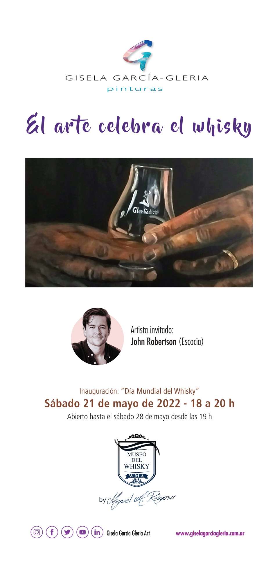
A year later, in 2019, Gisela began to have a more prominent presence by holding large solo exhibitions in important venues in Buenos Aires and the interior of the country, such as the «Free Spirit» exhibition, which presents works inspired by Scotch whisky and Argentine wineries and vineyards.

The volume of his work begins to grow notably with more than 140 artworks exhibited at each event, and the need to show them beyond the exhibitions leads me to suggest that he design his own website.

It was the right time to reverse the previous equation, where this time the artist is the one who presents her works and must highlight her identity through her art.

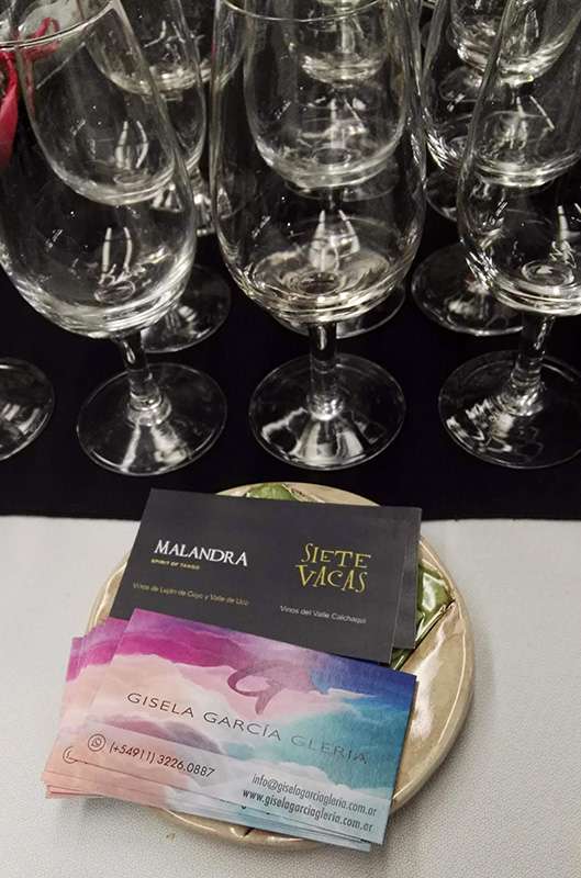
This time the promotional graphics consist of several flyers with different artworks, a personal card and a video clip that is projected at the event.


First things first

As always, before designing a website I advise my clients to have a good logo, a brand that represents them and strengthens their identity, and Gisela has immediately accepted my proposal.

Just as if it were a company, the design of a brand allows us to “order” the content and establish patterns of graphic communication, always maintaining coherence and criteria in the designs, and providing an “added value” that allows it to stand out from its peers, and this is precisely what designing an “identity”, a personal brand, is about.

And what better way to give identity to a brand than to use your own name.

Finding the brand concept

What does a name suggest to us?

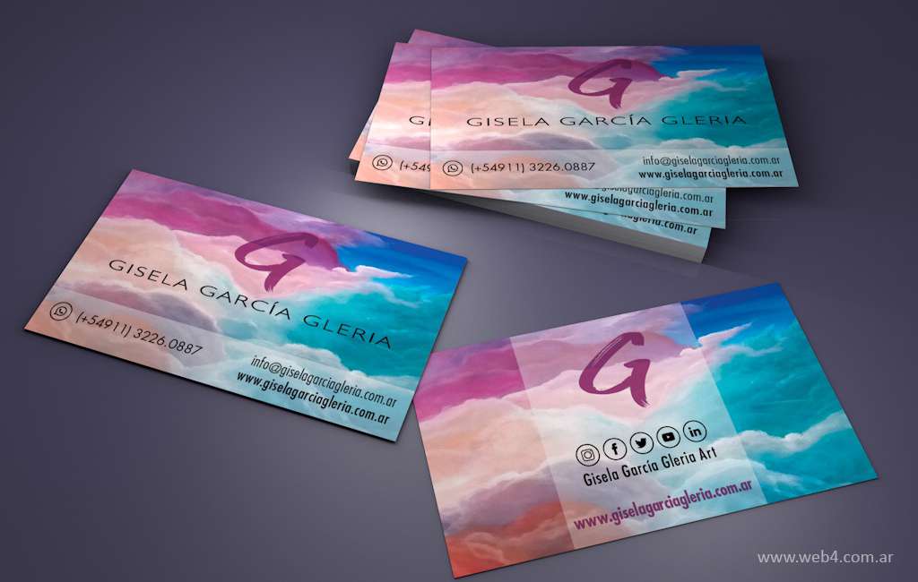
The case of Gisela García-Gleria has the particularity that both her name and her surname begin with the letter G, and that is why I decided on the typological option of “Initial” with said letter to develop the concept of her personal brand.

Maybe if her name had different initials I would have chosen a monogram or a signature, but the curious repetition of the G was confirming my decision to use it as an initial.

Furthermore, Gisela is often politely called by the abbreviation of her name: “Gi”, just as the letter G in English /dzi/ sounds phonetically.
This is not a whim or coincidence, since she develops a large part of her artistic activity oriented around the theme of Scotch whisky, and that is why I took advantage of this little linguistic game as a subliminal element that adds value to the brand, and both her website and her social media posts are bilingual: in Spanish and English.

Gisela Garcia Gleria concepto logo

Search for elements that define the identity of the person

When empathizing with the person and defining their main qualities, I wanted to give the initial G the characteristics of the artist's personality and the activity that she develops, and therefore, the letter is drawn with a brushstroke, as a gestural and spontaneous stroke.

The brush synthesizes the medium through which the artist develops her work and expresses herself; and applied to her own name represents her autograph, her signature, her guarantee of authenticity, her personal imprint.

It is completed using as a color fill one of his works consisting of an abstract texture with colors that will later allow creating palettes for the different applications of the brand.

The colors of the website's headlines and secondary elements respond to that color palette.

The brand also has enough semantic strength to be identified completely devoid of color and textures, both positive and negative, since the shape of the stroke speaks for itself.

Gisela Garcia Gleria logo BN

Create communication criteria

Once the brand has been developed, with its respective user manual where the design standards are established: color palette, typographic fonts, brand placements, size and readability variables, etc., we are in a position to develop and create all the media we need.

From now on, the “G” of Gisela will be our new Z of Zorro and will identify all of its artistic manifestations.

We already have the necessary elements to design your personal website www.giselagarciagleria.com.ar, where your complete catalog of works, biography, agenda of activities, press releases, personal blog and online store to acquire your art objects are displayed.

web gisela garcia gleria

Strengthening brand presence

The brand has an isotype made up of the letter G as a responsive logo, which is the minimum expression of the brand's presence in digital media, forming the avatar of the website and social networks, which allow its presence to be quickly identified, as well as identifying products in the online store.

Gisela avatar

Breaking new ground

Once the brand, website and social media have been designed, we can create other printed graphic elements that complement them.

Because not everything is virtual and there is still a “tangible” world beyond the screens, which allows people to carry a little bit of us in their pockets, as well as many other elements that make up physical spaces.

And so personal cards, flyers, banners and posters for exhibitions and events emerge, complementing digital promotion.

The true value of being original

My personal proposal for Gisela is to “design everything that can be designed” and apply her brand to various media that give identity and originality to her works.

And when I talk about originality I say it in the strictest sense of the word, since the artist proposes “original, unique and unrepeatable works”, and the possibility of acquiring them and certifying that condition of originality.

This is how I have designed the certificates of authenticity of the works that are given to those who acquire his paintings.

Each of them is personalized according to the work, reporting its technical characteristics, history of the work, name of the buyer and handwritten signature of the artist.

Therefore, each certificate is also unique and unrepeatable.

Packaging posavasos

The artist offers the possibility of acquiring limited edition art objects in her online store, personalized with her works, autographed and identified with packaging and self-adhesive labels carefully designed with her brand.

Packaging posavasos

Always prioritize identity

Labels identify a work of art within the space of an exhibition, indicating the name of the work, its author and its technical characteristics.

Taking advantage of the fact that each of the artist's works is published on her website, I have proposed designing personalized labels with QR codes that lead directly to the page of each painting on the website, providing more information to the visitor of the exhibition.

In this way, the virtual is integrated with the physical and the identity of the artist and her brand is strengthened, creating added value of interactivity to the experience of attending an exhibition.

This original feature has been very well received by the exhibition attendees and has encouraged traffic to the website, improving SEO and web positioning.

And almost without realizing it, we began to enter people's perception, establishing the presence of a personal brand that represents an artist and her work.

Packaging posavasos
Packaging posavasos

Final conclusion

I hope you enjoyed this article and understood the importance of having a personal brand and the possibilities that open up from it.

You have already seen the universe of elements that can be derived from a well-designed brand, strengthening your presence in print and digital media, giving credibility and solidity to your ventures.

But above all, providing identity, that essential gift that belongs to you and no one else, just as you would do yourself, showing the world who you are, your essence and your values ​​when you cannot be physically present to express yourself.

Therefore, a personal brand is an identity that “travels” to infinite places through the web or printed on cards, stationery stores or catalogs.

The identity that a personal brand gives you is precisely that: transcending the boundaries of what is possible, what is real, what exists, what is physical and what is virtual, taking your name to places you cannot reach, and still being present and saying who you are.

That is the value of your brand, your footprint, your signal.


If you want to have your own personal brand and you consider me to be a suitable professional, do not hesitate to contact me.

In the Related Posts section below, you will find some articles with specific topics that complement the one you just read.
I invite you to read them, share them and leave your comments if you wish.
Thank you very much.

>>> I WANT MY PERSONAL BRAND <<<

Packaging posavasos

80 famous logos with hidden messages

In this post I want to show you 80 famous logos with hidden or subliminal messages.
These messages are used by designers as creative resources to create memorable brands.

We all see thousands of logos without realizing it in our daily lives, and with advertisements that bombard us uncontrollably, we learned to ignore them naturally.
Large companies invest significant budgets to design their brands that allow them to stand out from their competitors.
Many seek that their logos have an allegorical representation of their activity, their values, their history or the geographical place to which they belong.

Creating a memorable logo that is easily remembered, and at the same time conveys a message, is not easy.
That is why designers make strategic use of subliminal messages that strengthen the identity of a brand.

Read my post The most complete guide to understanding logos for more information

What are hidden or subliminal messages?

A hidden or subliminal message is a low intensity signal designed to pass below (sub) the normal (liminal) limits of perception.
There are certain things that our brain is capable of capturing but that our eyes cannot see with the naked eye.
But paying attention, we begin to read very interesting messages between the lines, which reveal the versatility and creative capacity of designers.
Once we recognize them, we react in surprise: "Oh, that means that!"
In many cases, these are designs or messages that attract more attention due to the controversy that surrounds them than because of their effect on people.

Do they exist? Of course they exist, and we see them in advertisements, movies, songs, works of art, architecture, in religions and in political speeches.
Deciphering these messages requires reflection, analysis, and some mental and conceptual effort.
But from there to believing that they come to determine role models in society, it is something else entirely.

Subliminal messages have always created controversy and a halo of mystery among people.
Many times they can be used maliciously, in fact we have all heard about movies, advertisements or songs with satanic, sexual, offensive or racist messages.
Either way, when you discover that an image or object has a hidden meaning, it will pique your curiosity and fascinate you.
That is the true power of subliminal messages.

Subliminal messages as a creative resource in brand design

The logo is the sign that gives identity to a company.
It is used so that, at a glance, the consumer knows how to associate those words, shapes, colors or images with the brand in question.
Logo design is closely related to people's psychology, since it is associated with a mental and visual representation, which hides many subliminal messages.
The psychology of color, shapes, semantics, perception and synthesis are elements that are very much taken into account in the creation of logos.

>>>  QUIERO MI LOGO<<<

Packaging posavasos

The most famous examples of logos with hidden messages

Next, I am going to show you a compilation with the most relevant examples.
Some are logos of very famous brands and others not so much.
But they all give us a clear example to easily understand what these hidden messages are about and their semantic value when creating allegorical brands to companies that
Surely many of them will surprise you, and without seeing the relevant explanation of the logo you could never have discovered what
We will also meet their designers, anecdotes during their creation, and the reasons why these brands are the way they are, taking into account their history, their institutional values and the messages they want to convey.

FedEx

You probably didn't realize that there is a blank space between the "E" and the "x".
In it you can clearly see an arrow that, subliminally, conveys the idea of speed and precision.
Both are core values of the Federal Express company, which makes it a world leader in shipping and parcels.
Freedom and creativity combined with a blank space. The result? More than 40 design awards.

Lindon Leader, author of the FedEx logo redesign, knows the visual impact of playing with negative spaces.
"Direction, speed and precision" were hidden under that arrow that was drawn in a vacuum, and that many designers wanted to fill with color.
"They did not understand it, it was not the arrow, but the subtlety that makes it intriguing," said its author.

Amazon

Amazon is the giant of online shopping and its logo reflects that concept.
It was designed in 2000 by Turner Duckworth under the supervision of company founder Jeff Bezos.

The orange arrow of the logo leaves the letter "a" and ends in the letter "z", indicating that they sell all the products you want, from a to z.
The arrow also represents a smile, in which the tip is a stylized dimple or a line of expression, which gives a wink of sympathy, joy and confidence.
This smile represents the happiness that people feel when they buy on Amazon, since the company wants the best customer satisfaction, offering a friendly service.

The black typeface demonstrates Amazon's superiority and dominance in the online retail market, which has been demonstrated by its financial metrics.
The bright orange color detracts from the formality of the logo and adds energy and appeal.
It also symbolizes pride and happiness, showing how Amazon works and thinks.
This great logo has become a benchmark in world brand design.

logo Toblerone

Toblerone

Do you see only a mountain?
The Matterhorn is the fifth highest peak in the Alps at about 4,500 meters high, and probably the most famous for its peculiar pyramidal shape.

The Toblerone brand is very famous in the world for the triangular prism shape of its packaging.
Its packaging contains a mountain range of chocolate blocks that we can section, which adds a distinctive feature to the bars of traditional tablets.

But this Swiss chocolate brand has the silhouette of a perfectly defined bear on the mountain in the negative part of the logo. Did you notice it?
It is a tribute to Bern, a Swiss town known as “the city of bears”, where Theodor Tobler and his cousin Emil Baumann created the company in 1908.
So representative is this animal for the town that it even appears on its official shield.

Toblerone's original logo openly featured a bear alongside an eagle that carried the flags of Switzerland and Bern.
In addition, within the name Toblerone the word Bern hides

Cisco

The Cisco company is a benchmark in the telecommunications market and takes its name from the final part of the word "San Fran CISCO "
Its logo is inspired by its famous suspension bridge: the Golden Gate.
It uses 9 vertical lines to represent electromagnetic waves, which evoke said bridge and represents a connection between the past and the future.
The color red symbolizes responsibility, passion and willingness to work hard to achieve greater success. The color blue represents tranquility, optimism, fame and prosperity.
The current Cisco logo resulted from the cooperation between the Cisco branding team, Joe Finocchiaro and Jerry Kuyper.

logo Hope for African Children

Camel

Belgian-born graphic designer Fred Otto Kleesattel, known as “Fritz,” was hired to design the packaging for the new line of Camel cigarettes.
During World War I, he worked as a camouflage artist, concealing buildings, vehicles, and other potential targets to make them blend in with their surroundings.

There are urban myths about supposed subliminal images hidden within the camel artwork.
It is said that Fritz did not like Camel's marketing manager.
So he introduced into the design a drawing of a Manneken Pis, the most famous statue in Brussels, inside a camel's foot.

logo Vaio

Vaio

Vaio is a brand of personal computer manufacturers, which was part of Sony.
Their logo was created by Timothy Hanley and is one of the most interesting logos ever.
The Vaio logo consists of two parts of the word mark: “VA” and “IO
"VA" forms an analog wave, while "IO" represents the 1 and 0 of the digital binary code.
This reflects the visual identity of the brand as an integration of the two technologies.
The movement from left to right resembles progress and the step towards future innovations and technologies, without stress and with confidence.

One more curiosity about the brand name is that its pronunciation resembles the word "Vio-let".
This is manifested in the first models launched on the market that were purple or had an element of that color.
However, the logo's color palette is monochrome, conservative, and elegant. It is a perfect option to accentuate the hidden meaning of the name, by not catching the attention of the colors.

The Vaio logo is timeless and sophisticated, its smooth lines evoke a sense of calm and welcome.
In addition, the explanation of the meaning adds authority to the brand and reflects its technology and research values.

logo Quiksilver

Quiksilver

Quiksilver is an American company specialized in the manufacture of surf, skate and snowboard equipment and clothing.
The famous Quicksilver emblem was created in 1973 and never changed. The founders of the brand were the ones who designed the image.

Its logo symbolizes a wave and a mountain, the elements of nature most characteristic of two of Quiksilver's sports, surfing and snowboarding.
The logo is inspired by "The Great Wave off Kanagawa" by the artist Katsushika Hokusai.

logo Roxy quicksilver

Roxy

Roxy is the feminine version of the Quiksilver brand.
On the one hand, there is a clear link to Quiksilver, on the other hand, the logo has a noticeable feminine touch.
At first glance, the Roxy logo may look like just a stylized representation of a heart.
However, if you look closely, the heart is created from two mirrored copies of the Quiksilver emblem.
In addition, it represents the gesture of making a heart with both hands.
This unusual approach establishes a bond with the parent brand Quicksilver, and creates a unique and romantic image with a feminine identity at Roxy.

logo Tostitos

Tostitos

Tostitos one of the most popular brands of tortilla chips in America, owned by Frito-Lay, a division of PepsiCo.
With its classic festive theme, this aperitif has in its logo two people sharing and enjoying a tortilla chip between the two "T", and just below, the point of the "i" is its corresponding sauce pan for spreading or dipping.

logo starbucks

Starbucks

A mermaid with two tails is the image that characterizes the most famous chain of coffee shops in the world.
Just as the brand manages to seduce more and more customers every day, the history of its logo has a lot to do with powers of attraction and spell.

In 1971, the then university students Jerry Baldwin, Gordon Bowker and Zev Siegl had a business idea.
They needed to find a name and an image that would seduce people.
All three loved coffee and used to get together to read and comment on readings; one of the favorites was Herman Melville's Moby Dick.
This is how they decided to baptize their cafeteria as "Starbucks", in homage to the character Starbuck, first officer of the Pequod ship, in which the plot of Moby Dick takes place.

If the name referred to a story about sailors, the logo should also be related
For this they called designer Terry Hakcler, who was looking for an image that reflected the seduction of caffeine to people.

Seduction, sailors and coffee seemed to be difficult ideas to connect.
But it was exploring ancient books that they found the right image: a fifteenth-century two-tailed mermaid.
Just as it is believed that mermaids seduced sailors and made them forget their plans and objectives until lead them to their deaths, Starbucks should seduce people into addiction to its products.

logo Carrefour

Carrefour

The name of the Carrefour Group comes from the first store that was opened in France, which was located at a crossroads.
That is why the company decided to name it Carrefour, which in French means "crossroads"

The logo, at first glance, symbolizes precisely the two paths. In it there are two figures that represent arrows pointing in opposite directions, one blue and the other red.
The gap between them generates a blank letter "C", alluding to the French origin of the brand.

logo spartan golf club

Spartan Golf Club

This logo is one of the best I have seen for its impeccable execution and subtlety, since it brings together the concept of golf and a Spartan warrior, in direct allusion to the name.

At first glance it is a golfer taking a swing, unfolding its trajectory to the side of his body.
But if we look away and taking into account the space of the negative, we can see the helmet of a Spartan soldier and the body of the player himself makes up his face.

logo Hope for African Children

Levi’s

The objective of some companies is to convey that by using their products, you will improve some part of your life.
In this case, it is clear that the message has to be that with their product you will look more attractive than normal.
What has Levi’s done with its logo to convey that data?
You have cleverly concealed the part of the body that most people want to highlight when wearing jeans.

logo Hope for African Children

Hope for African Children Initiative

This logo is also double-sided and also looks like a game of optical illusions.
At first glance we can see the map of Africa, but its counter-forms show us an adult and a child in dialogue, as a sign of help and hope.

logo rolling stones

The Rolling Stones

Many think that the design of the ionic tongue was created by Andy Warhol, but it is not.
The reality is that Mick Jagger asked a young student at the Royal College of Art in London named John Pasche, a logo representing the group's record company, in exchange for 50 pounds.

The first time the logo came to light was on the inside sleeve of the "Sticky Fingers" album in 1971, the cover of which was designed by Andy Warhol. Hence the confusion about the authorship of the famous symbol of the group.
Some believe that the logo represents the unmistakable face and mouth of Mick Jagger, and something has to do with it, but not entirely.
“When Mick asked me to create a logo for Rolling Stones Records, he showed me a newspaper clipping showing the Hindu goddess Kali, with a pointed tongue, hanging down ”, John Pasche says.

logo Versace

Versace

Gianni Versace was a great Italian designer who gained his fame by producing elegant clothes, accessories and luxury items and managed to build an empire through his brand that still persists.
In 1976 Gianni Versace, together with his brother Santo, created the Gianni Versace company.
But it was only in 1993 that the famous head of Medusa Gorgon appeared in the company logo.
Fue diseñada por el propio Gianni Versace, quien explicó que deliberadamente se decidió por esta imagen mitológica.

The jellyfish was a symbol of hypnotic beauty, as if it were a secret that was brought to life. She made people fall hopelessly in love with her.
The designer expected his collections to produce the same magnetic effect.
The Versace emblem is made in the style of geometric graphics, and is a graphic representation of the marble statue of Medusa Rondanini.

Gorgon is represented at the moment when she turns from a beautiful woman into a terrible monster, destroying all living beings. It is at this moment that she acquires an extraordinary power that is felt in this symbol.
The emblem is surrounded by a ring of Greek keys. This decorative pattern consists of lines that twist to form a labyrinth, and is another typical Versace design motif.
The Medusa Gorgon head is used in all Versace products, from clothing to accessories.
The brand does not have a specific color scheme. This allows you to freely include it in any product without conflict with your own color scheme.

logo NBC

NBC

The NBC logo has a couple of hidden meanings.
It is clear that it represents a peacock, but why?

The logo was developed in the days of the beginnings of color television, and that explains the rainbow of color.
The network wanted a logo that would encourage owners of black and white televisions to make the switch to color.
So the station used the popular slogan of those years: "As proud as a peacock" to promote the pride they felt in their new color system.
The six colors of the pens represent the six divisions of NBC.

logo Hope for African Children

Night Golf

The designer was able to see a crescent moon in the texture of the golf ball, and the effect of its craters illuminated at night.
Several concepts are combined in this logo: moon, night, ball, round, outdoors, light, darkness.

logo London Symphony Orchestra

London Simphonyc Orchestra

This elegant and clean logo, it could not be otherwise, being a symphony orchestra, it is just an anagram with the initials LSO.
Despite its simplicity, it depicts a conductor waving his baton and with his arms raised.

logo Hope for African Children

Presbyterian Church USA

Las religiones están llenas de simbolismos y alegorías.
In this logo the designer managed to integrate 8 icons that represent the fundamental elements of the Presbyterian Church in the United States.
These are the cross, the pulpit, the dove, the fish, the chalice, the fire, the Bible, and the Trinity.

logo Hope for African Children

Hartford Whalers

Hartford Whalers was a professional ice hockey team from Hartford, Connecticut (United States), which existed from 1972 to 1997.
This logo shows 3 concepts: The tail of a whale, the W for “Whalers” and the white spaces draw the H for “Hartford”.

logo Hope for African Children

Global Movement for Children

The Global Movement for Children is the worldwide movement of organizations and individuals, joining forces to build a world fit for children.
The GMC seeks to promote global campaigns to defend children's rights and the accountability of governments to their children.
Its logo symbolizes the imprint of a helping hand, which reaches out and unites people in the same common purpose throughout the planet.

logo Hope for African Children

Pioneer

The Pioneer brand has always been synonymous with good quality in speakers and sound equipment.
Its old logo hides several meanings:
A Greek letter omega that indicates the unit of measurement (omhs) of speaker impedance.
A tuning fork that represents the fidelity of the tuning of the musical sound.
It also represents a headset and a microphone.

logo Baskin Robbins

Baskin Robbins

Popular ice cream chain Baskin Robbins has 31 flavors on its menu.
The pink color of the final part of the "B" and the initial part of the "R" make it very clear, which also serve to create the brand's own logo.
The logo evokes fun and energy, sensations that you will most likely experience during and after eating their ice cream.

logo LG

LG

LG is a brand recognized around the world and most people recognize the “L” and “G” in the isotype, which represents their slogan “Life is good”
For this company , life is as fun as the Pac-Man game that has entertained many generations, and whose main character can be composed with LG's own logo.
Also, more clearly, you can see a smiling face: The “L” forms the nose and the “G” forms the rest of the face.
This gives the brand a human element and makes it more attractive and accessible.

logo Airbnb

Airbnb

The logo includes four images that speak about the company: the silhouette of a person with open arms, the geolocation symbol, a heart and the letter "A" for Airbnb.

Airbnb talks about itself and speaks directly to its users: people who love to travel and who, in the experience of hosting, see an opportunity to meet new people.

logo le tour de france

Le Tour de France

This logo contains two hidden messages: The first is a little more obvious, the cyclist who is formed with the letters "OUR"
But the second is more disguised, and that is that the ocher circle that constitutes the bicycle wheel is also a sun.
This indicates that race events occur only during the day and in summer.

logo milwakee brewers

Milwaukee Brewers

This old logo for the Milwaukee Brewers, a professional baseball team from Milwaukee, Wisconsin, looks like a baseball glove catching a ball, but it is more than that.
If you look closely, you can see that the baseball glove is made up of the letters "m" and "b".

logo Galeries Lafayette

Galeries Lafayette

Galeries Lafayette are large luxury department stores located in Paris.
Its typography is not only elegant and sophisticated, but also, the two letters "t" hide an Eiffel Tower that reinforces its French origins.

logo GreenLabs

Greenlabs

This a digital marketing and web solutions company uses a tree as its logo.
This accentuates the “green” part of its name, but what about the “labs” part?
The top of the tree is, in fact, a human brain that represents the intelligence of the company's personnel.

logo museum of london

Museum of London

The Museum of London logo has an interesting and organic look.
The color shapes are not really just abstract blobs, they represent something: they show the geography of London and its changes over time.
They represent the constant transformations that the city and its inhabitants have undergone in the past and present, as well as the changes that will come in the future.

logo Hope for African Children

Big Ten Conference

Big Ten is a union of academics that was founded in 1896.
Until 1990 this union consisted of 10 universities, but in June 1990 the Pennsylvania State University was added.
And since they didn't want to rename it, they just subliminally added the number 11 to the logo.

logo audi

Audi

The Audi car logo may seem absent of symbology, but the four rings that make up the logo represent each of the four companies that merged to create the brand: Audi, DKW, Horch and Wanderer.

logo beats

Beats

Beats Electronics is a division of Apple, specializing in audio-related products, and is especially popular for its on-trend headphones.
Their logo apparently no more than a white b on a red circle, but represents a human head in which the letter “b” forms the brand's headphones.
This gives the brand a personal element that allows the consumer to see themselves in the hearing aids.

loogo my fonts

My Fonts

My Fonts is an online typographic resource that allows users to access a large number of typographic fonts.
The word “My” is stylized to look like a hand, thus conveying the message that users can dip into any source they want.

logo the swan and mallard

The Swan & Mallard

Designed by John Randall, this restaurant's logo takes visual mastery to another level.
The negative space of the swan not only hides a black duck, but also the swan forms the symbol "&" and seems to hug the duck with its neck.

logo BMW

BMW

This famous German car brand was linked to aviation in its beginnings, so there are those who interpret the central part of its logo as rotating propellers. The white quarters represent a helix, while the blue sections symbolize the sky.
But although this may seem like this, it was not an original intention. According to the New York Times, the brand was registered in 1917, but the propeller wasn't created until 1929.

What does it mean then? The blue and white colors represent the Free State Bavarian colors.
The reason it looks like this is because the use of a national symbol in a trademark was illegal, so the colors are arranged in a reverse order.

Logo Unilever

Unilever

Unilever is a multinational company that makes all kinds of products, from personal care products, sauces, detergents to ice cream and soft drinks.
For this reason, it has reflected in its logo the diversity of products it offers and the values it wishes to convey.
They can be identified in it from a heart, a bird, a fish, a hand, a sweater, lips, a bee, etc.

logo lion bird

Lion Bird

This logo is a perfect example of visual manipulation.
Did you see the bird or the lion first? They are both there, although the lion is barely hinted at.
The body of the bird forms the face of the lion and your eyes fill in the rest with negative space.
The lion represents the way the brand attacks its profession, while the bird represents its power.

logo Picasa

Picasa

Picasa, Google's image editor and organizer, has an interesting logo.
At first glance it looks like a simple camera shutter, but the negative space in the center of the shutter actually makes up a house.
This is because Picasa is the "house" of all your photographs.

logo Goodwill

Goodwill

This Google service to facilitate donations to NGOs, has a "happy" logo.
The very "G" that appears in the upper left as in the name itself, evokes a smiling face, to associate with the happiness that donations to non-profit organizations treasure.

logo Continental

Continental

This company is one of the leading tire manufacturers.
With a little visual acuity you can see how the first two letters of your logo make up the image of a tire with its corresponding rim.

logo Pittsburgh Zoo & PPG Aquarium

Pittsburgh Zoo & PPG Aquarium

The logo we see is very detailed, but that has a reason: the tree creates in negative the profiles of a monkey, a feline, some birds and some fish that seem to jump out of the water.
The logo thus shows the richness of the zoo and its aquarium and that the animals are in a natural and protected habitat.

logo sun microsistems

Sun Microsystems

This logo was created by Professor Vaughan Pratt of Stanford University.
Through a very clever design using a "U" shaped picotgram, he made it possible to read the brand name from any direction you look at it.
Technology company Sun Microsystem was bought by Oracle in 2010.

logo Nike

Nike

It is undoubtedly one of the most referential logos and represents one of the most famous sportswear brands in the world.
Most people think that the Nike logo is a pipe, and that is how the brand is known, and the association is logical because of the shape it takes, but this is a mistake.
Nike is the English adaptation of the name of the Greek goddess Nike, the goddess of victory.

En 1968, cuando Phil Knight decidió dejar atrás el nombre de «Blue Ribbon Sports» que llevaba su empresa, decidió buscar algo que se asociara con el ganar y que transmitiese la idea de movimiento y acción.
Thus he searched in Greek mythology until he found Nike. The final accent soon disappeared and thus began a story of success and worldwide diffusion.

Interestingly, the logo was developed by graphic design student Carolyn Davidson, who was inspired by the shape of the Greek goddess's wings. Phil and Carolyn met at Portland State University, where he taught accounting, and Davidson presented him with his invoice for a total of $ 35 for his design.
In 1983, Knight gave Davidson a gold and diamond ring in the shape of the Nike logo, and an envelope full of stocks. from the company as a thank you and bonus for your work done.

logo Nintendo GameCube

Nintendo Game Cube

The Nintendo Game Cube game console has in its logo a very good example of how to integrate the product itself within the brand itself.
It is not just a cube integrated into another cube, the obvious bluish area represents a “G” while inside it, a “C” is integrated in the negative space
Treated with gradient colors that give depth and volume, the three-dimensional sensation of the two cubes is achieved.

logo Hope for African Children

Nvidia

This company makes the world's best video cards for computing and adopted its first logo three years after it was founded in 1993.
It was then that his central visual metaphor was chosen: an all-seeing eye.
This emblem has a long history and generally symbolizes "the eye of God", however, in this context, it has a different symbolic meaning.
Nvidia's eye is constantly searching for innovation and the future.

logo yoga australia

Yoga Australia

This Yoga Australia logo hides a small treasure in its negative space.
In the gap between the leg and the arm that is holding it, the silhouette of the map of Australia is formed.

Logo Eight

Eight

This logo was designed by Stylo Design, a London advertising agency that has been more than successful in the idea.
The letters that compose it are always part of the same number eight, the word that gives the brand its name.

logo Nortwest Airlines

Northwest Airlines

NWA was one of the major airlines in the United States, founded in 1926 and absorbed by Delta Airlines in 2008.
The first thing we can see in its old design are the letters N and W, initials of the brand's name.
But what most people don't see is the compass pointing northwest, another reference to the brand name.
This triangle is also strategically positioned, so that when it is combined with the N of North, according to the W of West.
The new design sought to simplify the symbol and only kept the concept of a compass pointing northwest.

logo Pinterest

Pinterest

Pinterest the social network to share images where we can manage our images in collections or interests, they have a clear allusion to their name in the logo itself.

Pinterest's name comes from the idea of “pinning,” that is, taking things that interest you and tacking them onto a board.
To reinforce the idea of the "pin", the letter "P" represents a tack. This brings the digital age together with the real, physical aspect of taking something and pinning it to a wall.

logo The Bronx Zoo

The Bronx Zoo

Another good example of how to play with the negative of the logo.
Under the legs of the giraffes you can see the skyline of some of the most iconic buildings in New York City.

logo Toyota

Toyota

Motorsports giant Toyota has a very elaborate logo and it takes a lot to decipher what it hides.
The three overlapping rings of the popular auto company symbolize the unification between Toyota products and the hearts of its customers.
The space in the background represents your technological advancements and the opportunities that lie ahead.
But far from what it seems at first glance, it is not a series of three linked rings without more, with them each and every one of the letters that make up the name of the brand itself are composed.

logo Eighty 20

Eighty 20

This logo belongs to a company specialized in market analysis and big data.
It consists of two rows of squares and a message in binary code, which represents its own name.
The light color is equivalent to a 0 and the dark one to a 1, so that the first row is the number 80 in decimal (1010000) and the second the number 20 in decimal (0010100), which coincides with the name of the company itself.

logo snooty peacock

Snooty Peacock

Snooty Peacock is a jeweler in Dallas (Texas) that specializes in making unique “one-of-a-kind” jewelry.
Designer Ryan Russell wanted to create a logo that captured the eclectic spirit of jewelry and the unique women who make it.

This brand is simple but exciting, with a design that shows the clever use of figure and background, creating a stylized peacock and the face of an eccentric woman wearing jewelry.
Peacock significa «pavo real» en inglés, y al igual que el logo de la NBC, el pavo real representa el «orgullo» de lucir las joyas.

logo Elettro Domestici

Elettro Domestici

Elettro Domestici is an Italian electronics company.
Designed by Gianni Bortolotti, the logo uses negative space in an exceptional way, representing the two initials of the brand through the pictogram of a plug. (E and D)

logo Kolner Zoo

Koelner Zoo

This logo of the Cologne Zoo (Germany) is an example of a good use of negative space.
In addition to having an obvious star for an eye, the lower part of the elephant shows from left to right the two towers of Cologne Cathedral, a rhinoceros and a giraffe.

logo newman

New Man

At first glance, the logo for this French clothing company doesn't seem like anything special, but it does have a little visual trick.
The logo can be read exactly the same if it is rotated 360º.
This reflects the message that the company is innovative and that its clothing serves multiple purposes.

logo Washington Capitals

Washington Capitals

The NHL ice hockey team based in the United States capital (Washington)
It has in its logo the silhouette of one of the most emblematic buildings of the city: The Capitol, in the negative area placed under the head of the eagle.
It also makes good typographic use by turning the letter "t" into a hockey stick and using a simple script to refresh the puck.

logo XNA

XNA

This Microsoft API, conceived for the development of video games for the Xbox 360, Windows, Zune and Windows Phone 7 platforms, is now an abandoned project and the current MonoGame is based on it.
In its logo, the broken line that forms the X, hides the Morse code combination of XNA.

logo Yamaha

Yamaha

It is one of the most representative Japanese companies in the world, with a presence in multiple markets, it has the origins of the brand represented in its logo.
Before diversifying their lines of business they were dedicated to the manufacture of pianos and that is why their circular logo has three crossed tuning forks inside.
El diapasón representa la fidelidad y la calidad de los instrumentos musicales.
Al golpearlo suavemente vibra emitiendo una nota LA a 440 Hz, que ha sido tomada como medida universal para la afinación de todos los instrumentos musicales.

logo IBM

IBM

Las franjas blancas que atraviesan las letras del logotipo dan la ilusión de ser signos de igual en la parte inferior de las letras.
Esta imagen representa la equidad, valor fundamental de la empresa IBM.

logo adidas

Adidas

This German sportswear and footwear company is one of the best in the world.
The three stripes have always been part of their logo, but in recent redesigns the stripes have been staggered to simulate a mountain.
This mountain represents the challenges and obstacles that athletes have to face to achieve victory.
It also represents the idea of a triumphal podium in competitions, with 3 platforms at different heights.

logo Twitter

Twitter

This name refers to chirping or chirping, and represents an ideal term to symbolize the purpose of the social network: to send messages to friends or followers briefly and instantly like the chirping of a bird.
In addition, the network is characterized by sharing messages by forwarding them.
This creates a thread or chain of messages, where the popular phrase "A little bird told me" can be applied to avoid revealing the true origin of the message.
It is with this meaning that the famous Twitter bird for its logo emerged.

llogo NBA

NBA

The logo designed by Alan Siegel representing the NBA consists of a white silhouette dribbling under a blue and red background representing the United States flag.
The silhouette belongs to Jerry West (1938), also known as Mr. Clutch for his ability and dexterity in the last
moments of games.
He was a great basketball legend and one of the most sought-after players in the lakers between the 60s and 70s.

logo Hyundai

Hyundai

It does not seem so at first glance, but Hyundai's H is two people shaking hands, shop assistant and customer, the gesture that takes place after the sale of a car.
The honesty, trust and transparency that are represented in a handshake are the p0liars of this automotive company.

logo Gillette

Gillette

Gillette is a manufacturer of razor blades and foams, and therefore has a literally sharp logo.
The intricate and precise cut through the “G” and “i” looks like it was carefully removed with a very sharp Gillette razor, representing the brand's flagship product.

logo Families

Families

This logo designed by Herb Lubalin is an excellent example of the good use of fonts to convey a message without resorting to additional graphic elements.
The characters 'i' and 'l' suggestively form a family representing mother, father and son.

logo mother $ child

Mother & Child

Another great logo designed by Herb Lubalin.
It suggests the prenatal bond between the mother and the fetus that rests peacefully in her womb during pregnancy, connected by the umbilical cord.
The letter & represents the nexus between both beings and assumes the role of the baby about to be born, inside a very large womb represented by the letter O.
The immense typographic value of this logo shows us that just reading the word Mother gives us the message of pregnancy, without having to read the word Child.

logo Mc Donalds

McDonald’s

The well-known "golden arches" of the world's largest fast food chain refer to those that adorned its first restaurants.
When the company wanted to change the design, the psychologist Louis Cheskin made them give up on the idea, arguing that the M resembles a pair of breasts seen upside down, which unconsciously refer clients to their childhood.

logo Google

Google

Google uses primary colors (blue, red and yellow) in its logo in a row and then breaks this chain with a secondary color, green.
This was done in a totally intentional way to show that Google is not bound by patterns and rules, and that they also know how to play by making symbols that stand out.
That is why the Google logo uses only very simple letters and colors.

logo Coca Cola

Coca-Cola

The Coca-Cola logo is one of the logos that has created the most controversy.
If we look with a little imagination between the characters "o and l" the Denmark flag is hidden.
This has not always been their original intention. Coca-Cola discovered that part of its logo resembles the Danish flag, which has been named the happiest country in the world.
Once they figured this out, they set up the media stunt at Denmark's biggest airport, where they welcome people with flags.

logo Apple

Apple

Rob Yanoff, the designer of the Apple logo, revealed that the creation of the famous logo was thanks to some apples that he bought to paint them in a portrait.
When trying to simplify the symbol of the company, Yanoff wanted to place the image of the bitten apple since the word "bite" in English is bite, so it is translated as a term in computing (which is byte, like gigabyte, megabyte , etc.).

logo black cat

Black Cat

Designed by Hungarian artist Peter Vasvari for a Turkish TV production company, it has put the words vertically, so that the letters "C" are the eyes of a cat.
It represents the night and the mystery contained in the image of a black cat.

logo St Julian Rowing Club

St. Julian’s Rowing Club

Another logo designed by Peter Vasvari (Hungary) for a rowing club in Poland
It represents the eco-friendly spirit of the institution, group work and team spirit where the objective is common: to row all together towards the same direction, joining forces and wills.

logo Wendys

Wendy’s

If you look closely, on the neck of the girl's shirt you can read the word "mom", that's because the company wants to reinforce the concept that they serve fast food with a homemade touch.

logo British Blind Sport

British Blind Sport

The British Blind Sport charity makes it possible for the blind or visually impaired to participate in sports.
Their logo shows what appears to be simply a British flag.
The blank area in the center appears to only be there to make the word "blind" easier to read, but in reality, that area behaves like a pupil, while the outline of the flag forms the rest of the eye.
In addition, its shape is reminiscent of a rugby ball.

logo CodeFish

CodeFish

What is the hidden message of CodeFish?
That your logo is created from labels and typical programming symbols, thus creating a fish made based on code, as its name implies.

logo Breast Clinica de la mama

Breast

This Argentine clinic is dedicated to care and attention to prevent breast cancer.
Its logo clearly represents a breast where the nipple is replaced by a flower, putting life right where a disease can be generated, and inviting women to feel and self-examine to prevent the diagnosis of breast cancer.

logo revista argentina de anatomia online

Argentine Journal of Anatomy Online

Finally, a logo designed by me.
This is a scientific-themed magazine where articles related to the investigation of anatomical subjects are published.
The isotype hides several concepts: At first glance it is a letter "a" of Anatomy and Argentina within a curved rectangle.
This rectangle represents a slightly curved red page, simulating a magazine page.
The "a" is slightly rotated to the left, to suggest a drop of blood in the eye of the letter.
In turn, the red and white colors, with their shapes and negative spaces, represent the insertion of the muscles into the bones through the tendons.

Final conclusion

I hope you enjoyed this article and that it was useful to you.
La creatividad de los diseñadores de marcas nunca deja de sorprendernos y nos permite seguir aprendiendo siempre.
Mi objetivo en este trabajo es que conozcas las historias y motivos por las cuales las marcas son como son y cómo nos transmiten sus conceptos.

If you wanted to have your own brand and you consider that I am a suitable professional, do not hesitate to contact me.

In the Related Articles section below, you will find many articles with specific topics that complement the one you just read. Thank you!

>>>  QUIERO MI LOGO<<<

Packaging posavasos

The most complete guide to understand logos

Let's talk about logos

This is the most complete guide to understanding logos.
Do you know what is the difference between logo, isotype, isologotype and imagotype?

In this post I intend, without lecturing on anything, to show you everything you need to know about logos.
You will know the different types classified according to their morphological and semantic structure, graphed with very famous logos that you probably already know.

If you are a graphic designer, this guide will help you to reinforce your knowledge and incorporate some aspects that you may not have known about.
If you are a client who is looking to design your brand, you will have a global idea of all the design possibilities that I can offer you, and choose the one that best suits your company, product or service.

I welcome you and hope you enjoy it.

>>> I WANT MY LOGO <<<

Packaging posavasos

What do we call a logo?

Not everything we call a logo is actually a logo.
It is a misconception to call any graphic image that identifies a brand a logo.
But it is also true that our clients surely do not know all the technical terminology that we use. graphic designers.
And when requesting a visual identity design service we would be complicating the task of finding us on the web.

That is why we usually use the word logo (or its shorthand for logo) in a generic way, and we all understand what we are referring to.
In order to favor the SEO positioning of our services in search engines, we accept the word logo to cover all possible variables.
Therefore, it is certain that very few will Google “image design” but rather “logo design”.

What a logo is?

The word logo comes from the Greek language, where "logos" means "word" and "typos" means "punch mark or imprint".
This is because the old printing systems stamped the characters by means of blows given with molds called types.

The visual image of a brand, product or project (which we usually call a logo), is a graphic symbol that identifies it, allowing it to be recognized among its peers.
Some brands are capable of transmitting a message, a concept or specific information about it. which represent.

Although it is not necessary that this image be allusive to the brand, it is considered a good "added value" that this symbol transmits some allegorical message.
This message can be oriented both to the name and to the activity they carry out, favoring the pregnancy in the public and its correct identification.


Read my article 80 logos famous with hidden messages where you will know some interesting curiosities about the design of many logos that you will surely already know.


Represent the synthesis of an idea

The Fate logo represents a tire. Fate manufactures tires and the chosen symbol is the synthesis of their activity reduced to the minimum expression: All tires are round.

The INCAA logo represents a film frame: All stages of the film production process are reduced to a cut frame.

The Instagram logo represents a camera. Instagram is a photography social network: All photographs are obtained by means of a camera.

Therefore, we summarize that a logo is not just any graphic drawing or pretty typography that identifies a brand.
Graphic designers often hate when our clients say to us very proud: "I send you the logo in Word" and it is their name written in any typeface and color, but that is another topic of discussion.

What do we need to consider before designing a brand?

Before undertaking the project to develop a visual identity we have to know our client very well and know what they want to communicate, and thus obtain the concept of the brand.
Subsequently, it is essential to know what type of product or service sells and how the brand will be applied.


Brand usability

It is not the same to design a logo for electronic devices than one for a clothing brand, where the brand will be applied embroidered on a small fabric label.
In these cases, we should not design logos with too many details or quantity of colors, since we will have many inconveniences when applying them on the products.

Some companies require to apply their marks in large canopies with corporeal letters, or on the contrary, in very small supports such as pins or pens.
A brand's design must also support video animation or 3D implementations.
That is why we have to take into account all these factors before choosing what type of brand we are going to develop.

Logos 3D

What are the different types of logos and how do we identify them?

The visual image of a trademark can be made up of one or more words and a symbol in various combinations.
Next, I am going to explain to you with very famous examples, all the types of logos classified by their morphological and conceptual structure:

1. Logotype

The logo or wordmak consists of a brand composed exclusively of words.
It is a mistake to consider any name to which a typeface and an institutional color is applied as a logo.
A brand should try to be unique and perfectly recognized .
Logos must have a projected design with a communication strategy.
The typographic style and the appropriate choice of institutional color must be taken into account, both determining factors to give a visual identity to the brand.
The logo color is not a determining factor of identity.
A good brand must be able to identify itself in black and white, positive and negative.

Logotipos

Variations allowed

Large companies generally create their own typefaces that add identity.
Others take popular commercial typefaces by adding subtle detail or applying some kind of warp to them.
Thus we can see the use of expansion, contraction, variation of the kerning, curvatures in its baseline, which provide traits of business identity.

Some brands incorporate very subtle geometric elements that are not considered as isotypes or pictograms, and for this reason they are clearly considered logos, and not images or isologotypes.
Any other graphic element that composes it (boxes, outlines, underlines) will be secondary and will not provide identity but only decoration or graphic reinforcement.

Logotipos con variaciones

Some logos have duplicate letters or special typographic characters (such as umlauts, dashes or accents), or simply variations in their letters (ligatures, rotations, mirrors).
These are very useful elements, since strategically designed they grant an additional semantic value to the brand.

Logotipos con signos

There are also marks in which some of their characters are replaced by a pictogram with similar shapes.
These fulfill the role of the letter they substitute, and in other cases, the symbol replaces a verbal or phonetic expression.

Logotipos con simbolos

Some designers use the negative value resource to omit characters without losing readability.

Logos con contraformas

Other designers choose to take a bolder step and create typographic alphabets with minimal legibility but with a great pictographic sense, reaching the limit between the concept of logo and isotype.

At first glance it is perceived as an abstract isotype but in reality it is a typographic logo.

Alfabetos especiales

2. Isotype

The word isotype comes from the initials of the English expression “International System of Typographic Picture Education (Isotype)”.

The purpose of this system was to achieve visual communication through purely visual, non-verbal elements.
The value of this type of proposal was quickly capitalized by the advertising world for the benefit of brand positioning in the market.
Therefore, the isotype or symbol of the brand is a graphic symbol (not typographic) that represents the visual essence of the brand.

It is the perceptible representation of an idea, with features associated with a socially accepted convention:
They have the peculiarity of being able to be applied independently (without the logo) without losing identity.


The power of giving identity

Sometimes the isotype is so strong that when you see it you immediately associate it with a brand without having to read its name.
Many isotypes are allegorical or tell a story related to the brand they represent.
Generally used in large international companies with long trajectories, whose products or services are deeply rooted in the people.
In these cases, the mere presence of the isotype indicates prestige, quality and institutional solidity, and that is why they generate in people the need to acquire them.

Isotypes can be pictographic or typographic symbols.


Pictographic symbols or pictograms

Pictogram is a neologism and has its etymological origin in the Latin "pictus" which means "painted" , and in the Greek "gramma" which means "written"

Pictograms are signs that, through a figure or a symbol, allow to develop the representation of something.
Many ancient alphabets were created around pictograms, such is the case with Egyptian hieroglyphs.
In prehistory, man recorded various events through pictograms.
The figures that appear in cave paintings, for example, can be considered as pictograms.

A pictogram is a sub-class of isotype and consists of a symbol in the form of an icon that represents the minimum synthesis of the objects, shapes or characteristics that best identify it.

Pictograms can be figurative or abstract.

Figurative pictograms

They have great graphic similarity with the real elements they represent and their design is very simple and minimalist.
They are easily recognized and accepted by consumers, and they create a very close identity relationship with the brand they represent.
That is why We mention them as Apple's apple, Twitter bird, Mercedes Benz star , etc.

Picotgramas figurativos

Abstract pictograms

Unlike figurative pictograms. They are not directly related to elements of the real world, but rather represent a subjective concept or idea of the brand.

Picotgramas abstractos

Pictograms on signage

The pictogram is not an exclusive concept of brand design.
They are also used in the design of signaling systems due to their ability to replace words or concepts with images or icons.
This is very necessary and favorable to break from this way the international language barriers.

These are universally accepted symbols, with an extremely simple and minimalist design.

These symbols have a direct semantic relationship with what they represent, so as not to leave your meaning behind.
That is why it is very common to see them in public spaces such as airports, restaurants, highways and shopping centers, as well as on electronic devices .

Pictogramas en señaletica

Pictograms in everyday life

Surely very few times you became aware of the role that pictograms fulfill in our daily lives.
Not only from the world of brands, but also in the environment in which we live.
We are able to identify a commercial brand through its pictogram without having to see the name (unspoken mode) and that is possible thanks to good graphic design and successful advertising campaigns.
Without realizing it, we are bombarded with signals and stimuli that finally make us recognize those symbols even if we don't consume them.

Almost everything that surrounds us has some kind of pictogram and graphic design, from the remote control of the television, the urban signs, to your mobile phone.
We live permanently interacting with pictograms without realizing it, and these greatly simplify our daily life.

That is why when someone tells you that graphic design is not important or that it is only a «decorative» discipline, ask them what they would do if they were in an airport in Dubai or Tokyo without the presence of those «cartoons» that they despise so much.

Pictogramas aplicados

Typographic symbols

They are made up of typography and the main characteristic of these symbols is that the characters form graphics, but not words, so it can be confused with a logo.
According to the number of characters that compose it, they are divided into: Initial, Monogram, Acronym, Acronym and Anagram.


Initial

The brand is represented only by the first letter of its name and can have an element that contains it (a square, a circle, etc.)

Logos con inicial

Monogram

The word monogram comes from the Greek "monos" which means "alone, unique, isolated" and "gramma" which means "engraved, written"

The monogram is a logo variable and is applied to brands that use two or three initials as an abbreviation, and can be used (or not) accompanied by a logo.
Generally they correspond to the first and last names of people or the initials of the words that make up the name of a company.
It is not simply individual letters.
They are graphically combined by means of a design, interlacing the features of some letters with others, to form a sign fused in a single unit to stamp mode.

Logos con Monograma
Logos con Monograma

Sigla

Etymologically it comes from the Latin «sigla» which means «figures and abbreviations».

It is a word formed by the set of initial letters of an expression.
Each letter corresponds to a word, is pronounced independently, and does not form a new word, as in the case of anagrams and acronyms.
It differs from monogram in that it is not intended to create a fused symbol, but rather that the letters differ well separately.
They are generally used in large multinational companies to summarize very long or difficult international pronunciation names.

Logos con siglas
Logos con siglas

Acronym

An acronym is a linguistic rather than a graphic concept.
Its etymology is of Greek origin formed by the words «akros» which means «extremes», and «nimo» which means «name»
Consequently, an acronym means "extreme name" or "name made up of extremes."

On the one hand, it is the term formed by the union of elements of two or more words: Mercosur (Mercado Común del Sur), FedEx (Federal Express), Banelco (Banca Electrónica Compartida), Wi-Fi (Wireless Fidelity), etc.
On the other hand, an acronym that is pronounced as a single word is also called an acronym: NATO, UFO, UN, AFIP.
It also refers to the word formed by the union of elements of two or more words, consisting of the beginning of the first and the end of the last.

A clear example is Pinterest , a social network that summarizes the idea of clicking with a "pin" on the board those contents that "interest" us, so that they are quickly accessible when we need them.

Large multinational companies take advantage of the use of acronyms to create short, strong brands that are easy to recognize and pronounce in different languages.

Logos acronimos
Logos acronimos

Anagram

It comes from the Latin «anagramma» and consists of creating a new word from the rearrangement of the letters that make up another word.
They are very common examples of anagram: LOVE, ROMA, ARMO, MORA, RAMO

Therefore, an anagram, like an acronym, is a linguistic rather than a graphic concept, allowing the creation of word games that add originality to the brand name.

In the following examples, OXEN is a by-product of the NEXO company and the set of letters indicates the membership relationship between the two.
CANTORES ANCESTROS (ANCESTRAL SINGERS) is a folkloric musical project with strong aboriginal roots, and its name represents its essence: Singers who perform their ancestral music.
- ALERGIA + ALEGRÍA (in spanish means "less allergy, more joy") in addition to playing with the paronyms, it incorporates the antonym: ALERGIA (ALLERGY) produces sadness, and it is the opposite of ALEGRIA (JOY).

Logos Anagramas

3. Isologotype

An isologotype or isologo is a type of combined brand, which consists of an isotype and a logo grouped in a single graphic symbol that cannot be separated, as an identity seal.

You have to be very careful when designing isologos.
Being words within symbols, graphics can have legibility problems in very small brand applications, less than 15 mm.
Such is the example of merchandising products printed matter: pens, pins, newspaper ads, etc.

Isologotipos
Isologotipos

4. Imagotype

The origin of the word imagotype comes from Latin "imago" which means "image" and « type » comes from the Greek « typos » which means « Blow, mark, shape ». Just as the etymological meaning of the logo is "brand-word" , the imagotype is "brand-image".

The imagotype is the most frequent type of combined brand, in which the isotype and the logo act together.
Unlike the isologotype, both elements can be recognized separately without losing identity, since they have a well-defined graphic presence .

Imagotipos
Imagotipos

5. Signature

It consists of creating a logo from the handwritten signature of a person.
It is generally applied to very famous personalities whose own name has become a registered trademark.
Such is the case of great fashion designers, musicians and movie and sports stars.

Logotipos con firmas

6. Mascot

They are logos whose design is based on a character or mascot, be it an animal, a person, a cartoon or an animated object.

The mascots work as an isotype that complements the logo.
This logo has sufficient graphic identity and does not depend on the mascot to survive, in fact it can be omitted and the brand will be easily recognized.
While the logo gives identity, the mascot directly communicates value and culture to customers, and reinforces the institutional image, since they often maintain the colors of the logo.


Why use a mascot logo?

The mascot is associated with good luck and reflects the spirit of the organizations with which it is linked.
They are very efficient in terms of associating the image with the brand they represent as they are very easy for the public to remember .
They have great communication potential in marketing campaigns, since they are very friendly and allow various advertising developments.
And this is how we see them in animations in audiovisual media, creation of merchandising products, corporeal applications for banners and exhibition stands.
They are even used in promotional live performances with dolls and actors, etc.

The mascot creates a bond of familiarity with its consumers and transmits a very clear message:

  • The Bimbo bread bear is soft, delicate, neat and fluffy.
  • Mr. Muscle is a superhero who with his powers will do the heavy cleaning work without you having to strain.
  • “Fido Dido” from 7up, is a simple character, colorless, adolescent, rebellious, carefree, with a lot of personality and he always does his own thing.
Mascot logo
Mascot Logos

Gamers and Esports

Mascot Logos are currently a trend in the world of Gamers and Esports to identify sports teams.
The choice of mascot reflects the spirit and values of the brand they represent.

In these cases they have a very particular graphic design and their characters have aggressive attitudes and intense colors.
They represent action games with a lot of adrenaline, with opposing teams that seek to be the winner or the hero of the story.

Mascot Logos for Gamers

A good example of the use of mascots can be seen in the soccer championships for the FIFA World Cup.
Each country tries to show the world its spirit, culture and tradition through its graphic identity.

Below I show you the mascots and the emblems of the respective sede.

Mascot Logos FIFA World Cup

The following types of logos (emblem, shield, badge, and medal) are not necessarily logos, although some function as such.

A logo can be made up of an emblem, but an emblem is not necessarily a logo, rather it is a much more comprehensive concept.
The same concept applies to shields, badges and medals.
All these types of logos grant prestige, distinction and special recognition.
That is why many companies decide to take advantage of these concepts and design their brands using These guys.

7. Emblem

The term emblem comes from the Greek language and means "what is put inside or enclosed", since they were generally inside rectangles or circles.

In ancient times, emblems were enigmatic drawings that told stories through quite complex designs and provided with many details, accompanied by a title and an explanatory text.
They were made by woodcut or intaglio.

At present, they are widely used as a logo or seal to represent institutions of great prestige and trajectory. We can find them in very exclusive universities and clubs, which claim to show their ethical and philosophical values through a solid image that represents them.

They are also used to graphically represent ethical and moral values, such as Justice, Freedom, Independence, equality, etc.

Emblemas Logos
Emblemas Logos

A very frequent use of the emblems can be found in the commemorative designs of world events such as the Olympic Games.

Like the mascots, these emblems are intended to show the world the philosophy and spirit of the city they represent and also generate many advertising and merchandising products.

Emblemas Juegos Olimpicos

8. Shield

The shields are a type of emblem that refer to the ancient heraldic shields, symbols of belonging to a family, country, region, association or moral ideology, with a strong bond of identity and belonging.
They are directly associated with the coats of arms used by warriors in battles, and from them they acquire their most characteristic feature: their forms.

Shields are used as national symbols to represent countries and regions, as well as by sports clubs, universities, automotive companies, political parties, and religious and social groups.

Unlike emblems, shields have a much more simplified design.
They contain drawings that convey a message or represent identity, loaded with high semantic and allegorical content.
That is why some companies choose shields in their designs of its brands to transmit strength, security, trust, trajectory, luxury and exclusivity.

Logos con Escudos
Logos con Escudos

9. Insignia

An insignia (from the Latin insignia, which means "emblem, symbol, insignia, honorific mark") is a distinctive mark of belonging to a group, rank, rank or function.
It is a symbol or sign of personal power, status or function of a certain social sector.
There are several types of insignia such as flags, decorations, awards, accolades, crowns, cockades and shields.

In graphic design, badges fulfill a similar role to emblems and shields, but their shape and complexity of design vary.
It is very common for brands with badges to contain graphic elements such as wings, stars, crowns, medals, banners , flags, laurels and ribbons, all of them distinctive and decorative elements.

Some companies use badges when designing their brands to show a high-quality image, and make their customers feel worthy of belonging to a certain select group, or having access to a higher quality product.

Insignias logos
Insignias logos

Insignias are generally made of metal but they are also very frequently stamped or embroidered on flags, uniforms and clothing.
They are very chosen in automotive brands or luxury products and also in the military and sports environment.
Virtual badges are also used to reward the best buyer / seller or follower in online stores and social networks.

Insignias aplicadas

10. Medal

The medals (from the Italian "medaglia" which means "coin or prize") tend to be metallic discs, similar to coins, although with a larger diameter and pronounced relief, that incorporate some type of symbol or distinction.

They can contain logos, shields, emblems and legends.
Medals are quite similar to emblems, shields and badges in terms of the concept they represent.
They are always limited to a round, oval or rectangular shape, and generally go Accompanied by a ribbon to hang from the neck or put on clothing.


A matter of honor

The medals are issued for various purposes, such as a badge that recognizes a person in the military, religious or civil spheres.
They are also used as an award in sports, educational or business competitions, or as a commemoration of an important event or memory.
Therefore, a medal is synonymous with a prize, award, recognition, honor or decoration.

Conceptually, medals are highly prized and desired objects that are awarded to special people: the best in their class.
They are awarded at important ceremonies and events or at official events, and whoever receives them receives recognition that distinguishes them from their peers. .
This represents pride and added value to their curriculum and career, and causes the need to display them as a trophy or distinction.
The type of material of the medals represents the hierarchy of the award: gold, silver, bronze, etc.

As for the graphic design of the medals, we must consider that they are three-dimensional objects of small size and minted in metal in a similar way to coins.
We must choose monochrome designs (although some incorporate color) and that can allow the use of reliefs.

Medallas Logos
Medallas Logos

Final conclusion

I hope you have enjoyed this article and it has been useful to you.
Surely you will continue to call all types of trademarks logo, but at least now you know the differences and the possibilities of use of each one.

If you wanted to have your brand and you consider that I am a suitable professional, do not hesitate to contact me and I will gladly advise you.

In the Related Articles section below, you will find many articles with specific topics that complement the one you just read. Thank you!

>>> I WANT MY LOGO <<<

Packaging posavasos