80 famous logos with hidden messages

In this post I want to show you 80 famous logos with hidden or subliminal messages.
These messages are used by designers as creative resources to create memorable brands.

We all see thousands of logos without realizing it in our daily lives, and with advertisements that bombard us uncontrollably, we learned to ignore them naturally.
Large companies invest significant budgets to design their brands that allow them to stand out from their competitors.
Many seek that their logos have an allegorical representation of their activity, their values, their history or the geographical place to which they belong.

Creating a memorable logo that is easily remembered, and at the same time conveys a message, is not easy.
That is why designers make strategic use of subliminal messages that strengthen the identity of a brand.

Read my post The most complete guide to understanding logos for more information

What are hidden or subliminal messages?

A hidden or subliminal message is a low intensity signal designed to pass below (sub) the normal (liminal) limits of perception.
There are certain things that our brain is capable of capturing but that our eyes cannot see with the naked eye.
But paying attention, we begin to read very interesting messages between the lines, which reveal the versatility and creative capacity of designers.
Once we recognize them, we react in surprise: "Oh, that means that!"
In many cases, these are designs or messages that attract more attention due to the controversy that surrounds them than because of their effect on people.

Do they exist? Of course they exist, and we see them in advertisements, movies, songs, works of art, architecture, in religions and in political speeches.
Deciphering these messages requires reflection, analysis, and some mental and conceptual effort.
But from there to believing that they come to determine role models in society, it is something else entirely.

Subliminal messages have always created controversy and a halo of mystery among people.
Many times they can be used maliciously, in fact we have all heard about movies, advertisements or songs with satanic, sexual, offensive or racist messages.
Either way, when you discover that an image or object has a hidden meaning, it will pique your curiosity and fascinate you.
That is the true power of subliminal messages.

 Subliminal messages as a creative resource in brand design

The logo is the sign that gives identity to a company.
It is used so that, at a glance, the consumer knows how to associate those words, shapes, colors or images with the brand in question.
Logo design is closely related to people's psychology, since it is associated with a mental and visual representation, which hides many subliminal messages.
The psychology of color, shapes, semantics, perception and synthesis are elements that are very much taken into account in the creation of logos.


I invite you to read my post How to apply color psychology in logo design for more information

>>> I WANT MY LOGO <<<

Packaging posavasos

The most famous examples of logos with hidden messages

Next, I am going to show you a compilation with the most relevant examples.
Some are logos of very famous brands and others not so much.
But they all give us a clear example to easily understand what these hidden messages are about and their semantic value when creating allegorical brands to companies that
Surely many of them will surprise you, and without seeing the relevant explanation of the logo you could never have discovered what
We will also meet their designers, anecdotes during their creation, and the reasons why these brands are the way they are, taking into account their history, their institutional values and the messages they want to convey.

Click on the icons to see details.

FedEx
Amazon
Toblerone
Cisco
Camel
Vaio
Quicksilver
Roxy
Tostitos
Starbucks
7Up
Spartan Golf Club
Levi's
Hope for African Children Initiative
The Rolling Stones
Versace
NBC
Night Golf
London Simphonyc Orchestra
Presbyterian Church USA
Hartford Whalers
Global Movement for Children
Pioneer
Baskin Robbins
LG
Airbnb
Le Tour de France
Milwaukee Brewers
Galeries Lafayette
Greenlabs
Museum of London
Big Ten Conference
Audi
Beats
My Fonts
The Swan and Mallard
BMW
Unilever
Lion Bird
Picasa
Goodwill
Continental
Pittsburgh Zoo & PPG Aquarium
Sun Microsystems
Nike
Nintendo Game Cube
Nvidia
Yoga Australia
Eight
Northwest Airlines
Pinterest
The Bronx Zoo
Toyota
Eighty 20
Snooty Peacock
Elettro Domestici
Koelner Zoo
New Man
Washington Capitals
XNA
Yamaha
IBM
7Up
Twitter
NBA
Hyundai
Gillette
Families
Mother & Child
McDonald’s
Google
Coca-Cola
7Up
Black Cat
St. Julian's Rowing Club
Wendy's
British Blind Sport
CodeFish
Breast
Revista Argentina de Anatomía Online

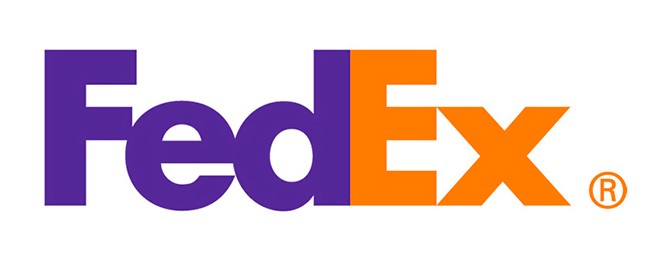
FedEx

You probably didn't realize that there is a blank space between the "E" and the "x".
In it you can clearly see an arrow that, subliminally, conveys the idea of speed and precision.
Both are core values of the Federal Express company, which makes it a world leader in shipping and parcels.

Freedom and creativity combined with a blank space. The result? More than 40 design awards.
Lindon Leader, author of the FedEx logo redesign, knows the visual impact of playing with negative spaces.

"Direction, speed and precision" were hidden under that arrow that was drawn in a vacuum, and that many designers wanted to fill with color.
"They did not understand it, it was not the arrow, but the subtlety that makes it intriguing," said its author.
Amazon

Amazon is the giant of online shopping and its logo reflects that concept.
It was designed in 2000 by Turner Duckworth under the supervision of company founder Jeff Bezos.

The orange arrow of the logo leaves the letter "a" and ends in the letter "z", indicating that they sell all the products you want, from a to z.
The arrow also represents a smile, in which the tip is a stylized dimple or a line of expression, which gives a wink of sympathy, joy and confidence.
This smile represents the happiness that people feel when they buy on Amazon, since the company wants the best customer satisfaction, offering a friendly service.

The black typeface demonstrates Amazon's superiority and dominance in the online retail market, which has been demonstrated by its financial metrics.
The bright orange color detracts from the formality of the logo and adds energy and appeal.
It also symbolizes pride and happiness, showing how Amazon works and thinks.
This great logo has become a benchmark in world brand design.
logo Toblerone

Toblerone

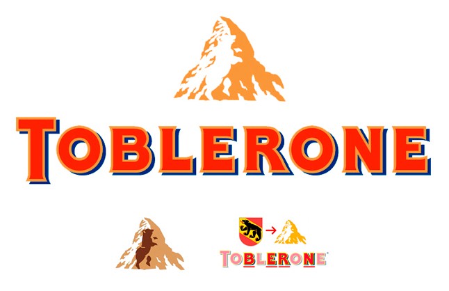
Do you see only a mountain?
The Matterhorn is the fifth highest peak in the Alps at about 4,500 meters high, and probably the most famous for its peculiar pyramidal shape.

The Toblerone brand is very famous in the world for the triangular prism shape of its packaging.
Its packaging contains a mountain range of chocolate blocks that we can section, which adds a distinctive feature to the bars of traditional tablets.

But this Swiss chocolate brand has the silhouette of a perfectly defined bear on the mountain in the negative part of the logo. Did you notice it?
It is a tribute to Bern, a Swiss town known as “the city of bears”, where Theodor Tobler and his cousin Emil Baumann created the company in 1908.
So representative is this animal for the town that it even appears on its official shield.

Toblerone's original logo openly featured a bear alongside an eagle that carried the flags of Switzerland and Bern.
In addition, within the name Toblerone the word Bern hides
Cisco

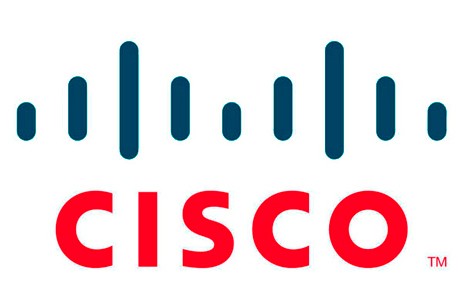
The Cisco company is a benchmark in the telecommunications market and takes its name from the final part of the word "San Fran CISCO "
Its logo is inspired by its famous suspension bridge: the Golden Gate.
It uses 9 vertical lines to represent electromagnetic waves, which evoke said bridge and represents a connection between the past and the future.
The color red symbolizes responsibility, passion and willingness to work hard to achieve greater success. The color blue represents tranquility, optimism, fame and prosperity.
The current Cisco logo resulted from the cooperation between the Cisco branding team, Joe Finocchiaro and Jerry Kuyper.
logo Hope for African Children

Camel

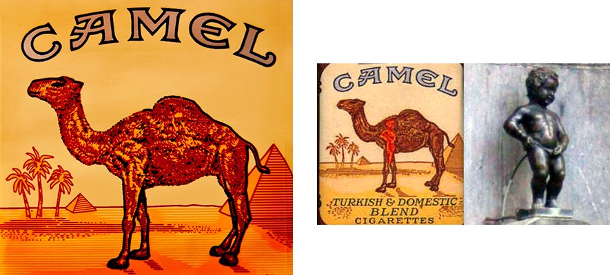
Belgian-born graphic designer Fred Otto Kleesattel, known as “Fritz,” was hired to design the packaging for the new line of Camel cigarettes.
During World War I, he worked as a camouflage artist, concealing buildings, vehicles, and other potential targets to make them blend in with their surroundings.

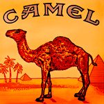
There are urban myths about supposed subliminal images hidden within the camel artwork.
It is said that Fritz did not like Camel's marketing manager.
So he introduced into the design a drawing of a Manneken Pis, the most famous statue in Brussels, inside a camel's foot.
logo Vaio

Vaio

Vaio is a brand of personal computer manufacturers, which was part of Sony.
Their logo was created by Timothy Hanley and is one of the most interesting logos ever.
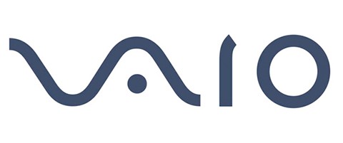
The Vaio logo consists of two parts of the word mark: “VA” and “IO
"VA" forms an analog wave, while "IO" represents the 1 and 0 of the digital binary code.
This reflects the visual identity of the brand as an integration of the two technologies.
The movement from left to right resembles progress and the step towards future innovations and technologies, without stress and with confidence.

One more curiosity about the brand name is that its pronunciation resembles the word "Vio-let".
This is manifested in the first models launched on the market that were purple or had an element of that color.
However, the logo's color palette is monochrome, conservative, and elegant. It is a perfect option to accentuate the hidden meaning of the name, by not catching the attention of the colors.

The Vaio logo is timeless and sophisticated, its smooth lines evoke a sense of calm and welcome.
In addition, the explanation of the meaning adds authority to the brand and reflects its technology and research values.
logo Quiksilver

Quiksilver

Quiksilver is an American company specialized in the manufacture of surf, skate and snowboard equipment and clothing.
The famous Quicksilver emblem was created in 1973 and never changed. The founders of the brand were the ones who designed the image.

Its logo symbolizes a wave and a mountain, the elements of nature most characteristic of two of Quiksilver's sports, surfing and snowboarding.
The logo is inspired by "The Great Wave off Kanagawa" by the artist Katsushika Hokusai.
logo Roxy quicksilver

Roxy

Roxy is the feminine version of the Quiksilver brand.
On the one hand, there is a clear link to Quiksilver, on the other hand, the logo has a noticeable feminine touch.
At first glance, the Roxy logo may look like just a stylized representation of a heart.
However, if you look closely, the heart is created from two mirrored copies of the Quiksilver emblem.
In addition, it represents the gesture of making a heart with both hands.
This unusual approach establishes a bond with the parent brand Quicksilver, and creates a unique and romantic image with a feminine identity at Roxy.
logo Tostitos

Tostitos

Tostitos one of the most popular brands of tortilla chips in America, owned by Frito-Lay, a division of PepsiCo.
With its classic festive theme, this aperitif has in its logo two people sharing and enjoying a tortilla chip between the two "T", and just below, the point of the "i" is its corresponding sauce pan for spreading or dipping.
logo starbucks

Starbucks

A mermaid with two tails is the image that characterizes the most famous chain of coffee shops in the world.
Just as the brand manages to seduce more and more customers every day, the history of its logo has a lot to do with powers of attraction and spell.

In 1971, the then university students Jerry Baldwin, Gordon Bowker and Zev Siegl had a business idea.
They needed to find a name and an image that would seduce people.
All three loved coffee and used to get together to read and comment on readings; one of the favorites was Herman Melville's Moby Dick.
This is how they decided to baptize their cafeteria as "Starbucks", in homage to the character Starbuck, first officer of the Pequod ship, in which the plot of Moby Dick takes place.

If the name referred to a story about sailors, the logo should also be related
For this they called designer Terry Hakcler, who was looking for an image that reflected the seduction of caffeine to people.

Seduction, sailors and coffee seemed to be difficult ideas to connect.
But it was exploring ancient books that they found the right image: a fifteenth-century two-tailed mermaid.
Just as it is believed that mermaids seduced sailors and made them forget their plans and objectives until lead them to their deaths, Starbucks should seduce people into addiction to its products.
logo Carrefour

Carrefour

The name of the Carrefour Group comes from the first store that was opened in France, which was located at a crossroads.
That is why the company decided to name it Carrefour, which in French means "crossroads"

The logo, at first glance, symbolizes precisely the two paths. In it there are two figures that represent arrows pointing in opposite directions, one blue and the other red.
The gap between them generates a blank letter "C", alluding to the French origin of the brand.
logo spartan golf club

Spartan Golf Club

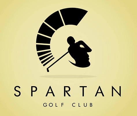
This logo is one of the best I have seen for its impeccable execution and subtlety, since it brings together the concept of golf and a Spartan warrior, in direct allusion to the name.

At first glance it is a golfer taking a swing, unfolding its trajectory to the side of his body.
But if we look away and taking into account the space of the negative, we can see the helmet of a Spartan soldier and the body of the player himself makes up his face.
logo Hope for African Children

Levi’s

The objective of some companies is to convey that by using their products, you will improve some part of your life.
In this case, it is clear that the message has to be that with their product you will look more attractive than normal.
What has Levi’s done with its logo to convey that data?
You have cleverly concealed the part of the body that most people want to highlight when wearing jeans.

logo Hope for African Children

Hope for African Children Initiative

This logo is also double-sided and also looks like a game of optical illusions.
At first glance we can see the map of Africa, but its counter-forms show us an adult and a child in dialogue, as a sign of help and hope.
Rolling Stones

The Rolling Stones

Many think that the design of the ionic tongue was created by Andy Warhol, but it is not.
The reality is that Mick Jagger asked a young student at the Royal College of Art in London named John Pasche, a logo representing the group's record company, in exchange for 50 pounds.

The first time the logo came to light was on the inside sleeve of the "Sticky Fingers" album in 1971, the cover of which was designed by Andy Warhol. Hence the confusion about the authorship of the famous symbol of the group.
Some believe that the logo represents the unmistakable face and mouth of Mick Jagger, and something has to do with it, but not entirely.
“When Mick asked me to create a logo for Rolling Stones Records, he showed me a newspaper clipping showing the Hindu goddess Kali, with a pointed tongue, hanging down ”, John Pasche says.
logo Versace

Versace

Gianni Versace was a great Italian designer who gained his fame by producing elegant clothes, accessories and luxury items and managed to build an empire through his brand that still persists.
In 1976 Gianni Versace, together with his brother Santo, created the Gianni Versace company.
But it was only in 1993 that the famous head of Medusa Gorgon appeared in the company logo.
Fue diseñada por el propio Gianni Versace, quien explicó que deliberadamente se decidió por esta imagen mitológica.

The jellyfish was a symbol of hypnotic beauty, as if it were a secret that was brought to life. She made people fall hopelessly in love with her.
The designer expected his collections to produce the same magnetic effect.
The Versace emblem is made in the style of geometric graphics, and is a graphic representation of the marble statue of Medusa Rondanini.

Gorgon is represented at the moment when she turns from a beautiful woman into a terrible monster, destroying all living beings. It is at this moment that she acquires an extraordinary power that is felt in this symbol.
The emblem is surrounded by a ring of Greek keys. This decorative pattern consists of lines that twist to form a labyrinth, and is another typical Versace design motif.
The Medusa Gorgon head is used in all Versace products, from clothing to accessories.
The brand does not have a specific color scheme. This allows you to freely include it in any product without conflict with your own color scheme.
logo NBC

NBC

The NBC logo has a couple of hidden meanings.
It is clear that it represents a peacock, but why?

The logo was developed in the days of the beginnings of color television, and that explains the rainbow of color.
The network wanted a logo that would encourage owners of black and white televisions to make the switch to color.
So the station used the popular slogan of those years: "As proud as a peacock" to promote the pride they felt in their new color system.
The six colors of the pens represent the six divisions of NBC.
logo Hope for African Children

Night Golf

The designer was able to see a crescent moon in the texture of the golf ball, and the effect of its craters illuminated at night.
Several concepts are combined in this logo: moon, night, ball, round, outdoors, light, darkness.
logo London Symphony Orchestra

London Simphonyc Orchestra

This elegant and clean logo, it could not be otherwise, being a symphony orchestra, it is just an anagram with the initials LSO.
Despite its simplicity, it depicts a conductor waving his baton and with his arms raised.
logo Hope for African Children

Presbyterian Church USA

Las religiones están llenas de simbolismos y alegorías.
In this logo the designer managed to integrate 8 icons that represent the fundamental elements of the Presbyterian Church in the United States.
These are the cross, the pulpit, the dove, the fish, the chalice, the fire, the Bible, and the Trinity.

logo Hope for African Children

Hartford Whalers

Hartford Whalers was a professional ice hockey team from Hartford, Connecticut (United States), which existed from 1972 to 1997.
This logo shows 3 concepts: The tail of a whale, the W for “Whalers” and the white spaces draw the H for “Hartford”.
logo Hope for African Children

Global Movement for Children

The Global Movement for Children is the worldwide movement of organizations and individuals, joining forces to build a world fit for children.
The GMC seeks to promote global campaigns to defend children's rights and the accountability of governments to their children.
Its logo symbolizes the imprint of a helping hand, which reaches out and unites people in the same common purpose throughout the planet.
logo Hope for African Children

Pioneer

The Pioneer brand has always been synonymous with good quality in speakers and sound equipment.
Its old logo hides several meanings:
A Greek letter omega that indicates the unit of measurement (omhs) of speaker impedance.
A tuning fork that represents the fidelity of the tuning of the musical sound.
It also represents a headset and a microphone.
logo Baskin Robbins

Baskin Robbins

Popular ice cream chain Baskin Robbins has 31 flavors on its menu.
The pink color of the final part of the "B" and the initial part of the "R" make it very clear, which also serve to create the brand's own logo.
The logo evokes fun and energy, sensations that you will most likely experience during and after eating their ice cream.
logo LG

LG

LG is a brand recognized around the world and most people recognize the “L” and “G” in the isotype, which represents their slogan “Life is good”
For this company , life is as fun as the Pac-Man game that has entertained many generations, and whose main character can be composed with LG's own logo.
Also, more clearly, you can see a smiling face: The “L” forms the nose and the “G” forms the rest of the face.
This gives the brand a human element and makes it more attractive and accessible.
logo Airbnb

Airbnb

The logo includes four images that speak about the company: the silhouette of a person with open arms, the geolocation symbol, a heart and the letter "A" for Airbnb.

Airbnb talks about itself and speaks directly to its users: people who love to travel and who, in the experience of hosting, see an opportunity to meet new people.
logo le tour de france

Le Tour de France

This logo contains two hidden messages: The first is a little more obvious, the cyclist who is formed with the letters "OUR"
But the second is more disguised, and that is that the ocher circle that constitutes the bicycle wheel is also a sun.
This indicates that race events occur only during the day and in summer.
logo milwakee brewers

Milwaukee Brewers

This old logo for the Milwaukee Brewers, a professional baseball team from Milwaukee, Wisconsin, looks like a baseball glove catching a ball, but it is more than that.
If you look closely, you can see that the baseball glove is made up of the letters "m" and "b".
logo Galeries Lafayette

Galeries Lafayette

Galeries Lafayette are large luxury department stores located in Paris.
Its typography is not only elegant and sophisticated, but also, the two letters "t" hide an Eiffel Tower that reinforces its French origins.

logo GreenLabs

Greenlabs

This a digital marketing and web solutions company uses a tree as its logo.
This accentuates the “green” part of its name, but what about the “labs” part?
The top of the tree is, in fact, a human brain that represents the intelligence of the company's personnel.
logo museum of london

Museum of London

The Museum of London logo has an interesting and organic look.
The color shapes are not really just abstract blobs, they represent something: they show the geography of London and its changes over time.
They represent the constant transformations that the city and its inhabitants have undergone in the past and present, as well as the changes that will come in the future.
logo Hope for African Children

Big Ten Conference

Big Ten is a union of academics that was founded in 1896.
Until 1990 this union consisted of 10 universities, but in June 1990 the Pennsylvania State University was added.
And since they didn't want to rename it, they just subliminally added the number 11 to the logo.
logo audi

Audi

The Audi car logo may seem absent of symbology, but the four rings that make up the logo represent each of the four companies that merged to create the brand: Audi, DKW, Horch and Wanderer.
logo beats

Beats

Beats Electronics is a division of Apple, specializing in audio-related products, and is especially popular for its on-trend headphones.
Their logo apparently no more than a white b on a red circle, but represents a human head in which the letter “b” forms the brand's headphones.
This gives the brand a personal element that allows the consumer to see themselves in the hearing aids.
loogo my fonts

My Fonts

My Fonts is an online typographic resource that allows users to access a large number of typographic fonts.
The word “My” is stylized to look like a hand, thus conveying the message that users can dip into any source they want.
logo the swan and mallard

The Swan & Mallard

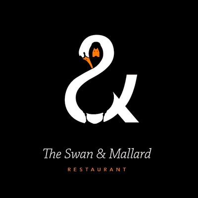
Designed by John Randall, this restaurant's logo takes visual mastery to another level.
The negative space of the swan not only hides a black duck, but also the swan forms the symbol "&" and seems to hug the duck with its neck.
logo BMW

BMW

This famous German car brand was linked to aviation in its beginnings, so there are those who interpret the central part of its logo as rotating propellers. The white quarters represent a helix, while the blue sections symbolize the sky.
But although this may seem like this, it was not an original intention. According to the New York Times, the brand was registered in 1917, but the propeller wasn't created until 1929.

What does it mean then? The blue and white colors represent the Free State Bavarian colors.
The reason it looks like this is because the use of a national symbol in a trademark was illegal, so the colors are arranged in a reverse order.
Logo Unilever

Unilever

Unilever is a multinational company that makes all kinds of products, from personal care products, sauces, detergents to ice cream and soft drinks.
For this reason, it has reflected in its logo the diversity of products it offers and the values it wishes to convey.
They can be identified in it from a heart, a bird, a fish, a hand, a sweater, lips, a bee, etc.
logo lion bird

Lion Bird

This logo is a perfect example of visual manipulation.
Did you see the bird or the lion first? They are both there, although the lion is barely hinted at.
The body of the bird forms the face of the lion and your eyes fill in the rest with negative space.
The lion represents the way the brand attacks its profession, while the bird represents its power.
logo Picasa

Picasa

Picasa, Google's image editor and organizer, has an interesting logo.
At first glance it looks like a simple camera shutter, but the negative space in the center of the shutter actually makes up a house.
This is because Picasa is the "house" of all your photographs.
logo Goodwill

Goodwill

This Google service to facilitate donations to NGOs, has a "happy" logo.
The very "G" that appears in the upper left as in the name itself, evokes a smiling face, to associate with the happiness that donations to non-profit organizations treasure.
logo Continental

Continental

This company is one of the leading tire manufacturers.
With a little visual acuity you can see how the first two letters of your logo make up the image of a tire with its corresponding rim.
logo Pittsburgh Zoo & PPG Aquarium

Pittsburgh Zoo & PPG Aquarium

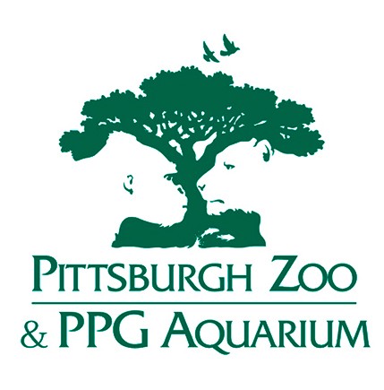
The logo we see is very detailed, but that has a reason: the tree creates in negative the profiles of a monkey, a feline, some birds and some fish that seem to jump out of the water.
The logo thus shows the richness of the zoo and its aquarium and that the animals are in a natural and protected habitat.

logo sun microsistems

Sun Microsystems

This logo was created by Professor Vaughan Pratt of Stanford University.
Through a very clever design using a "U" shaped picotgram, he made it possible to read the brand name from any direction you look at it.
Technology company Sun Microsystem was bought by Oracle in 2010.
logo Nike

Nike

It is undoubtedly one of the most referential logos and represents one of the most famous sportswear brands in the world.
Most people think that the Nike logo is a pipe, and that is how the brand is known, and the association is logical because of the shape it takes, but this is a mistake.
Nike is the English adaptation of the name of the Greek goddess Nike, the goddess of victory.

En 1968, cuando Phil Knight decidió dejar atrás el nombre de «Blue Ribbon Sports» que llevaba su empresa, decidió buscar algo que se asociara con el ganar y que transmitiese la idea de movimiento y acción.
Thus he searched in Greek mythology until he found Nike. The final accent soon disappeared and thus began a story of success and worldwide diffusion.

Interestingly, the logo was developed by graphic design student Carolyn Davidson, who was inspired by the shape of the Greek goddess's wings. Phil and Carolyn met at Portland State University, where he taught accounting, and Davidson presented him with his invoice for a total of $ 35 for his design.
In 1983, Knight gave Davidson a gold and diamond ring in the shape of the Nike logo, and an envelope full of stocks. from the company as a thank you and bonus for your work done.
logo Nintendo GameCube

Nintendo Game Cube

The Nintendo Game Cube game console has in its logo a very good example of how to integrate the product itself within the brand itself.
It is not just a cube integrated into another cube, the obvious bluish area represents a “G” while inside it, a “C” is integrated in the negative space
Treated with gradient colors that give depth and volume, the three-dimensional sensation of the two cubes is achieved.
logo Hope for African Children

Nvidia

This company makes the world's best video cards for computing and adopted its first logo three years after it was founded in 1993.
It was then that his central visual metaphor was chosen: an all-seeing eye.
This emblem has a long history and generally symbolizes "the eye of God", however, in this context, it has a different symbolic meaning.
Nvidia's eye is constantly searching for innovation and the future.

logo yoga australia

Yoga Australia

This Yoga Australia logo hides a small treasure in its negative space.
In the gap between the leg and the arm that is holding it, the silhouette of the map of Australia is formed.
Logo Eight

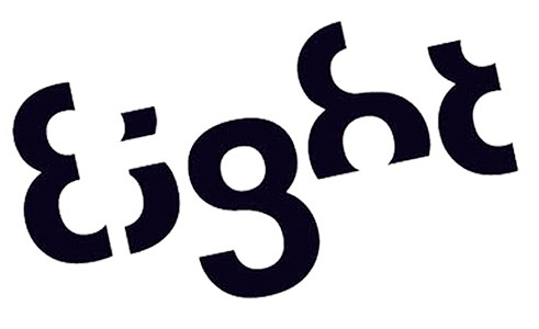
Eight

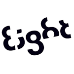
This logo was designed by Stylo Design, a London advertising agency that has been more than successful in the idea.
The letters that compose it are always part of the same number eight, the word that gives the brand its name.
logo Nortwest Airlines

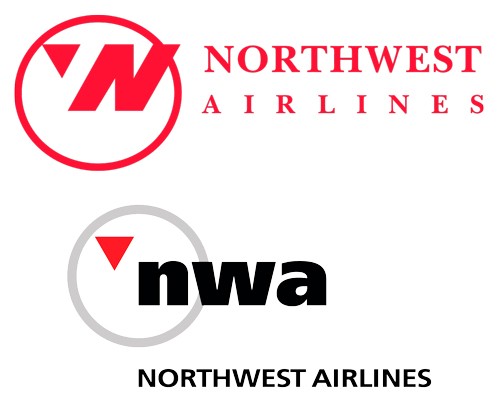
Northwest Airlines

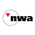
NWA was one of the major airlines in the United States, founded in 1926 and absorbed by Delta Airlines in 2008.
The first thing we can see in its old design are the letters N and W, initials of the brand's name.
But what most people don't see is the compass pointing northwest, another reference to the brand name.
This triangle is also strategically positioned, so that when it is combined with the N of North, according to the W of West.
The new design sought to simplify the symbol and only kept the concept of a compass pointing northwest.
logo Pinterest

Pinterest

Pinterest the social network to share images where we can manage our images in collections or interests, they have a clear allusion to their name in the logo itself.

Pinterest's name comes from the idea of “pinning,” that is, taking things that interest you and tacking them onto a board.
To reinforce the idea of the "pin", the letter "P" represents a tack. This brings the digital age together with the real, physical aspect of taking something and pinning it to a wall.
logo The Bronx Zoo

The Bronx Zoo

Another good example of how to play with the negative of the logo.
Under the legs of the giraffes you can see the skyline of some of the most iconic buildings in New York City.
logo Toyota

Toyota

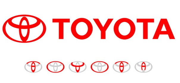
Motorsports giant Toyota has a very elaborate logo and it takes a lot to decipher what it hides.
The three overlapping rings of the popular auto company symbolize the unification between Toyota products and the hearts of its customers.
The space in the background represents your technological advancements and the opportunities that lie ahead.
But far from what it seems at first glance, it is not a series of three linked rings without more, with them each and every one of the letters that make up the name of the brand itself are composed.
logo Eighty 20

Eighty 20

This logo belongs to a company specialized in market analysis and big data.
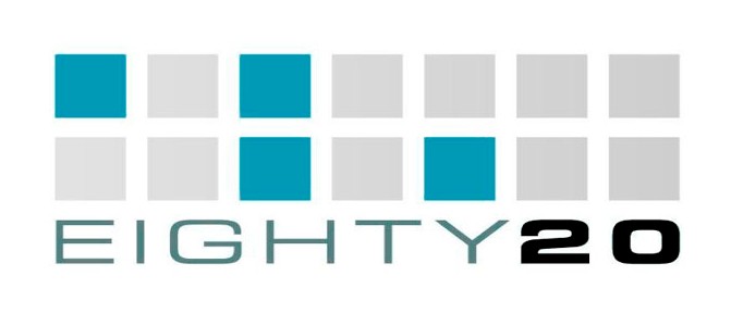
It consists of two rows of squares and a message in binary code, which represents its own name.
The light color is equivalent to a 0 and the dark one to a 1, so that the first row is the number 80 in decimal (1010000) and the second the number 20 in decimal (0010100), which coincides with the name of the company itself.
logo snooty peacock

Snooty Peacock

Snooty Peacock is a jeweler in Dallas (Texas) that specializes in making unique “one-of-a-kind” jewelry.
Designer Ryan Russell wanted to create a logo that captured the eclectic spirit of jewelry and the unique women who make it.

This brand is simple but exciting, with a design that shows the clever use of figure and background, creating a stylized peacock and the face of an eccentric woman wearing jewelry.
Peacock significa «pavo real» en inglés, y al igual que el logo de la NBC, el pavo real representa el «orgullo» de lucir las joyas.
logo Elettro Domestici

Elettro Domestici

Elettro Domestici is an Italian electronics company.
Designed by Gianni Bortolotti, the logo uses negative space in an exceptional way, representing the two initials of the brand through the pictogram of a plug. (E and D)
logo Kolner Zoo

Koelner Zoo

This logo of the Cologne Zoo (Germany) is an example of a good use of negative space.
In addition to having an obvious star for an eye, the lower part of the elephant shows from left to right the two towers of Cologne Cathedral, a rhinoceros and a giraffe.
logo newman

New Man

At first glance, the logo for this French clothing company doesn't seem like anything special, but it does have a little visual trick.
The logo can be read exactly the same if it is rotated 360º.
This reflects the message that the company is innovative and that its clothing serves multiple purposes.
logo Washington Capitals

Washington Capitals

The NHL ice hockey team based in the United States capital (Washington)
It has in its logo the silhouette of one of the most emblematic buildings of the city: The Capitol, in the negative area placed under the head of the eagle.
It also makes good typographic use by turning the letter "t" into a hockey stick and using a simple script to refresh the puck.
logo XNA

XNA

This Microsoft API, conceived for the development of video games for the Xbox 360, Windows, Zune and Windows Phone 7 platforms, is now an abandoned project and the current MonoGame is based on it.
In its logo, the broken line that forms the X, hides the Morse code combination of XNA.
logo Yamaha

Yamaha

It is one of the most representative Japanese companies in the world, with a presence in multiple markets, it has the origins of the brand represented in its logo.
Before diversifying their lines of business they were dedicated to the manufacture of pianos and that is why their circular logo has three crossed tuning forks inside.
El diapasón representa la fidelidad y la calidad de los instrumentos musicales.
Al golpearlo suavemente vibra emitiendo una nota LA a 440 Hz, que ha sido tomada como medida universal para la afinación de todos los instrumentos musicales.
logo IBM

IBM

Las franjas blancas que atraviesan las letras del logotipo dan la ilusión de ser signos de igual en la parte inferior de las letras.
Esta imagen representa la equidad, valor fundamental de la empresa IBM.
logo adidas

Adidas

This German sportswear and footwear company is one of the best in the world.
The three stripes have always been part of their logo, but in recent redesigns the stripes have been staggered to simulate a mountain.
This mountain represents the challenges and obstacles that athletes have to face to achieve victory.
It also represents the idea of a triumphal podium in competitions, with 3 platforms at different heights.
logo Twitter

Twitter

This name refers to chirping or chirping, and represents an ideal term to symbolize the purpose of the social network: to send messages to friends or followers briefly and instantly like the chirping of a bird.
In addition, the network is characterized by sharing messages by forwarding them.
This creates a thread or chain of messages, where the popular phrase "A little bird told me" can be applied to avoid revealing the true origin of the message.
It is with this meaning that the famous Twitter bird for its logo emerged.
llogo NBA

NBA

The logo designed by Alan Siegel representing the NBA consists of a white silhouette dribbling under a blue and red background representing the United States flag.
The silhouette belongs to Jerry West (1938), also known as Mr. Clutch for his ability and dexterity in the last
moments of games.
He was a great basketball legend and one of the most sought-after players in the lakers between the 60s and 70s.
logo Hyundai

Hyundai

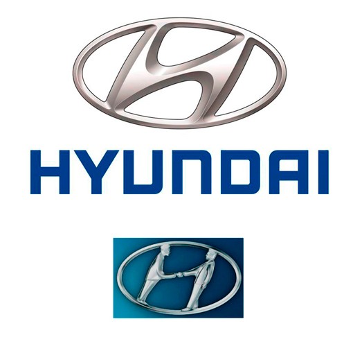
It does not seem so at first glance, but Hyundai's H is two people shaking hands, shop assistant and customer, the gesture that takes place after the sale of a car.
The honesty, trust and transparency that are represented in a handshake are the p0liars of this automotive company.
logo Gillette

Gillette

Gillette is a manufacturer of razor blades and foams, and therefore has a literally sharp logo.
The intricate and precise cut through the “G” and “i” looks like it was carefully removed with a very sharp Gillette razor, representing the brand's flagship product.
logo Families

Families

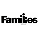
This logo designed by Herb Lubalin is an excellent example of the good use of fonts to convey a message without resorting to additional graphic elements.
The characters 'i' and 'l' suggestively form a family representing mother, father and son.
logo mother $ child

Mother & Child

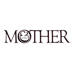
Another great logo designed by Herb Lubalin.
It suggests the prenatal bond between the mother and the fetus that rests peacefully in her womb during pregnancy, connected by the umbilical cord.
The letter & represents the nexus between both beings and assumes the role of the baby about to be born, inside a very large womb represented by the letter O.
The immense typographic value of this logo shows us that just reading the word Mother gives us the message of pregnancy, without having to read the word Child.
logo Mc Donalds

McDonald’s

The well-known "golden arches" of the world's largest fast food chain refer to those that adorned its first restaurants.
When the company wanted to change the design, the psychologist Louis Cheskin made them give up on the idea, arguing that the M resembles a pair of breasts seen upside down, which unconsciously refer clients to their childhood.
logo Google

Google

Google uses primary colors (blue, red and yellow) in its logo in a row and then breaks this chain with a secondary color, green.
This was done in a totally intentional way to show that Google is not bound by patterns and rules, and that they also know how to play by making symbols that stand out.
That is why the Google logo uses only very simple letters and colors.
logo Coca Cola

Coca-Cola

The Coca-Cola logo is one of the logos that has created the most controversy.
If we look with a little imagination between the characters "o and l" the Denmark flag is hidden.
This has not always been their original intention. Coca-Cola discovered that part of its logo resembles the Danish flag, which has been named the happiest country in the world.
Once they figured this out, they set up the media stunt at Denmark's biggest airport, where they welcome people with flags.

logo Apple

Apple

Rob Yanoff, the designer of the Apple logo, revealed that the creation of the famous logo was thanks to some apples that he bought to paint them in a portrait.
When trying to simplify the symbol of the company, Yanoff wanted to place the image of the bitten apple since the word "bite" in English is bite, so it is translated as a term in computing (which is byte, like gigabyte, megabyte , etc.).
logo black cat

Black Cat

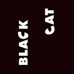
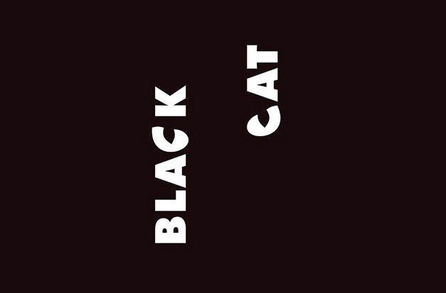
Designed by Hungarian artist Peter Vasvari for a Turkish TV production company, it has put the words vertically, so that the letters "C" are the eyes of a cat.
It represents the night and the mystery contained in the image of a black cat.
logo St Julian Rowing Club

St. Julian’s Rowing Club

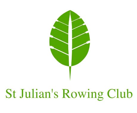
Another logo designed by Peter Vasvari (Hungary) for a rowing club in Poland
It represents the eco-friendly spirit of the institution, group work and team spirit where the objective is common: to row all together towards the same direction, joining forces and wills.
logo Wendys

Wendy’s

If you look closely, on the neck of the girl's shirt you can read the word "mom", that's because the company wants to reinforce the concept that they serve fast food with a homemade touch.
logo British Blind Sport

British Blind Sport

The British Blind Sport charity makes it possible for the blind or visually impaired to participate in sports.
Their logo shows what appears to be simply a British flag.
The blank area in the center appears to only be there to make the word "blind" easier to read, but in reality, that area behaves like a pupil, while the outline of the flag forms the rest of the eye.
In addition, its shape is reminiscent of a rugby ball.
logo CodeFish

CodeFish

What is the hidden message of CodeFish?
That your logo is created from labels and typical programming symbols, thus creating a fish made based on code, as its name implies.
logo Breast Clinica de la mama

Breast

This Argentine clinic is dedicated to care and attention to prevent breast cancer.
Its logo clearly represents a breast where the nipple is replaced by a flower, putting life right where a disease can be generated, and inviting women to feel and self-examine to prevent the diagnosis of breast cancer.
logo revista argentina de anatomia online

Argentine Journal of Anatomy Online

Finally, a logo designed by me.
This is a scientific-themed magazine where articles related to the investigation of anatomical subjects are published.
The isotype hides several concepts: At first glance it is a letter "a" of Anatomy and Argentina within a curved rectangle.
This rectangle represents a slightly curved red page, simulating a magazine page.
The "a" is slightly rotated to the left, to suggest a drop of blood in the eye of the letter.
In turn, the red and white colors, with their shapes and negative spaces, represent the insertion of the muscles into the bones through the tendons.

Final conclusion

I hope you enjoyed this article and that it was useful to you.
La creatividad de los diseñadores de marcas nunca deja de sorprendernos y nos permite seguir aprendiendo siempre.
Mi objetivo en este trabajo es que conozcas las historias y motivos por las cuales las marcas son como son y cómo nos transmiten sus conceptos.

If you wanted to have your own brand and you consider that I am a suitable professional, do not hesitate to contact me.

In the Related Articles section below, you will find many articles with specific topics that complement the one you just read. Thank you!

>>> I WANT MY LOGO <<<
Packaging posavasos

How to get the best profitability from your product photos

The value of images in your online store


Do you know how to get the best return on the photos of your products in your online store?
In this post I will tell you some aspects that you should take into account about the images and also about the experience of selling online and how to approach your business in the Web.

If you are thinking of having your virtual store, or you already have one and want to improve its performance through an aesthetic and professional interface, I suggest you pay special attention to the quality of the images of your products. Own manufacture, since if you resell third-party products, your provider will surely give you the images to publish in your store, and you would not have to deal with that.

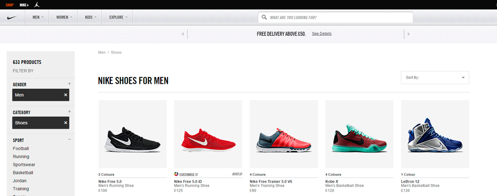
Nike

The client is the one who chooses you

If you are a wholesale manufacturer and you sell your products to third parties, and they want to publish them in their own stores or social networks, the images that you provide must be of very good quality. to buy, since they themselves will have to re-photograph your products to publish them on their platforms, and thus maintain the quality with which they are shown to the public, and that means double work and more unnecessary investment.
You must think that there are other providers that offer them ready-to-use images and therefore, they will choose them.
That is why having good images helps a lot to make your website profitable, generating better income, but it also speaks of having respect for your business and towards your customers.

That's what the internet and networks are all about, connecting and expanding, and you will never know where your images end, but wherever they end it is sure that they will continue to talk about you and your business, so make sure they are good.

comprador elige

>>> I WANT MY ONLINE STORE <<<
Packaging posavasos

Good images to improve profitability

The photos of your online store fulfill the same role as the window and the windows of your commercial premises: Attract customers!
If there is nothing attractive in your store, customers will look for another site that attracts the most attention .

Never forget that your website, your store and your images speak of you and your business, when you are not there to do it in person.

A popular phrase is worth here: «How they see you, they treat you. If they see you badly they mistreat you and if they see you good they hire you »
The image is a fundamental and predetermining factor to obtain success in the world of electronic commerce.
Photography is an art, and art is a work done by an artist, everything else will be attempts full of good intentions and a desire to save money, but without good results.
Always look for the gaze of an artist to face your projects, they know how to see what others cannot.

Sephora

Monetize your online store

The main function of an online store is to allow you to sell your products automatically, but above all, to generate economic income, and therefore it must be profitable.
All the elements of your store should be oriented to that: to sell, to make money and to get new customers.

monetizar tu tienda online

Your online store may have a very good design, but the photos represent more than 80% of the success so that a user is interested in knowing more about the product you offer.
A good image will lead you to click and see more details, and finally make the decision to buy.

Here are phrases such as "The first impression that counts", "Everything enters through the eyes", "A picture is worth a thousand words" and "The monkey even if it is dressed in silk, will be always a monkey! ”

If the image is of poor quality, the customer will not be interested in it no matter how excellent the product is, and will surely find the same product shown in a better way in the competition and will feel more comfortable and reliable to buy it.


I invite you to read my article Everything you need to know to have your online store for more information.


Lack or abundance?

Don't consider design and photography costs as dispensable expenses, but as an investment, since they contribute to the solid and professional construction of your online business, and you will see it monetized in successful sales in the short or medium term future.
Do not imagine your online business from "lack", but from "ABUNDANCE".
People do not choose the lacking, nor the mediocre, nor the lukewarm, nor the losers.
So do not think that this is not a good time to invest, that you are not selling or billing, that the budget is not enough, that the economic crisis, that people do not buy ...
People buy, but they do not buy from you but from your competition, who long ago decided to expand and invest in growth

Therefore, think better of investing to be able to get out of where you are stagnant, to sell more and better, to reach more people, and that investment will take you out of your current state of lack.
That is what the Law is about of Universal Attraction: what you ask for you get, on the other hand, if you decide to settle in the constant complaint and the lack, you will get only that ...

foto producto set

Play and learn to sell online

I propose you to play subjectivity.

Throughout this article I am going to show you examples with real photos obtained from online stores of the sellers themselves on the web, so that you can evaluate and sharpen your perception and subjectivity.
I propose you to play as a buyer and choose what products you would buy and which ones you would not, and above all, how do you imagine the seller of those products: their reliability, their commercial premises, their appearance, their character ...
It's just an imaginary game and nothing more than that, take it as such .

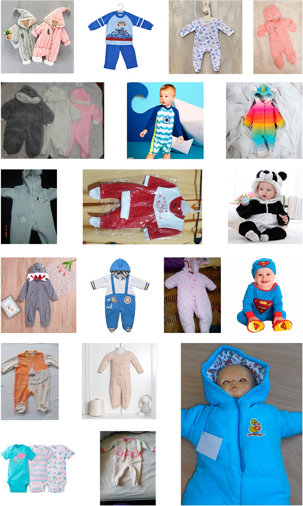
Do not stop at the quality of the products, but observe the lighting of the images, the composition, the frames, the cutouts, the environment, the setting, the background ... in short, see what each photo says or suggests.
What is your first impression? What sensations do they produce?


Different looks, different results

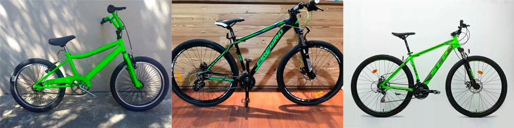
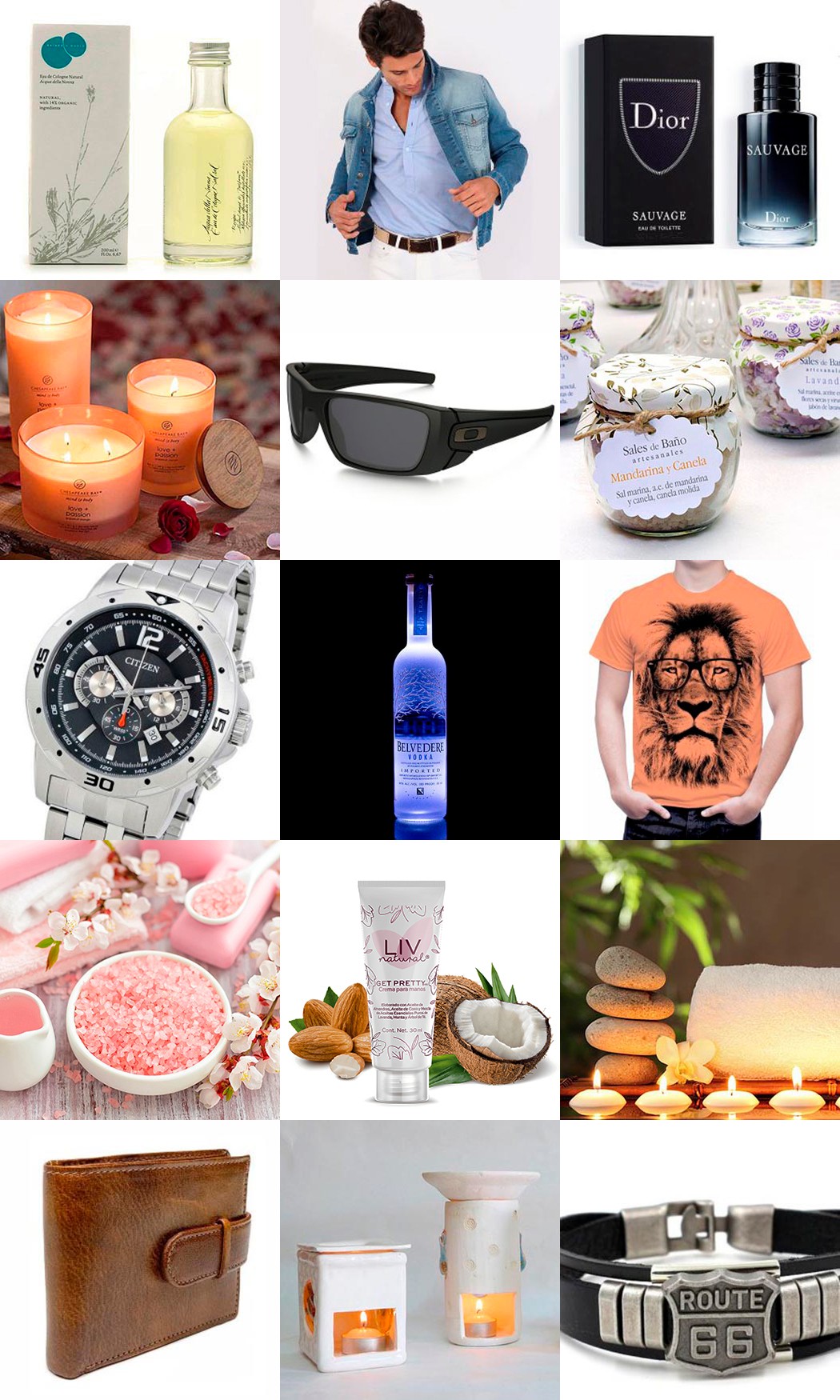
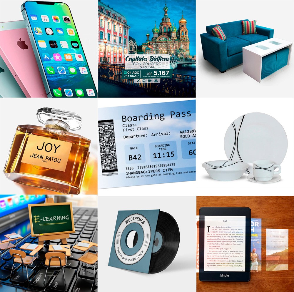
The following images show very similar products from the same commercial category, and from the same country (Argentina) but from different vendors, and therefore are competitors among themselves.
All are shown as they were downloaded from the respective websites and networks salespeople's social media.
They have not been digitally retouched or corrected, therefore, this is the way they have decided to face the challenge of selling their products online.

ditintos criterios para vender online

Ahora que ya las observaste, te invito a reflexionar…
Así como tú has podido imaginar a estos vendedores sin conocerlos, tus compradores te imaginarán a ti, tan sólo viendo las fotos de tus productos, ya que no estarás allí físicamente para convencerlos de otra cosa.
Ellos no te conocen, jamás hablaron contigo, no saben de tu experiencia en el mercado ni de la calidad de tus productos.
Sólo pueden tu única carta de presentación: tu tienda online y tus fotos.
From this, they decide whether they are interested or not.


Believe or not believe

Never forget that your store must be aesthetically pleasing and be credible and professional.
In this case "homemade and amateur does not work", and it can generate disinterest or mistrust in the potential buyer
Behind a product for sale there must be a company or person who supports it, and who responds efficiently and responsibly.
This is where improvised appearances fail, and much more if there are other similar stores on the web, whose owners They decided to approach their business with professionalism, and make quality their main virtue.

desconfianza al comprar online

A purchase is not finalized when you click the BUY button. A purchase ends when the customer received the product, tested it and was satisfied.
If this happens, he will surely buy from you again, he will save your store in his Favorites and you will have won a new customer who will recommend you to others.
If this it does not happen ... it is your responsibility and you should rethink your business strategy.

Read my article Everything you need to know to have your online store (Section 2- Aesthetics) for more information


Awaking the interest

You must think that customers do not have the possibility to physically see your products, touch, feel, smell, or perceive the textures, sizes, shapes and weight.
They cannot even try it on their body, nor do they have you to that you convince or advise them before buying. They only have one photo on their screen.
This is where a good image made with professional judgment and vision, opens the channel of interest between the buyer and your store.
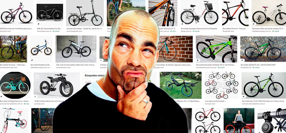
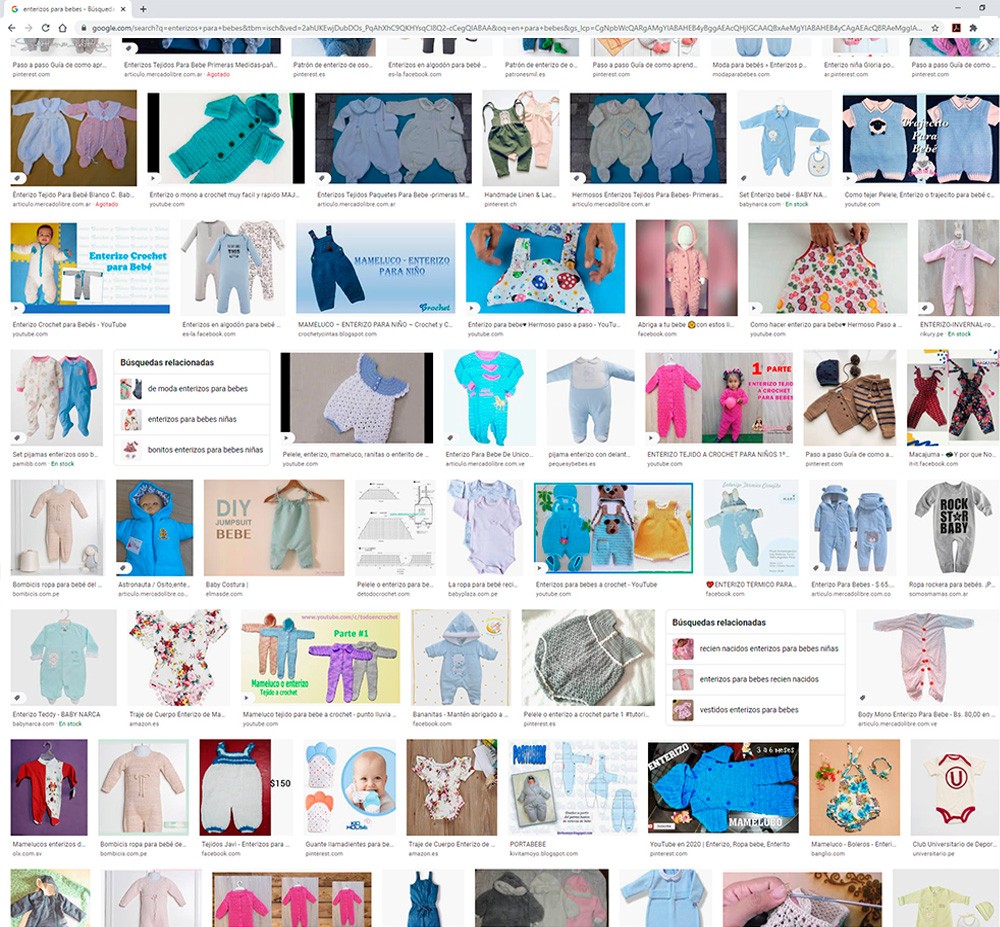
Surely the first thing that the customer sees in a search engine like Google an image of the product that he needs to buy, and that image will only take him to the web that contains it if it manages to arouse his interest.
In addition, that image will be seen in a list among many others similar, where excellent photos coexist with terrible photos, and you will surely choose the most attractive one.

buscar productos en google

Buying online

Immediacy is a determining factor in the success of online purchases.
A product must be displayed in the best possible way, both from the image and from the textual descriptions, so that the customer does not need to ask additional questions about it .
The simple fact that a buyer asks you a question before buying represents a waiting time for your answer, and the possibility of a cooling down in their desire to acquire your product, or that they simply look elsewhere while waiting your answer.
Therefore, you have to minimize the situations that generate doubts or cross-questions, through good descriptive texts and excellent photographs.
You must understand that you are not the only one who sells your types of products, and your competitors have the same desire to sell as you.


I want it right now!

Immediacy is a determining factor in the success of online purchases.
A product must be shown in the best possible way, both from the image and from the textual descriptions, so that the customer does not need to ask you additional questions about it.
The simple fact that a buyer asks you a question before buying represents a waiting time for your response, and the possibility of a cooling in their desire to acquire your product, or that they simply look for it elsewhere while waiting for your response.
Therefore, you have to minimize situations that generate doubts or questions, through good descriptive texts and excellent photographs.
You must understand that you are not the only one who sells your types of products, and your competitors have the same desire to sell as you.

buscar productos en google

Seduce, tempt and persuade

An image must convey the desire to own the product it represents, and that desire implies a choice, a motivation to disburse money, of which not many are willing to give.
That is why the sensations we transmit through the images of our products are very important to seduce the buyer and awaken the interest to buy.


Observe those who know

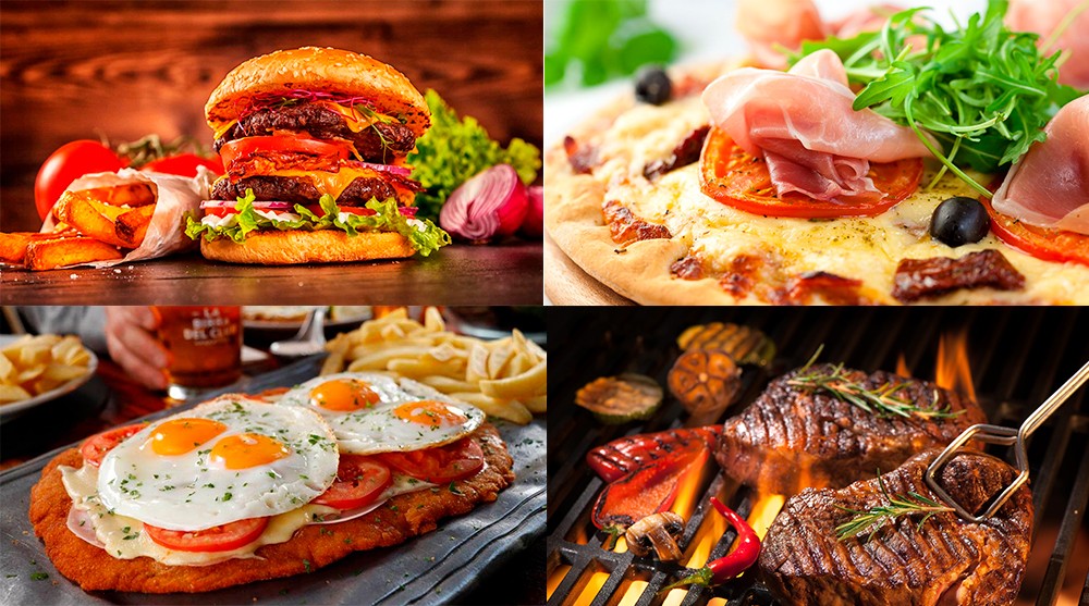
A good example is photos of food business canopies or those that illustrate restaurant menus.
What do those photos look like? What sensations do they produce in you? Maybe hungry?
Surely if you buy it, your dish will not be as attractive as the photos, but you have already bought it, you will be convinced that it is delicious and you will be satisfied that you have paid for it, and the owner of the restaurant very happy that you have chosen it.

buscar productos en google

Feel, be and act like a professional

Even if you are not a qualified professional, you should behave as such, so that whoever is interested in what you sell is willing to pay you without knowing you, and to feel safe and supported when doing so.

In the world of electronic commerce, things are not how you want them to be, but how the customer expects them to be.

Maybe you have images that you think are good and efficient, but you see that time passes and no one or very few people are interested in your products. What is failing?
Your professional view of your own business is surely failing.
It does not matter how many years of experience you have selling in the field and the knowledge you have about your activity.


The experience of selling online

It is important that you understand that selling online is a totally different experience than selling in a commercial place, where people enter, choose, point, touch, ask, talk and finally buy.

You can have many years of commercial experience with your business and yet realize that you are not doing well in the virtual world, and that can discourage you.
You just have to understand that they are two very different things, and try to adapt to both sales methods.
If you are a good seller and take care of the details of your products in your shop, you should also do it in your online store.

local comercial y tienda online

Always prioritize quality

I advise you to invest time and money in creating images and / or videos conscientiously and with criteria, where you can show your products in the best possible way.
Always go to a trained graphic designer or a professional product photographer, who will surely they will have a much more competent look to understand your requirements, and carry them out in the best way.
Always remember that the fact that you have a good digital camera with many megapixels does not make you a photographer, and that taking an advertising photo to sell a product or service goes way beyond focusing and pressing the shutter.


Whats up?

A friend who helps you with “cool” photos is not a photographer, a friend who takes beautiful photos on his trips is not a photographer, a friend who publishes thousands of photos on his networks is not a photographer either, a friend who decides not charging you is not a photographer either.
And believe it or not, a professional photographer who works on social events such as parties and baptisms is not a product photographer either.
Always hire a product photographer.

telefonos

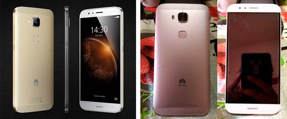
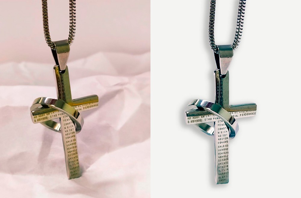
The images above show the same product photographed by a professional and an amateur. Both photos were obtained from online stores. Which one would you buy?

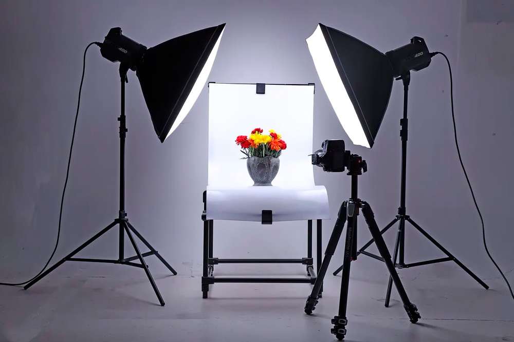
Photographing products to sell involves other factors such as lighting, framing, background, environment, detail.
But above all, it implies having the criteria and the professional look, the knowledge of the target to whom it is directed, and the way to open the channel of attention and interest of potential buyers.
That is why I advise you to consult a professional and do not skimp on costs, since if the images are of poor quality, everything else will be on the way to failure.


DIY: Do it yourself!

If your budget is not enough to hire a professional and you dare to take the photos yourself, arm yourself with a good camera, a lot of time and patience. Trial and error are the best teachers.
I recommend that you do some courses in Product Photography and Photoshop, which will surely open up the panorama for you and you can make the most of your camera.
There are many very good and free tutorials on the web that will be very useful to you.
Do not abuse mobile apps, since most of them are designed for social photography and not for products, and they automate tasks that should not be automatic but specific for each image.

telefonos

Some technical tips

If you decide to do without a good photographer and venture to do the work yourself, here are some suggestions.


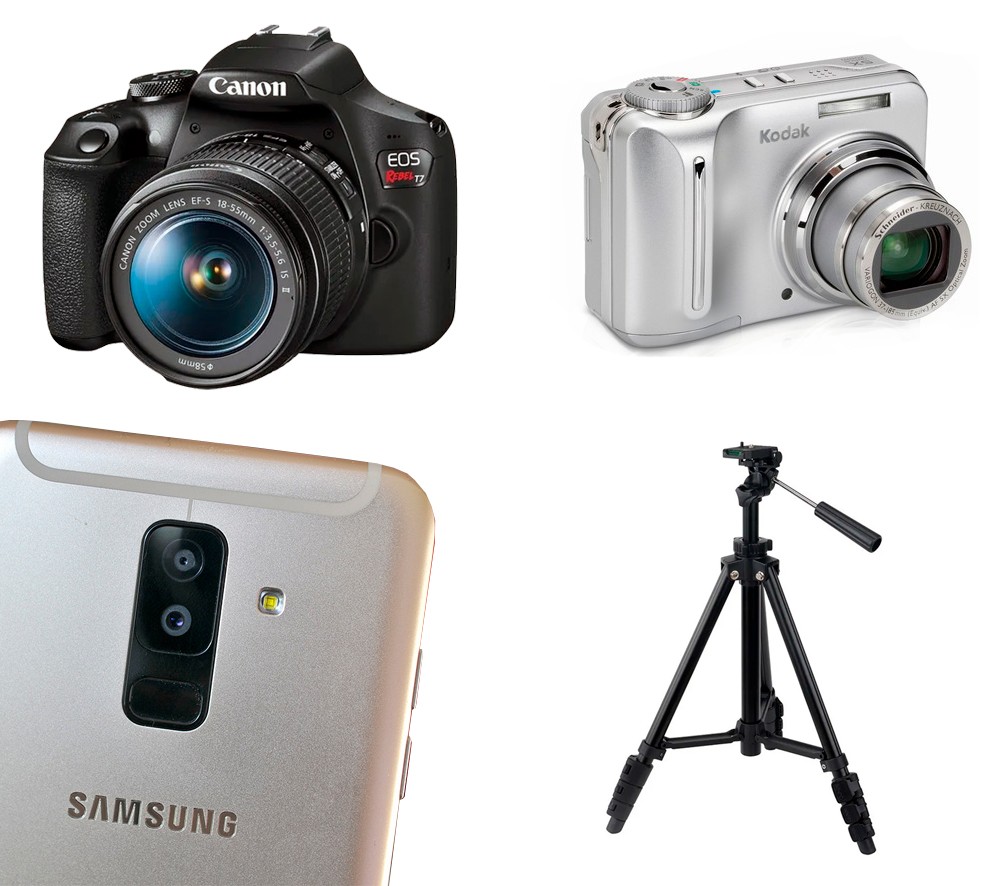
The camera

Reflex cameras are the best for photographing products, since they have multiple focal lengths and allow working depth of field and focus with excellent results, but they are very expensive and you have to know how to use them.

If you cannot access a SLR camera, use a good pocket camera or your cell phone camera, although you will obtain lower quality photographs, but if you treat them with criteria you can obtain very good results at a very low cost.
Avoid using the macro function of the camera, unless you need to show a very small and complex detail.
The same advice is valid for zooming, especially if you use the cell phone camera, since they lose definition.
In all cases, I advise you to use a tripod to hold the camera and always keep the same distance from the objects to be photographed.

tipos de camaras

The enviroment

Whether you sell cars or homemade crafts, you should display them with an advertising marketing concept.
Never display a photographed product on the floor or kitchen counter, and be very careful what you see in the background.

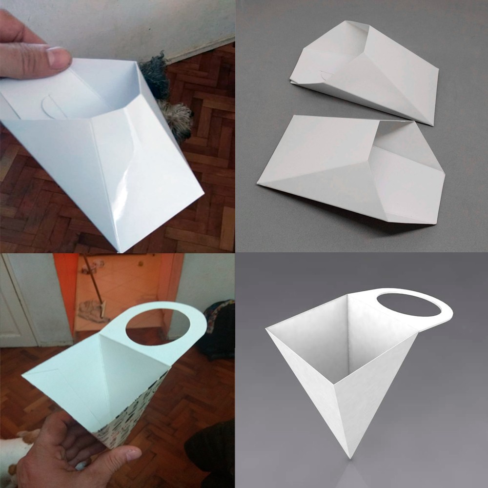
I challenge you to find what items are left over in the following images.
Las imagenes de la izquierda fueron proporcionadas por el cliente, mientras que las de la derecha son la soluciones propuestas por un fotógrafo profesional.

cartulinas food

Backgrounds are quality determinants

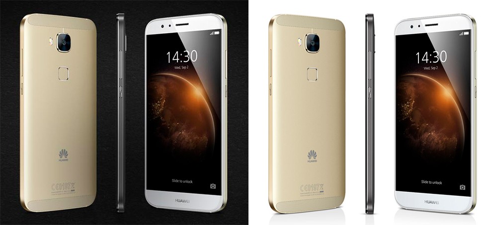
The background can be removed or changed only if the product image is good and if you have knowledge of Photoshop or any other digital image editing program or application.
Do not ask Photoshop for miracles, because if the image is bad You can't do too much to achieve good results.

edicion de fondos

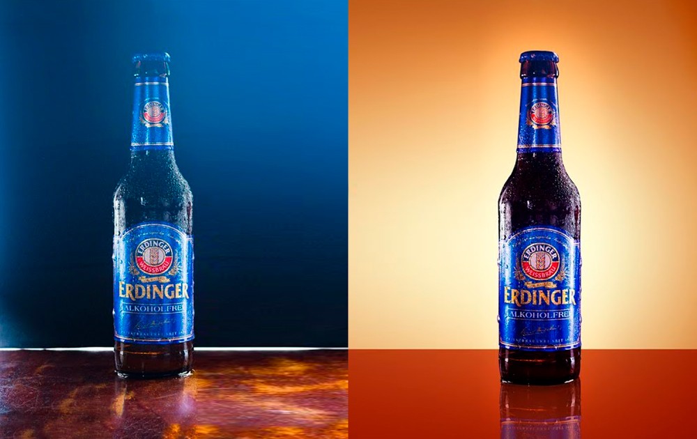
The same product with a different background creates very different climates.

telefonos blanco y negro

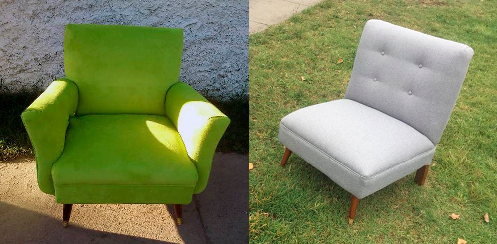
If you are selling furniture or large items, try to make sure the setting and lighting are appropriate.

ambientacion sillones

Choose the right environment

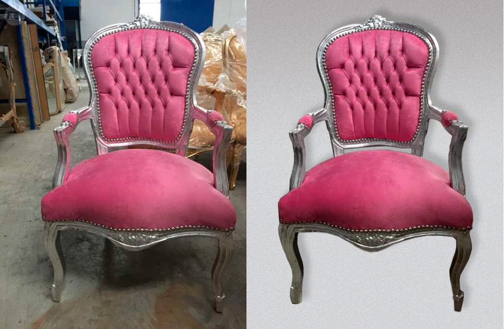
If you cannot access a showroom with a good setting, try to take the photo with soft and even lighting, edit the image with Photoshop and remove the background.
The important thing is to create a good composition and that the product looks good .

eliminar el fondo

Nunca elijas ambientes que no correspondan al contexto del producto que vendes.
Si son productos de interiores deben estar fotografiados en ambientes interiores, y viceversa.

The settings must be clean and tidy, removing any object that is not related to the product.
Never photograph products in full sunlight as they generate very overexposed lights and very harsh shadows.

telefonos blanco y negro

Attention to detail

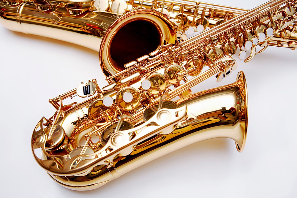
Si fotografías objetos metálicos, espejados o muy pulidos y brillantes, cuida muy bien lo que se refleja en la superficie. Muchas veces sin darse cuenta, se ve reflejado el mismo fotógrafo, u objetos del entorno que nada tienen que ver con el producto.
Los objetos deben estas limpios y sin huellas digitales.
Cuida también que no queden restos de fibras y pelusa al limpiarlo con paños, ya que en las fotos se ve todo.

telefonos blanco y negro

The lighting

Try to shoot with even light that casts soft shadows on the background.
Hard shadows are not aesthetic and often become part of the object.
Si fotografiás en el exterior, evitá la luz directa del sol o filtrada a través de los árboles.
Los dias parcialmente nublados son los mejores para hacer tomas exteriores.

telefonos blanco y negro

Avoid using direct flash on objects as they can produce unnecessary glare and harsh shadows.
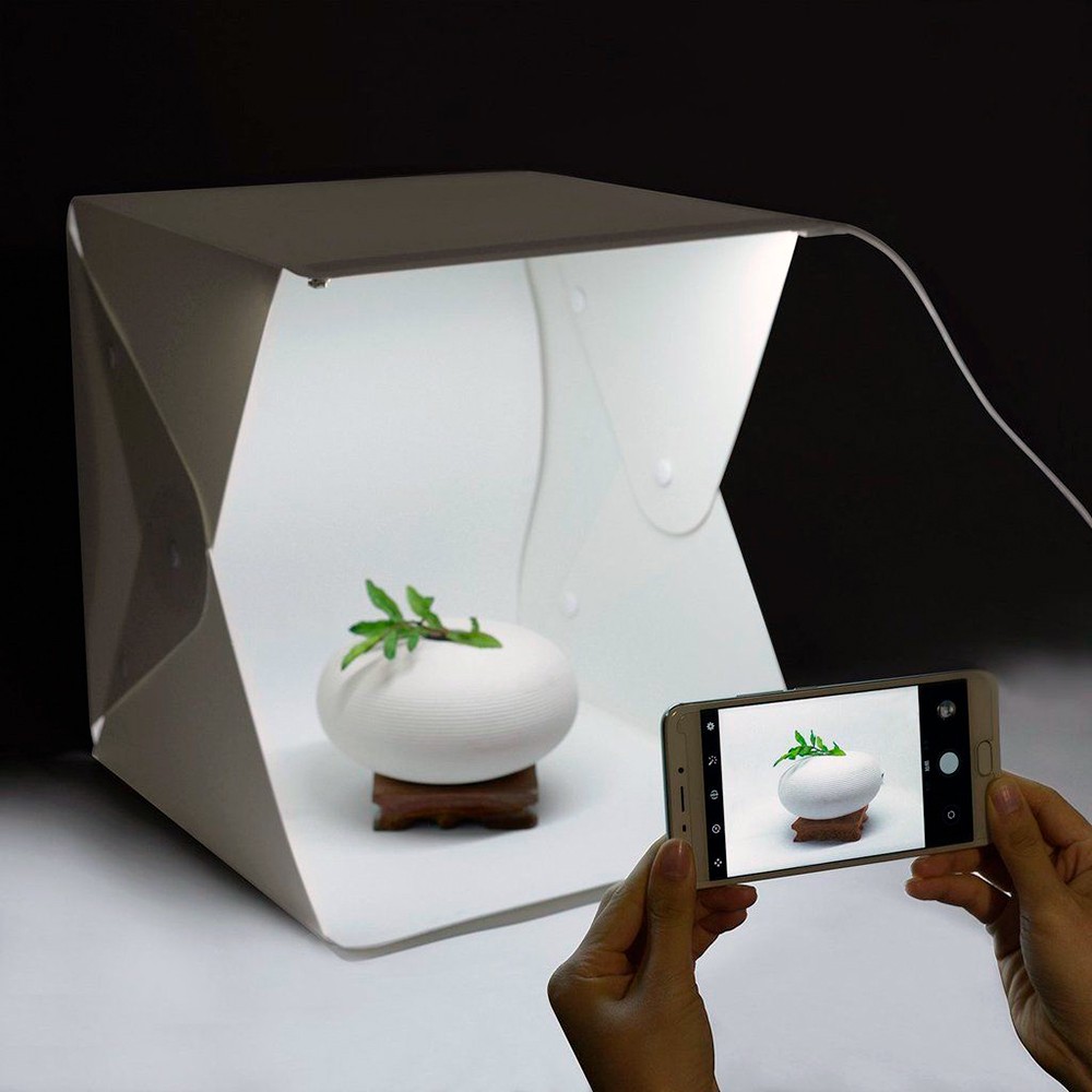
Si vas a fotografiar objetos pequeños te aconsejo comprar una ligthbox (o caja de luz).
Va a solucionarte muchos aspectos de iluminación y entorno, con un bajo costo.

lightbox

Controls aperture and white balance, avoiding overexposure, which gives the appearance of a "burned-out photo," or underexposure that becomes too dark.

telefonos blanco y negro

Editing images

Never use a photo on the web as it is from the camera.
There is a lot of information that is not necessary, and neither the format, nor the size, nor the framing will be adequate.
Many times the images take on color tones from the environment that must be neutralized, and reflections that must be corrected.
Here you will need knowledge of Photoshop to correct lights, tones, framing, crops and graphic resolution.

edicion de imagenes

Image cropping and resolution

Te sugiero usar fotos cuadradas (tipo Instagram) para dar armonía general a la tienda.
Si alternas fotos verticales y apaisadas, la cuadrícula se desordena y pierde estética el diseño general de la tienda.
If you have vertically arranged photos, you may be able to extend the background to the sides until you get a square ratio.
You should always seek harmony and coherence with all the photos, that gives the store "personality" and visual quality.
Never use a resolution higher than 72 dpi since the screens do not read higher resolutions and the file size increases a lot and therefore, the download time on the web.

productos tienda

Final conclusion

As you will see, taking product photographs is not as simple as it seems, and the results are in sight.
Starting an online business is not simple either, believing that it is the same as the traditional business in a commercial premises.

I hope you enjoyed this article and that it helped you clarify your doubts about how to photograph products for your online store and how to approach your business to improve its profitability.

If you consider that I am a qualified professional to carry out your projects, do not hesitate to contact me.

In the Related Articles section below, you will find many articles with specific topics that complement the one you just read. Thank you!


>>> I WANT MY ONLINE STORE <<<
Packaging posavasos

How to improve SEO on your website

In this article I will give you some suggestions on how to improve SEO on your website.
I am going to show you how search engines like Google work so that you understand why it is so important that your content meets the basic SEO requirements.

Although SEO implies a very meticulous work and must be carried out by experts, the idea of this article is only to give you some basic concepts so that you can have an acceptable performance for your website or your online store.
The concepts shown here are based on the use of the WordPrefect plugin Yoast SEO in its free version.


What is SEO?

SEO is the acronym for Search Engine Optimization and consists of a series of "textual" requirements that search engines like Google requires that your content be indexed and found on the web.
These requirements help improve your search engine positioning and the more accurate they are, the greater your chances of appearing in the results.

SEO is an “additional” process to web design, through which aspects of the content of a page are modified, to improve its visibility in search engine results.
Therefore, it is very important that you approach SEO-oriented work from the beginning and take it as a general rule for all your startups on the web.
It is very counterproductive to do it after the publication of the site, in addition to representing a double job and a double budget.

In recent years, SEO has been one of the most valuable practices in web marketing, due to the contributions it generates to the traffic of a web page.
This contribution, depending on the intention of the page, can translate into more sales , more opportunities, more publicity, greater dissemination of content, etc.
If you intend to get advertising advertisers for your website, you must make sure you do a good SEO and that your website is very well ranked and gets many visits.
Otherwise no one is going to invest money in a little visited website.

So you should never do without SEO!

How do search engines work?

Whether you have a corporate website or an online store, you have to understand that each page represents a fundamental element to improve SEO.
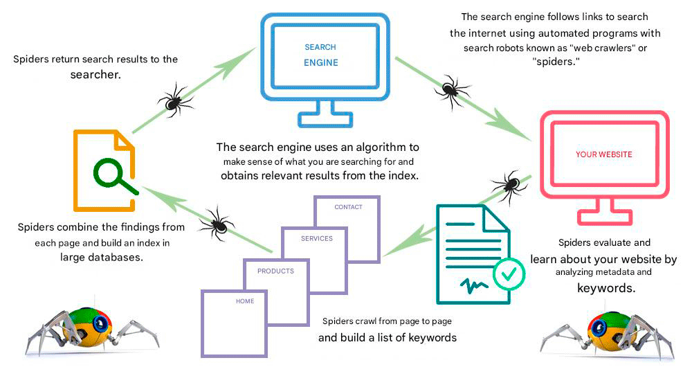
Search engines have two main functions: searching the web and building indexes.
With this you They provide answers through a relevance calculation and thus show you optimal results.

A search engine consists of four basic parts:

  • A user interface to make search requests (for example, the Google website)
  • A robot or spider that searches for information on the Internet
  • An algorithm that connects user requests to the database.
  • A database where all content has been indexed

The heart of any search engine is undoubtedly the algorithm that directs the robot or spider and then categorizes the information that will be displayed after user requests.

>>>  I WANT MY WEBSITE <<<
Packaging posavasos

The "spideries"

Google sends some tracking robots or spiders, which we call “spiderlings”, which periodically analyze your website looking for variations in the content.
These variations add value to your positioning, since if the robots pass continuously for your website and do not register new content, Google will consider it as not very relevant and your positioning will not be good.

I advise you to periodically update the contents of your website by adding new sections and new products if you have an online store.
Having a news blog with topics related to your activity is highly valued by Google as it contributes Relevant content and favors the traffic of your website.
But I advise you that the content is your own and not copied from other sites, since it can be considered duplicate content and can be penalized.
Therefore, you should be concerned that the information on your website is relevant to improve your positioning and make it easier for your customers to find you.


Establishing communication priorities

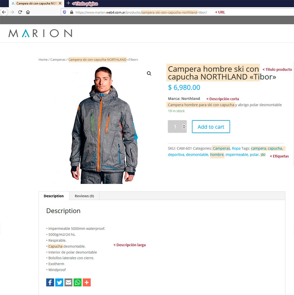
Search engines first read the URL of the page (www.yourcompany.com), then the title of each page, then the subtitles of the content and finally the texts and images of your pages.
All these elements must be strategically and with logical criteria in view of improving SEO.

Each article on your website or online store constitutes a new independent page and you should make the most of it.
Each page allows you to create a "target keyword phrase" that defines the content of the page.
This phrase should contain no more than 5 words, the keywords for which a user would search for you on the web, and should be as specific as possible, avoiding generic phrases that would yield many results.

If you have an online store, they must also appear in the title of the product, since as I said before, it is the first thing that search engines read.
These keywords must also appear in the descriptive text of the products and in the metadata of the images.


Do we see an example?

I am going to graph it with a concrete example of a product in an online store, but it is valid for any type of website.
The product is a Nothland brand men's jacket.

An objective keyword phrase that describes the product could be “gray hooded jacket” , but that description would return hundreds of search results.
So we need a more narrow phrase. How about we try something more specific?
“northland men's ski jacket with hood”

Here we are giving 5 basic concepts that could be of interest to the customer who is looking for a specific product:
First we define the product (jacket), then the user (man , women, children), then the specific use or material (ski , sports, dress, raincoat), then we clarify that it has a hood, and finally the brand (Northland)
Those 5 words are filtering us and narrowing down a lot of results that we are not interested in and that favor our products to show up in better positions.
The product title (and the page) should contain this key phrase, preferably at the beginning.
The title can be longer: Northland men's ski jacket with hood, Tibor waterproof model with zippers, but we make sure it contains the key phrase.

The key phrase, or any of its words, must also be repeated in the descriptive texts and will favor web positioning.

SEO in images

Although the meta description does not influence the web positioning, it allows highlighting the search keywords, improving the CCR (number of times a keyword appears).

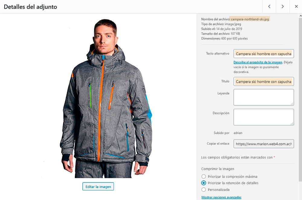
As I said in my previous article Requirements to have an online store , it is very important how the JPG image files are named, they must be descriptive and contain the key phrase to improve their indexing.

So I repeat, never leave the default name as it comes from the camera (eg pic0024585.jpg )


Optimizing image attributes

The images of your website are saved in the WordPress Media Library that allows you to configure their attributes.


Completing these fields creates HTML tags that favor SEO.

Título de imagen: Normalmente lo toma por defecto del nombre del archivo de la imagen, y es por eso que antes te dije que no desatiendas a este título de archivo.
Se aconseja crear los archivos de imagen con los títulos definitivos orientados al SEO y que contengan las palabras clave que queremos posicionar.
De todos modos, se puede optimizar en el editor de imágenes de la biblioteca de WordPress

Texto alternativo: Es muy importante para el SEO y es necesario para personas con discapacidad visual (el navegador reproduce un audio con el texto).
Tiene que ser descriptivo de la imagen y tratar de incluir las palabras clave, pero sin abusar, no deben estar en TODAS las imágenes de la misma página.

Los campos Leyenda y Description son información adicional que no está de más implementar.
Si bien no generan posicionamiento, toda la información de valor añadido siempre es valiosa.

Final conclusion

We all know that Google is the one who imposes the rules of the game on the Internet, and that the success of our website or online store depends on being found in their search engines, and being chosen among our competitors.
If you want to be part of the game, you must understand and accept the regulations and requirements that your website must have.
Otherwise you will be left out, no matter how attractive your website is or how good the products you are trying to sell online are.

I hope you enjoyed this article and that it was useful to you.

If you wanted to have your own website and you consider that I am a suitable professional, do not hesitate to contact me and I will gladly advise you.

In the Related Articles section below, you will find many articles with specific topics that complement the one you just read. Thank you!

>>>  I WANT MY WEBSITE <<<
Packaging posavasos

Requirements to have an online store

In this post I will show you all the prerequisites you need to have your online store.
I am also going to tell you what you have to request from your webmaster and what things you must provide to develop your virtual store.

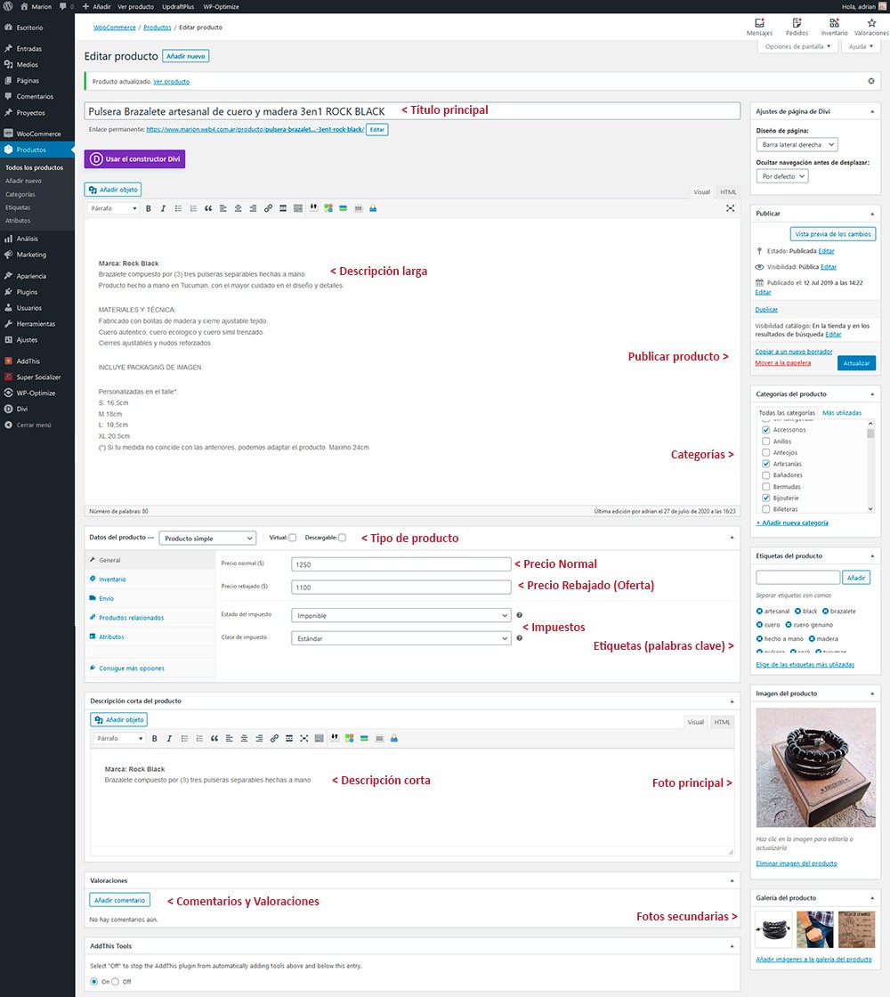
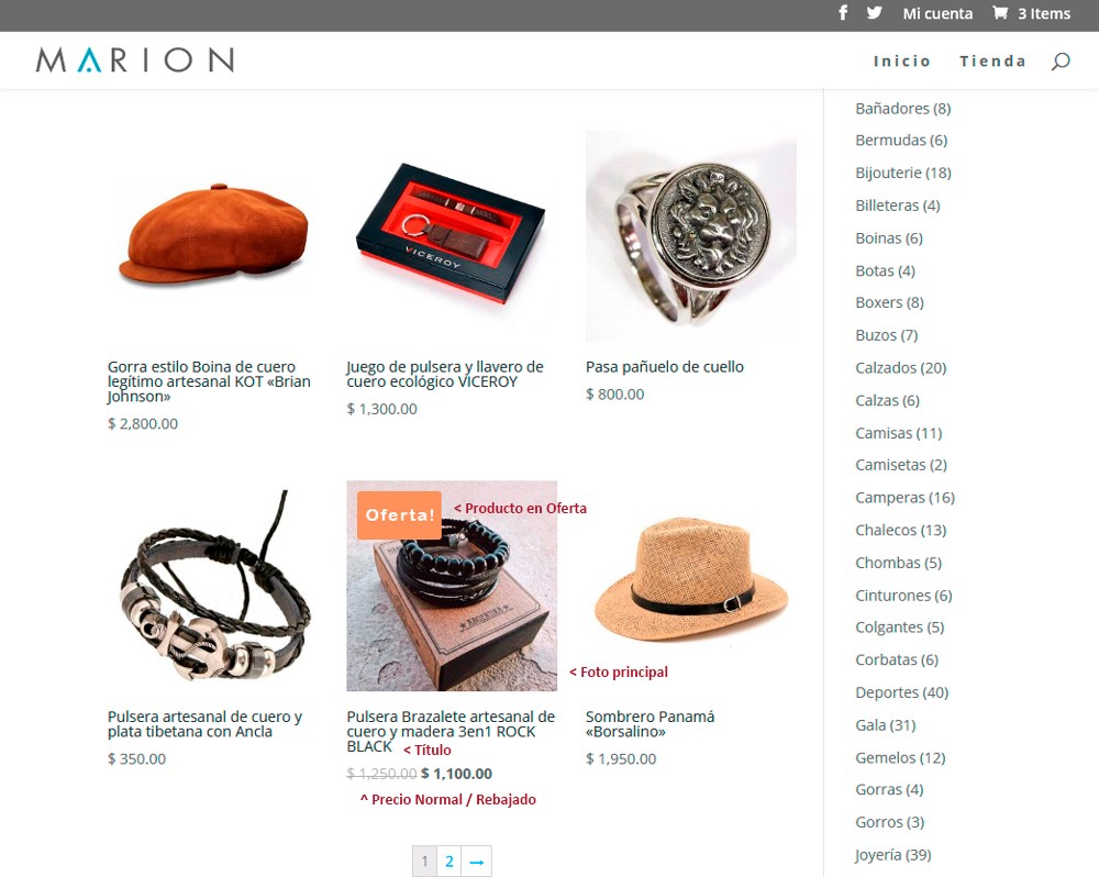
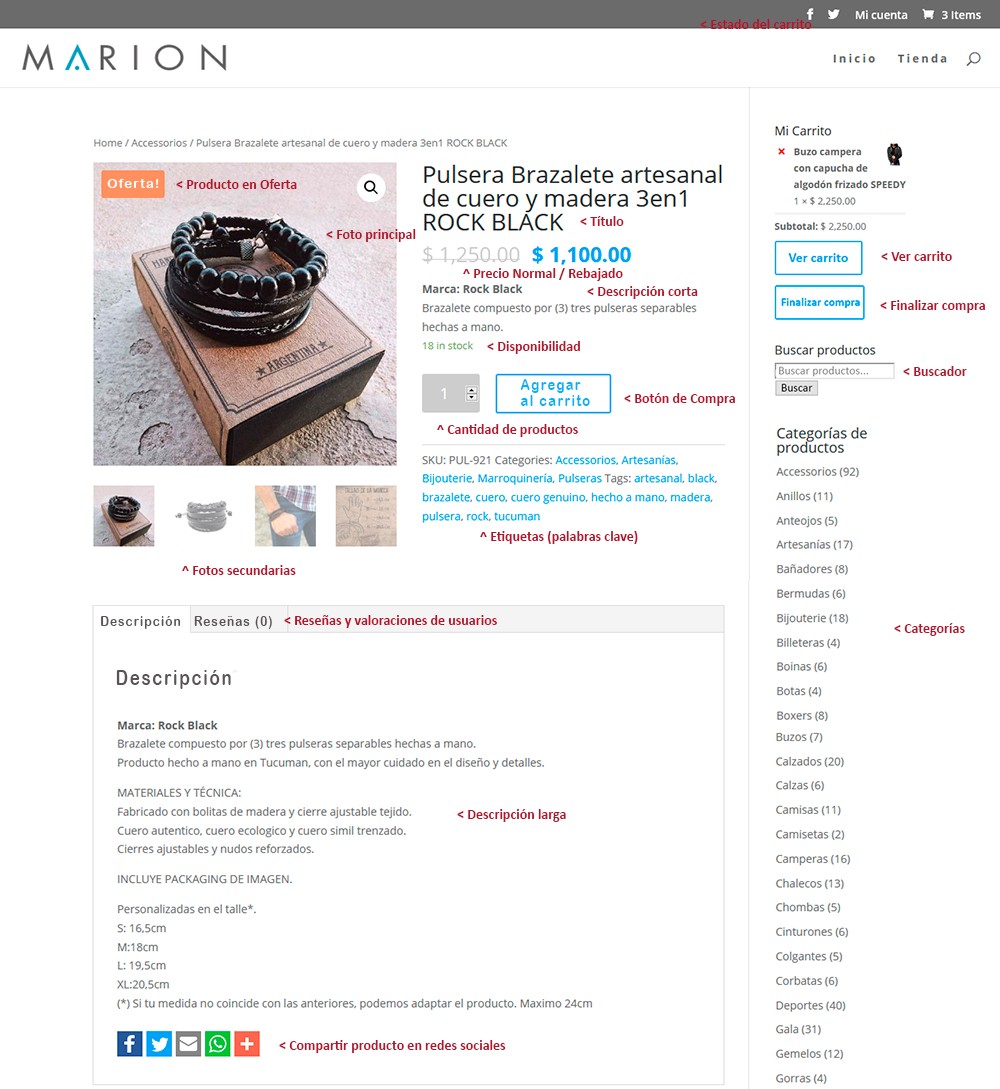
The purpose of this article is to give you a rough idea about what you will have to face if you decide to self-manage your store, showing you what the product configuration screens look like, what data you must enter and how it is reflected in the general view of the store.
You will see that it is quite simple and the graphical interface is very friendly, similar to the ones you could find in places like Mercado Libre or Ebay.


Let's start

The first thing you need to enter the world of virtual sales is to become aware that you will be the owner of a business, even if it does not exist physically.
That makes you an entrepreneur and you must assume yourself as such, and understand that your website It has to generate monetary income that improves your subsistence and your quality of life.

It is useless if you have a beautiful virtual store, with hundreds of products if behind it there is no human factor that supports it.
A virtual store can greatly simplify the management of selling online, both for you and your customers.
It provides you with all the necessary security factors to automatically carry out all commercial transactions. But you have to work conscientiously and with criteria, and not leave anything to chance.

>>> I WANT MY ONLINE STORE <<<

Packaging posavasos

Requirements to have an online store

These are the fundamental elements that you have to have to start your business on the internet:

1. Graphic and Web Designer

Once you have made the decision and commitment to be an entrepreneur, the first thing you have to do is hire a good graphic and web designer, who will advise you and be able to develop a virtual business tailored to your needs, with efficiency and responsibility. .
Look for a designer who has proven experience in virtual store design.
Not all web designers know how to develop online stores.

Although a store is a type of website, its design and operation is quite different and requires special knowledge.
I advise you that your web designer is also your webmaster, since he will have a global vision of the development of the store and its correct operation.


Services to hire

To have an online store, or any other type of website, you need to acquire a national or international web domain, and a webhosting service.
You can purchase this on your own or through your webmaster, who will surely offer it to you as a additional service so that you ignore all the commercial and technical questions that you probably do not know.

2. Web Domain

The domain is your web address, something like your home address, and which we all know as "www.yourcompany.com.ar", and it is the one that is written in browsers to access a website
This domain is unique and unrepeatable. There cannot be two equal domains, although they can be similar.


National and international domains

National domains (.com.ar) refer to Argentina, they are acquired through NIC.AR and previously you must be registered in AFIP to qualify and be the owner of a domain.
They are valid for one year and are renewed at each expiration date.
The lack of domain renewal will cause your site to crash and remain offline, with all the consequences that this may bring you.
Therefore, I recommend that you schedule the due dates.

International domains (.com) do not refer to any country and are acquired through companies or domain sales websites. You do not need to register in AFIP.
They are widely used by multinational companies.

verificar dominio web

3. Webhosting

Webhosting is an outsourced service.
It is a virtual space that is hired on a server to host (host) a website and it is who allows this site to be active.

It is generally paid in advance and periodically (yearly, semi-annually, monthly, etc.) depending on the company.

The web hosting provider in addition to giving you the space on the server, provides you with several tools related to your domain: create email boxes with your domain (eg info@tuempresa.com.ar ), create sub domains, databases, obtain statistics on the traffic of your website, technical service, etc.

It is very important that the web hosting service is of very good quality and compatible with WordPress.
It must provide you with the SSL (https) security protocols that will allow you to carry out commercial transactions safely through your virtual store.

I suggest that your webmaster be the one who provides you with the web hosting service since he will surely have experience working with such a company and there is a communion of teamwork between the two endorsed by years of experience.
If you do not have experience in web hosting, no assume that responsibility, since there is a lot of terminology that you do not know and that you will need when making any technical or administrative consultation.

Detalle de pagina de compra de productos en tienda

4. Webmaster

A webmaster is a graphic and web designer who designs your site or your store, manages the contents, updates the templates and plugins so that your website is always safe.
It also solves technical problems that may arise.

Never think of your designer as an all-in-one polirubro maxikiosk.
While we have global knowledge on many topics, we are not competent in all areas.
In design there are also specific tasks for each need.

Surely you would not ask your cardiologist to prescribe glasses to see better. True?

Do not confuse Webmaster with Comunity Manager, since they are two completely different tasks.
The first one handles the design of your site and the whole administrative and technical issue, while the second one creates content for your social networks and cares for your followers.

Once you have hired the first 4 requirements, your designer is ready to start working on the design of your virtual store.

5. Basic store setup

The online store is configured only once and you will have to provide the following personal and administrative data:

  • Determine the postal address of the store, city, postal code, telephone numbers and opening hours, geolocation, etc.
  • Choose which areas and countries you want to sell to.
  • Define shipping areas: Each area has a different cost and taxes.
  • Indicate the taxes you are going to add.
  • Activate discount coupons. (optional)
  • Define currency of payment.
  • Allow public reviews and ratings on products.
  • Add payment gateways.


6. Products to sell

Here begins "your work" providing all the information of the products for your store.
So create a document in Word or an Excel template and start collecting the information.
Before you start, I advise you to describe your products with a view to applying SEO. (search engine optimization like Google)
I invite you to read my post How to improve SEO in your online store for more information.

 I suggest that you classify your products in headings or categories. Each product can belong to 1 or more categories and it will appear in all of them.


Product Configuration

Each product in the store allows you to enter the following data:

  • Main title: It is the brief descriptive title of the product that appears in the general grid of the store followed by the price. This will be the title of the product page and the fundamental factor for your client to find it. This title is also essential to promote SEO
  • Price: It is the sale price and, if you want, also add a reduced price. In this case, the sale price is crossed out, the reduced price next to it and an indicator that says SALE. Temporary salescan be created (for example: from July 15 to 25).
  • Short description: It is a small text that complements the title and appears immediately below the price when entering the product (you can indicate brand, color, size, etc.)
  • Long description: It is what appears below as technical or complementary data. It can include additional photos and videos, technical data, measurements, ways of use, advertising messages, user manuals, frequently asked questions and everything you need to explain about the product.
  • Code or article reference (SKU): Each product has a code and can contain letters and numbers which we call SKU. This is the reference code that will appear in the inventories and in the order notes. You can just put the article number if you wish.


A friendly and self-manageable graphical interface

The following image shows the editing panel for each product in the store, where you can see the fields that you will have to complete.

The data you entered in the previous panel will be reflected in the general list of the store. (Photo 1)
By clicking on the image you access the individual page of each product where the complete descriptions are displayed. (Photo 2)

7. Product photographs

The images are essential to convince the customer to decide to buy your products.
The quality of the photos represent more than 80% of the success of your online store.

The images have the fundamental role of capturing the customer's attention and therefore they must be of excellent quality, and they must show the product from very well cared for strategic angles.
Each product must have at least one main photo and can have a gallery of additional photos.
You can also include videos, previously uploaded to your YouTube or Vimeo channel.

I advise you to read my article How to get the best return on your product photos for more information.


Photo nomenclature

In order to facilitate the work of your designer and favor SEO (Google Search Optimization), I suggest you name the digital files as follows:

Product code (SKU) + description + (brand) + (color, shape or size) + (order number in case the same item has multiple pics)

BRA401-leather-bracelet-3in1-man-bracelets-rock-black-1.jpg

Never leave the name by default as you get it from the camera (eg pic0024585.jpg ) Your designer does not know your stock and Google does not like those names and ignores or penalizes them.

You can read my article How to improve SEO on your website for more information.

Final conclusion

I hope you enjoyed this article and that it was useful to you.
The advantages offered by e-commerce are so many, that there are definitely no reasons not to try to position yourself on the web.
What are you waiting for to have your virtual store?

If you wanted to have your virtual store and you consider that I am a suitable professional, do not hesitate to contact me, I will gladly advise you.

In the Related Articles section below, you will find many articles with specific topics that complement the one you just read. Thank you!

>>> I WANT MY ONLINE STORE <<<

Packaging posavasos

Why have an online store

Surely you wondered why have an online store if so far you have done quite well with your business premises, or perhaps you do not have enough information to encourage you and start your own virtual store.
In this post I will show you the benefits of integrating your business or activity into the world of electronic commerce.

>>> I WANT MY ONLINE STORE <<<

Packaging posavasos

Internetizing

Internet is now available to everyone and more than half of the world's inhabitants are connected to the Internet, either through a computer, tablet or smartphone.
The truth is that consumers search the web for information about what they want to buy BEFORE than anywhere else.
The percentage of people who directly choose to buy from a virtual store, and this can open many doors to your business that you could not access otherwise.

For this reason, and because it is also an economic resource to increase business, there is no reason to waste the opportunity to sell any product, activity or service through this wonderful medium.

Samsung

Immediacy, comfort and security. Those are the keys

Nowadays, people no longer often go to stores to buy a product.
All these searches are carried out through the Internet, so that when the customer arrives at the store, he already has a more specific idea of what he wants to buy.
But if you can buy that without leaving your home, at any time and from anywhere, it is much better.

As a seller, making the decision to enter electronic commerce is to assume that there are other ways of buying and selling, and that one does not disable the others but rather they complement each other.
An online store offers you everything that you need. business needs to carry out electronic commerce operations, with the immediacy and security that both you and your customers need.

The pros and cons of having your own online store

We all know several very popular websites that are leaders in online sales and are in fact very effective and reliable.
Many of us have had the experience of buying or selling through these sites with very good results, but sometimes also very bad.


What are the advantages and disadvantages of having your own store, or selling through those sites?

  • The main advantage of having your own store is that you are the owner and no one else interferes.
  • You decide what to publish and how to do it, you set the price and conditions, you manage the orders and delivery times, just as you would in a traditional commercial premises.
  • Nobody knows your income since it is totally private and confidential.
  • The store operates under secure e-commerce protocols that protect you and your clients.
  • You do not pay commissions, neither to publish nor to sell your products, as long as you do it in cash, bank transfer or check.
  • It allows you to include external payment methods such as MercadoPago or PayPal and assume the commissions that these platforms charge you for using them as payment gateways.
  • Your posts never expire unless you delete them and there is no limit to the number of products in your store.
  • You can organize your products by headings or categories and add as many photos and videos as you need for free.
  • By integrating your store into your social networks, you can expand the promotion and sales options.
  • You can sell to the whole world and with various currencies, all kinds of articles, activities and services that are legal in your country.
  • The buyer only watches your products in the store and is not distracted by products from the competition.

Una cuestión de promoción

Among the possible disadvantages that your own store may have against commercial sales platforms is that these sites have their own web positioning and dissemination systems.
Being leading brands with a long history online, they enjoy sufficient fame and prestige to become inevitable reference points for people looking to buy online.
They are platforms that have been evolving for years in the market where everything is already set up.
You just have to publish your products under their conditions, pay and wait that people are interested in them and buy from you.
It also facilitates (and disregards) all commercial management, but at the same time it subjects you and forces you to use their commercial platforms, with their commissions and conditions of use .

Coexisting for a time

Surely you are not going to do without the use of these platforms, but it is always very good to start the path of commercial independence.
Give your store the opportunity to grow and position itself in the market until you get your own clientele, and you become their best option to buy the products or services you offer.

The success of your virtual store also depends a lot on your commercial vision and the budget that you allocate, that you take it seriously and consider that it is as important as your commercial premises, and that it deserves attention and dedication.
Assemble a good work team with your webmaster, who will surely guide you so that you can obtain a customized virtual store and achieve optimization of your work and improve your profits.

What benefits can your own online store give you?

Next I show you some of the advantages that entering the world of e-commerce through your own online store will bring you


Expand your market from local to global

Your neighborhood, your city, your province, your country ... the whole world! There are no longer borders to sell your products or services online.
Unlike physical stores, you can sell wherever and whenever you want and you will gain new customers from different parts of the world.

global market

Making your schedules more flexible

Tu tienda online está abierta las 24 horas y sin limitaciones geográficas, para que los consumidores puedan conocer más sobre la empresa, sus productos y servicios, e incluso concretar una transacción al instante, y de esa forma no atas al cliente a que te visite en tu horario de apertura, ni tampoco te ata a ti a estar permanentemente disponible.
How many people work business hours that coincide with your business hours? How many people can come to your place?

optimizar horarios

Lower costs

Traditional stores bear very high fixed costs, even when they are not working.
You have to pay rent, expenses, insurance, taxes, services, authorizations, salaries, travel expenses, cleaning, etc.
Unlike this, the online store has a much lower cost: You only pay for the design, the domain and the webhosting, now sell!
In this way, the focus should be on offering a good professional design, excellent photographs and videos, and immediate attention to the client, and in an efficient service of dispatch of the orders.

optimizar costes

Accessible from any device

By having an online store, your customers will be able to access it through any of their mobile devices and from anywhere in the world. The more facilities you give them, the better.

Imagine that you meet a friend and he tells you that he wants to buy an armchair for his house, and you advise him where to buy it. Immediately your friend looks for the store on his cell phone and buys it.
He no longer has to wait to return home, remember what you told him, connect to the internet with his computer and finally buy, just as he did just a few years ago. years.

At the same time, if you have a physical store and no online store, you are failing to take advantage of a very interesting virtual customer traffic.
Time is a very precious value for today's buyer, and immediacy is a fundamental factor to capture it and make the purchase.
For this reason, if someone wants to buy something that they saw in your physical shop window, but cannot find you online, it is very likely that they will end up buying it in the competition.

web responsive

A great showcase for your brand

What better showcase than being on the web? Anyone with Internet access can access your store and see your products.
Having an extensive online catalog is much easier and cheaper than renting more meters in your business premises.
It is only necessary to carry out a photo session or make videos, where you can show your products from all possible perspectives.

Self-management

Your online store is fully self-managed with very basic knowledge of electronic commerce.
You will find hundreds of tutorials on the internet that will help you solve your concerns and optimize the performance of your store.
There are many reasons why you can choose sell online, but the most important thing is that you are the owner of the store and can manage its operation with total freedom and independence.


Wholesales or retails

On the Internet there are no limits for your store to grow. You can sell whatever you want in the amounts you can think of.

joyas

Knowing the customer better

Thanks to the web analytics that your virtual store offers you, you will be able to create reports on the operation of your online business.
This allows you to create marketing campaigns, offers, control your stock, know your customers' shopping trends, which products they like the most, which sections they are interested in compared to others, and even the age and geolocation of each one.
These reports are essential to offer the customer what they are looking for and that you can strengthen your products according to their specific needs.

In addition, your online store includes a user registration system that allows you to know who buys from you and to know the history of their activities.
It also has a rating system, where users rate the seller on the product, delivery times, etc. determining the degree of trust and the quality of the product or service.

The more you know about your customers, the more you can meet their needs and encourage loyalty and feedback with your company.

Si tus clientes están en internet ¿por qué no estás tú?

We all spend a large part of the day on the web, our daily lives have become "internetized" and we can no longer live offline. Can you imagine your life without internet? How do you feel when your service is cut off and you are cut off?
Your clients are there waiting for you. Go get them.


Your competition is already on the network

If you enter the network you will be able to make direct competition to your peers.
However, if you do not decide to enter, your competition will continue to move forward, while you continue to think about whether or not to launch into electronic commerce.
The world works perfectly without your presence Don't you think it's time to integrate?

Primark

Who can have an online store?

Any company, professional or individual that has products, activities or services to sell.

We can all have an online store, be it a large company that manufactures electronics, a clothing or footwear store, a supermarket, a publishing house, artists, artisans, manufacturers, traders, wholesale or retail distributors, importers or exporters, entrepreneurs, services. professionals, tourism agencies or catering service ...

Any product, service or activity that has a price can be sold:

  • Physical products: phones, furniture, food, clothing, crafts, etc.
  • Virtual products: e-books, tutorials and online courses, etc.
  • Downloadable products: music, videos, images, tickets for shows or museums, air tickets, etc.
  • Services: tourism packs, professional attention, etc.

Final conclusion

I hope you have enjoyed this article and it has been useful.
The advantages offered by e-commerce are so many that there is definitely no reason not to try to position yourself on the web.
What are you waiting for have your own virtual store?

If you wanted to have your virtual store and you consider that I am a suitable professional, do not hesitate to contact me, I will gladly advise you.

In the Related Articles section below, you will find some articles with specific topics that complement the one you just read.
I invite you to read them, share them and leave your comments if you wish.
Thank you very much.

>>> I WANT MY ONLINE STORE <<<

Packaging posavasos